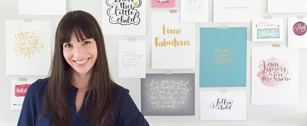
Lettering. We do it even up here in the Great White North. I’m Amanda from Say It Pretty Designs in Vancouver, BC (Find me on the web at
sayitpretty.com and on
Instagram @amandaarneill). I started hand lettering when my second daughter was born and I haven’t stopped since. I think my husband likes my lettering because it’s one of the cheapest hobbies I’ve ever started. You can get new supplies for the cost of a few cups of coffee. I can’t say that about all of my other endeavors.
Living in Canada, it’s harder to get many brush pens in stores up here, so buying my Tombow pens online has been a lifesaver! No, I’m not saying that because Tombow pays me (they don’t but I love them anyway), but because they make my favourite pens! I go through
Tombow Fudenosukes like they’re going out of style. I love the feeling of opening a new pen and seeing the crisp black line start to play its way across the page. And then I take my old pen and slam dunk it into the garbage can. (Unfortunately, my one year old has also seen me do this with my pens and she now searches for the house for things to slam into the garbage can, including, but not limited to, the house phone, the remote control, my pens, her water bottle, her sister’s Barbie and my cell phone.)

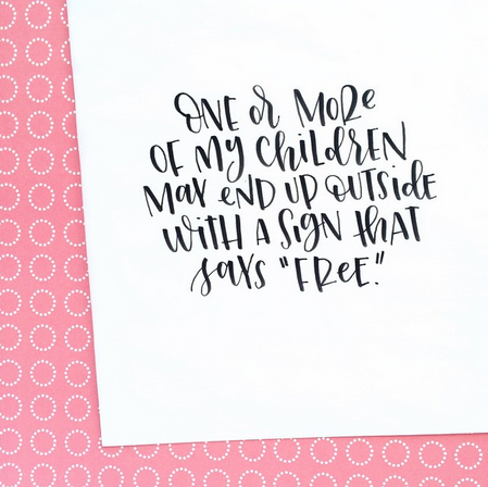
One of the lettering styles that I really enjoy using is a mixed script and print style that uses the letter styles interchangeably. I get lots of people asking if it is a font but, nope, it’s just something that flows out of my pen. I don’t have a special alphabet that I practice to write this, I just use the letters that I know and mix and match them together, rather than only using one style at a time. I thought I would give you a few tips on how make your own mix and match lettering.
I find the mix and match style is fantastic for letting letters cuddle. That’s a weird way to think about it but I always try to have my letters interacting somehow, like fitting together gently as if they are pieces of a puzzle. This is easy with single words but gets more complicated when there are multiple lines of text and they have to fit together top to bottom as well.
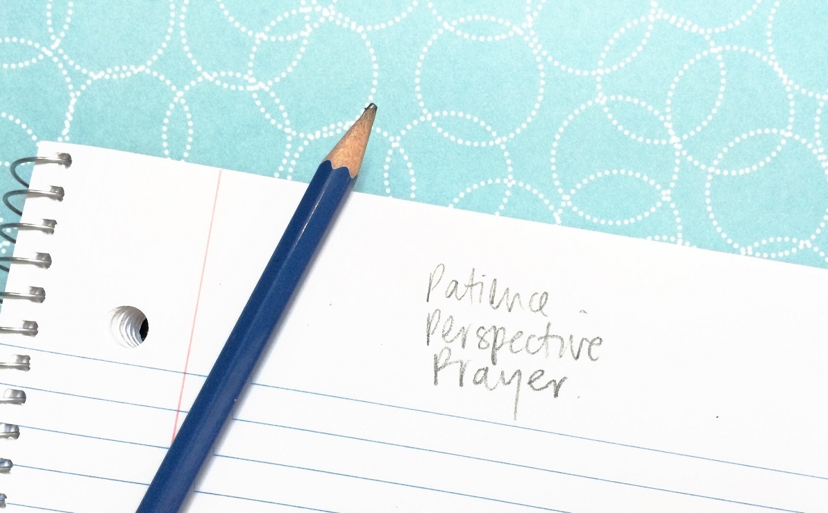
I think the best way to explain how to use this lettering style is to work through a piece together. I’m creating a poster for a friend that says Patience, Perspective, Prayer. Because she is awesome and has great taste, she wants them to be written in the playful mixed script style that I love so much.
There are a few things that I keep in mind when I’m writing the letters out:
1. Most of the letters should be approximately the same size as each other. The only letters that should be smaller are usually vowels.
2. If there are two of the same letter (or more), they should each be written in a different style.
3. There should be a random mix of script and printed style letters in roughly equal numbers.
…But most importantly, I approach each piece knowing that there are no hard and fast rules to follow.
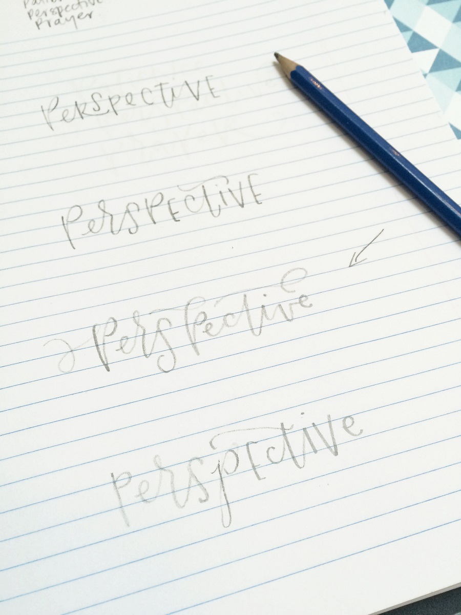
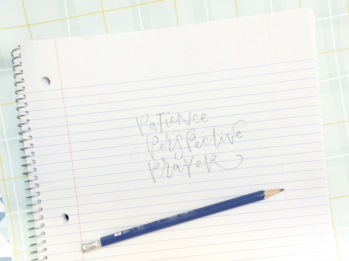
When I start on a piece, I always scribble my words out in pencil at the top of my page and go from there. For pieces with multiple words, I typically start with the middle word and letter out from there. In this case, that means that I’ll be starting with the word Perspective. Still working in pencil, I usually write my first word out a few times and see which version I like the best.
Since this piece has a plethora of Ps, I don’t want them all to look the same which means that I’ll have to get creative with them. That means I need to use flourishes and changes in size and shape. I don’t want to change the angle of the letters too much because that will make them look like they aren’t all a part of a cohesive piece.
Once I’ve picked my starting word, I build off of that, by completing the word (or words) that come before. When I write them in, I make the baselines (or bottoms) of the letters go down into the spaces left in the top of the middle word, while creating a consistent upper limit to the letters. This helps the words look like they are naturally nesting together and creates a pleasing border at the top of the piece.
When I add the word (or words) below what I’ve already done, I make some of the letters float higher to fill in the spaces or I stretch them taller than normal like little letter giraffes. Just like when I did the word above, I’m always trying to create a straight baseline with the bottom word so that it give a generally straight border.
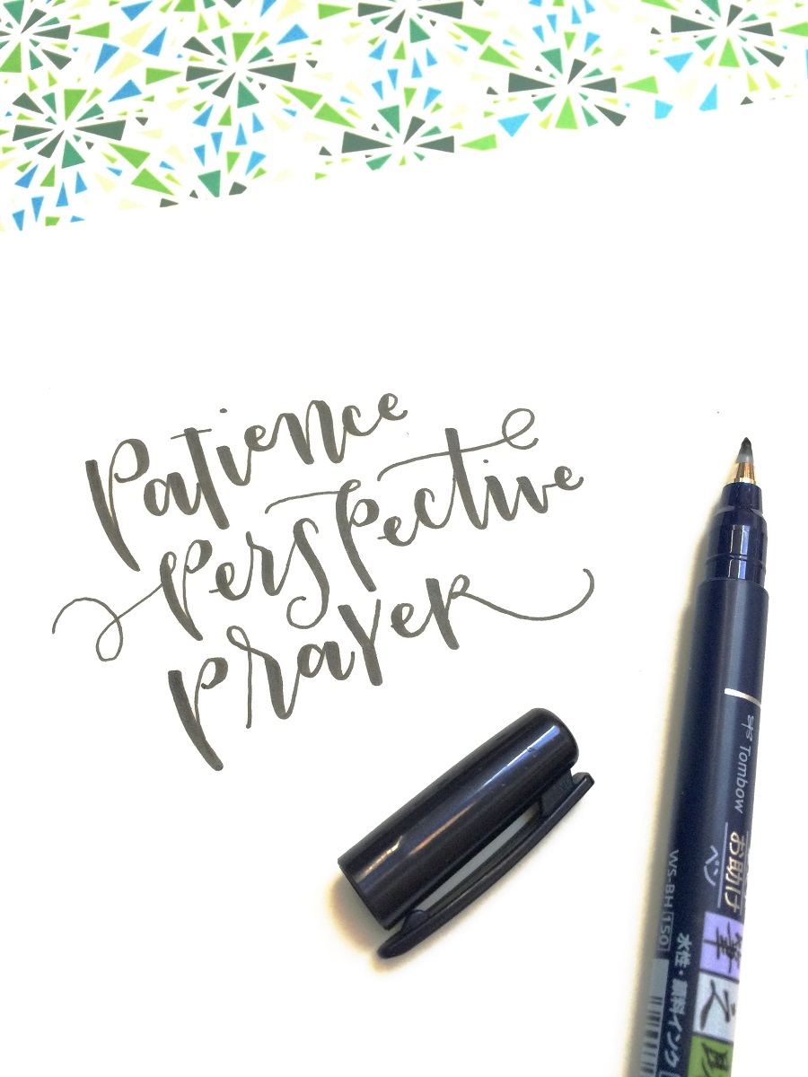
After coming up with a composition that I like, I pull out my tracing paper and my Tombow Fudenosuke and use my brush pen to write the words out. I find that sometimes the composition looks different once I do them with a Tomboow Dual Brush Pen and, before I move onto a final product, I want to make sure that I like the way that it looks in ink. Using my pen once my sketching phase is finished also helps to conserve my ink. With the number of pieces that I do, anytime I can save some ink is fantastic!
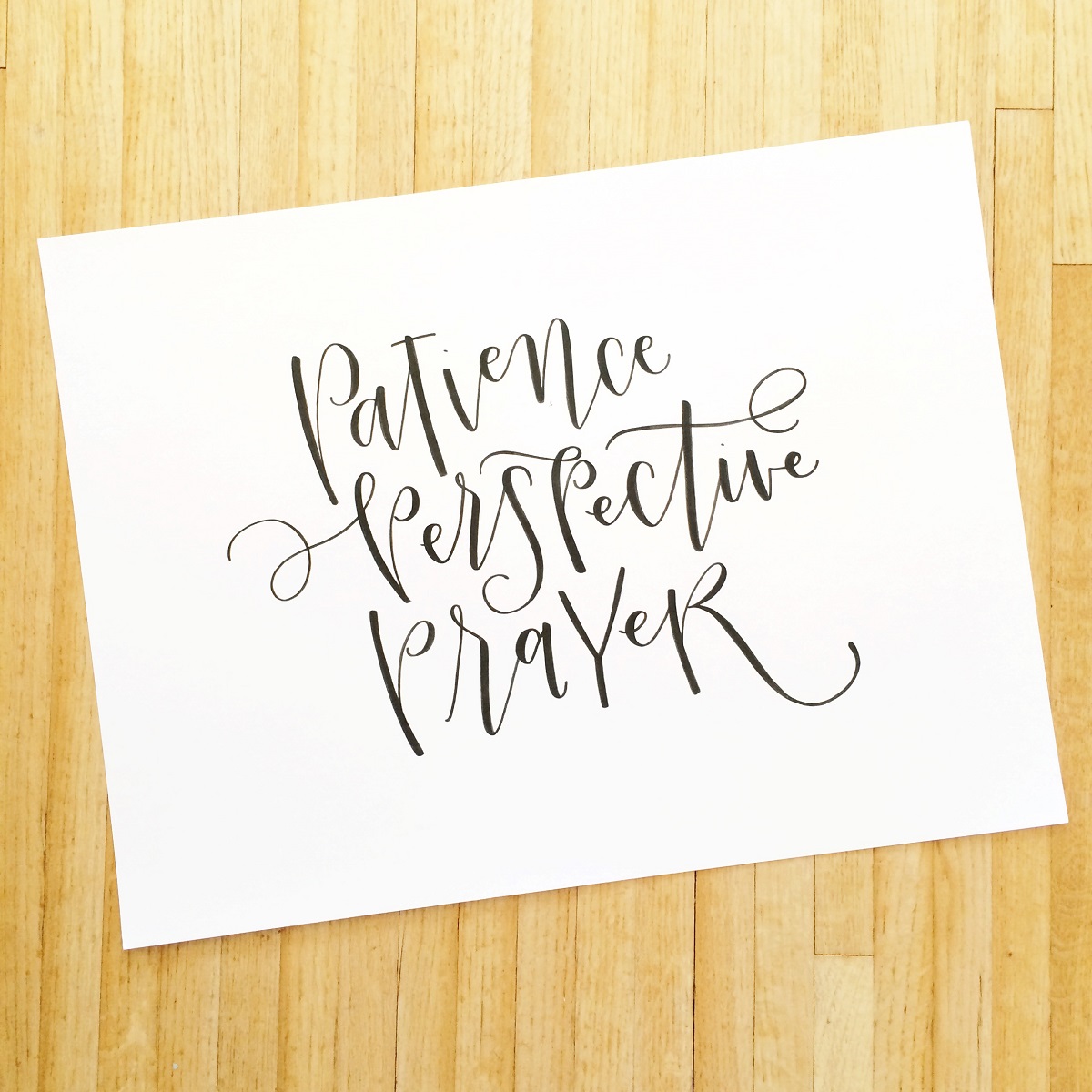
With just a few tweaks, the inked sketch is ready to go! When I scale something up for a poster, I always sketch out my design with a pencil again first. Then I grab my
Tombow Dual Tip Brush Marker, which is great for large scale pieces, and go over my lightly penciled letters (make sure the pencil is light so that it is not noticeable underneath the marker). If the edges of my letters aren’t as crisp as I want them to be, I flip the pen over and use the fine tip to touch up any edges that I’m not happy with. This is perfect for me since I do most of my large scale work sprawled over the floor and getting up to grab another pen simply reeks of effort.
The final product on acid free, archival quality paper with an acid free Tombow pen is something that I know that my friend will cherish for years to come and it will look just as great then as it does now.
If you want to see more of the things that I’m making on a daily basis, you can follow me on Instagram at
@amandaarneill. (And if I don’t mention which pen I have used for a piece I post, it’s pretty much guaranteed that it was a Tombow pen!)
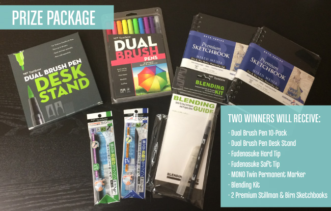
If you want to practice what you will be learning this week you need a good kit! How lucky are you we are giving away 2 Amazing Lettering Packages! Use our Rafflecopter and come back everyday for more chances to win this prize!
a Rafflecopter giveaway
Amanda Arneill is a hand lettering artist who runs Say It Pretty Designs (sayitpretty.com). While she is not chasing her two crazy girls around the park, she is curled up on the couch with her Tombow fudenosuke pens and a pad of paper doodling letters. Her pieces are designed to make you laugh, smile and love your life just the way that it is. Check out her full range of products and custom pieces at sayitpretty.com or follow her on Instagram @amandaarneill.
Great giveaway. Thanks for the chance to win.
craftymom205 at yahoo dot com
So beautiful. I just love brush lettering. I’m hoping to learn how to do it myself. Thanks so much for taking the time to write out the tutorial, on how you do your mixed lettering. It’s very pretty and unique.
Thanks for sharing your process! This was very fun and helpful!
Thanks for sharing all your tips. I love brush lettering and this giveaway is just great. You rock. Keep up the good work!
Thank you for these tips and techniques from these talented letterers! I’m just getting started and love my tombow brush markers.
Love it!
I love this style! You work is lovely!!
I love watching Amanda’s Instagram posts and I want to learn how to do this type of lettering. It’s just so cool!
Thanks for the tips and the giveaway!
This was so helpful, love the tip on starting with the middle letters! Spacing and uniformity are always my biggest issues!
This is great! Especially since I am behind on my homework from the amazing class you taught! I busted my pen and just ordered more so now I can practice and create and use these added tips!!! Thanks so much!!!
Would love to win these fantastic pens!
I haven’t mastered hand-lettering with a tombow pen yet, so I am looking forward to more practice!
I love this!! SO badly want some Tombow pens!
I just started brush lettering (I’m taking the bigpictureclasses.com Lettering Basics courses) and I am loving it! It’s always so much easier to do once I’ve seen a pro write it out and use the advice given to inspire and improve my own style! I am so excited about this giveaway!
Beautiful Amanda! I never thought letter types could be mixed so successfully. Thank you for the inspiration.
Wonderful giveaway and super helpful lesson for a lettering newbie! Thank you!
Thanks so much for this post, it was very helpful to see your creative process.
Very helpful!!
Love the contrasting letters. Thanks for the permission/encouragement to mix and match!
Love hearing about your process!
Thanks for the chance to win a great prize. I’ve been trying some brush lettering and these tips are very helpful.
Hi Amanda, thanks for your generous sharing of these great tips! And now I’m inspired to practice more! The giveaway is amazing, we don’t get tombow brush pens in Singapore so I have to order from Amazon and get them shipped here. Hopefully I can win this giveaway, it’ll be really lovely!
Whoa. I never thought about sketching it out on lined paper to keep it even!
Thank you for sharing all your tips.
Great giveaway. Thanks for the chance to win :).
Hugs
Tiggerchen
I’m so excited about this week’s blog posts! I love lettering and know the need to practice regularly. I’m a follower of Amanda’s on Instagram for a couple of months now and love seeing her inspiring work. It helps me to keep practicing! Thanks for doing this awesome giveaway Tombow!
Awesome tips! Thanks so much for sharing!
I absolutely love the combo! I haven’t been brave enough to mix the two but Amanda’s tips and pieces are very persuasive. Also, I’m psyched that there’s not one, but two winners for this prize package giveaway!
Awesome! Thanks for the tips!
I love this post!! I’ve been curious about some new techniques & these are great! Thanks for sharing!
Thank you for the tips. Love your work!
Thanks for the tips. I love your prints.
Such lovely writing and
you make it sound so
easy!
Carla from Utah
Thank you so much Amanda for these suggestions. I always think I have to get it right the first time but it’s good to know you do several drafts first. Also, thanks for the tip about the vowels, I was kinda wondering about that! I’m a huge fan of yours, way, way back to your Mother’s Day card about the uterus! Ha!
Thanks for the tips! I really love this style too, and would love to adapt and incorporate it into my own lettering! I hadn’t thought about keeping the top and baseline at a standard even with creative letters, it does make it structured but keeps playfulness.
I love learning more about the process of other artists. Thanks for sharing your tips & insights!
thank you for this fantastic tutorial. Love your process.
Great post!
Amanda got me interested in brush lettering after I found her on instagram one day. She’s Uh-mazing and I’m loving the tips she gave on this post! <3
I am just getting into lettering and need all the information I can get. I will be checking out your excellent videos and subscribing to the blogs mentioned above. I love Tomboy and use the adhesives and grunge pencils on many projects. Now I need to learn more about the different lettering brush pens/markers that Tombow carries. Thanks for the tutorial and thanks for a chance to win!
Your work is always beautiful!!!
Love the mix of lettering and the visibility on the process. Thanks for sharing!
I love your lettering style.
I have been enjoying your work on Instagram and look forward to finding you on YouTube ?
Nice job , enjoyed your lesson !
Thanks for sharing!!
I cannot wait to recreate old pieces & move forward getting better with these tips! Thank you!
Thanks for sharing your tips. I love Tombow Dual Tip brush markers too and this is an awesome giveaway!!! Love your IG posts too!!
Thanks for the lessons. I’ve got so much to learn.
Love love love your style! I must try the Tombow markers instead of my old school drawing letters and filling them in.
Your calligraphy is simply beautiful!!! Every picture i see I’m in awe ??!!!
Super cute style! I’ll definitely have to try some of these. I especially struggle when people ask me to letter something with a lot of repetition or alliteration, so maybe some mix and match will solve that!
I love your use of space! Hoping to learn to create work as even as your work is.
Love your work. Thank you for for sharing. Need to start practicing.
Aaaammaaazing! As always. I love your style, and how this piece turned out. Thanks for the awesome tips!
I love Amanda’s lettering style and wit 😉 She has quickly inspired me and my love for Tombow Dual Brush pens! Enjoying my newfound hobby!
Hey Amanda, thanks for the tip on filling up the negative space and balancing the letters. Will definitely try your pointers out when I practice!
Thanks for the tips! I love the playful style! Aaand all the funny bits about your kids haha
I love to see the process behinds someone’s art. Love your lettering!
I love your style of lettering. Thank you for sharing. Now i just need the pens so i can practice.
Brush lettering is so beautiful (especially when you do it!) and even more so with the Tombow brush pens!!! LOVE!!
I seriously love all of your work Amanda! Practice will make perfect if I win this set! I’m so glad you wrote about mixing letters and did a piece start to finish! So helpful!!!
thanks for the info!!
I love the topic you decided on. Very fun!
Thank you for the giveaway
I love your designs and easy tips! I want to be a master with the dual tips like you!!
Very nice!
This was so beautifully explained and so easy to follow. Thank you for sharing with us. Your work is amazing!!
So much good information – thanks for sharing!
Great post-love your style!! Now I have a good reason to go buy a brand new note book….
I love your mix of letters. I enjoy doing this with my own lettering, but mine never looks this good. You have encouraged me to keep on practicing!
Hahaha! That first one was a hoot! Thanks for showing your thought process!
I love you suggestions! Thank you!
Love the funky mix of scripty letters!!! Looks fabulous!!
<3 J
jwoolbright at gmail dot com
HerPeacefulGarden.blogspot.com
CAT LOVERS HOP coming Oct. 26-30 at HerPeacefulGarden.blogspot.com
Thanks for the fun tips and how-to’s 🙂 This is something I really need to learn. Will apply it soon! 🙂 Thank you and God bless you! 🙂
I really enjoyed this post. Everything made so much sense! THANK YOU!!! I am a very visual learner, so to see the information written out after being written about was kind of a game changer for me. 🙂 And I love to read the posts on Instagram. 🙂
This mixed style is very refreshing. I will try out sketching because I love the way the letters are resting on each other.
love how you mix up different font styles!
Pingback: Lettering Week Winners! - Tombow USA Blog
This is great, thanks for the How-To! Love the mixed style. The clean lines make it look fantastic.
Thank you! I love your style–of lettering and of writing tutorials. This was super fun to read, AND I learned how to do my own composition! Two- for-one deal!