Hey Tombow friends, It’s Katie here to show you how to create color studies! Have you ever started a painting or illustration only to realize halfway through that the colors don’t quite capture the mood you envisioned? Me too.
One way that I’ve been working around that is by creating Color Studies before creating my final artwork, and today I want to show you how! By experimenting with different color combinations before diving into your final piece, you can make intentional choices that enhance the mood and storytelling of your art. In this blog post, I’ll show you how to use colored pencils to create quick and effective color studies and see how different hues evoke different emotions.
Let’s make some Color Studies!
Supplies:
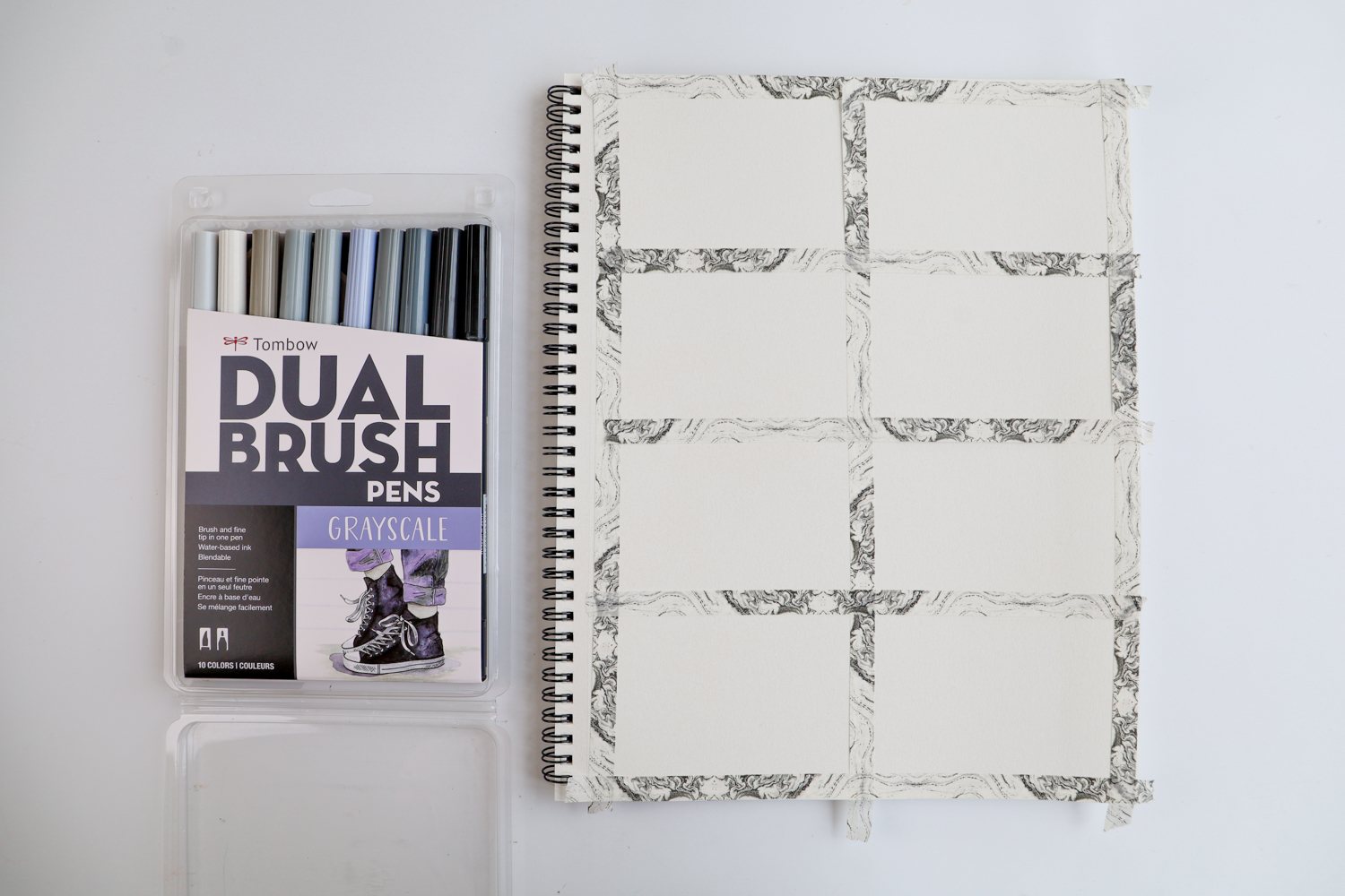
- Tombow Irojiten Desk Cup, Cottage
- Sketchbook (I’m using a pad of colored pencil paper)
- Tombow Dual Brush Pen Art Markers, Grayscale, 10-Pack
- Washi Tape
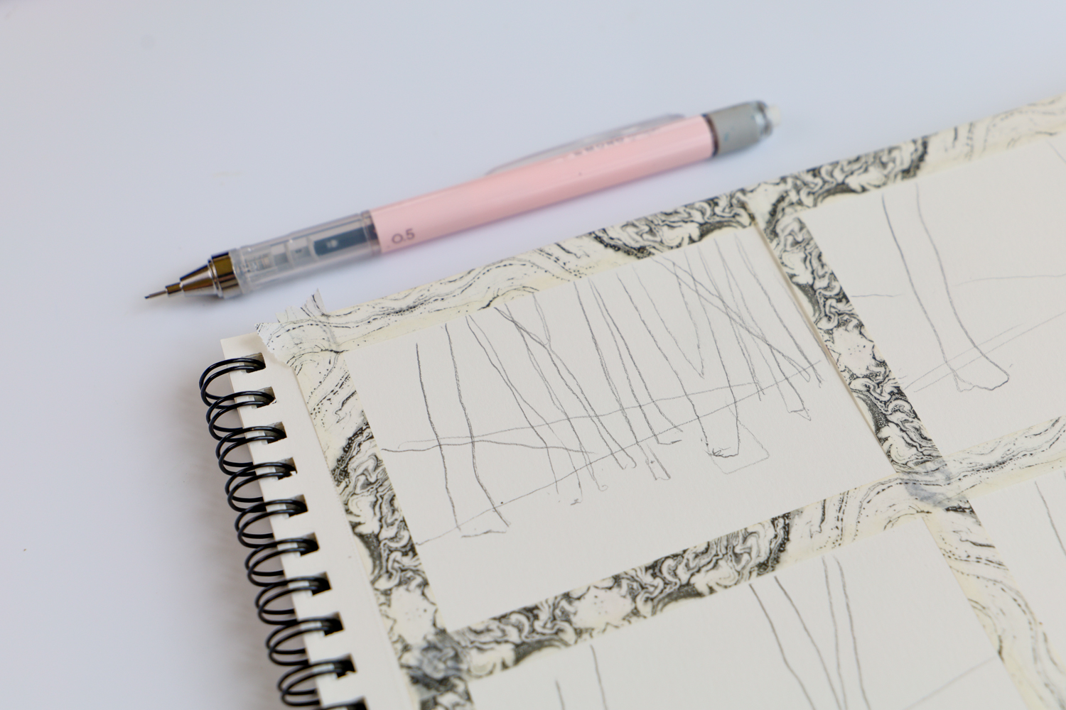
- Tombow MONO Graph Mechanical Pencil, Pastel, Coral Pink
Step one:
Start by making a grid on your paper with washi tape. I like to do this so I have a bunch of boxes that are all the same size for me to do my color studies in.
Step two:
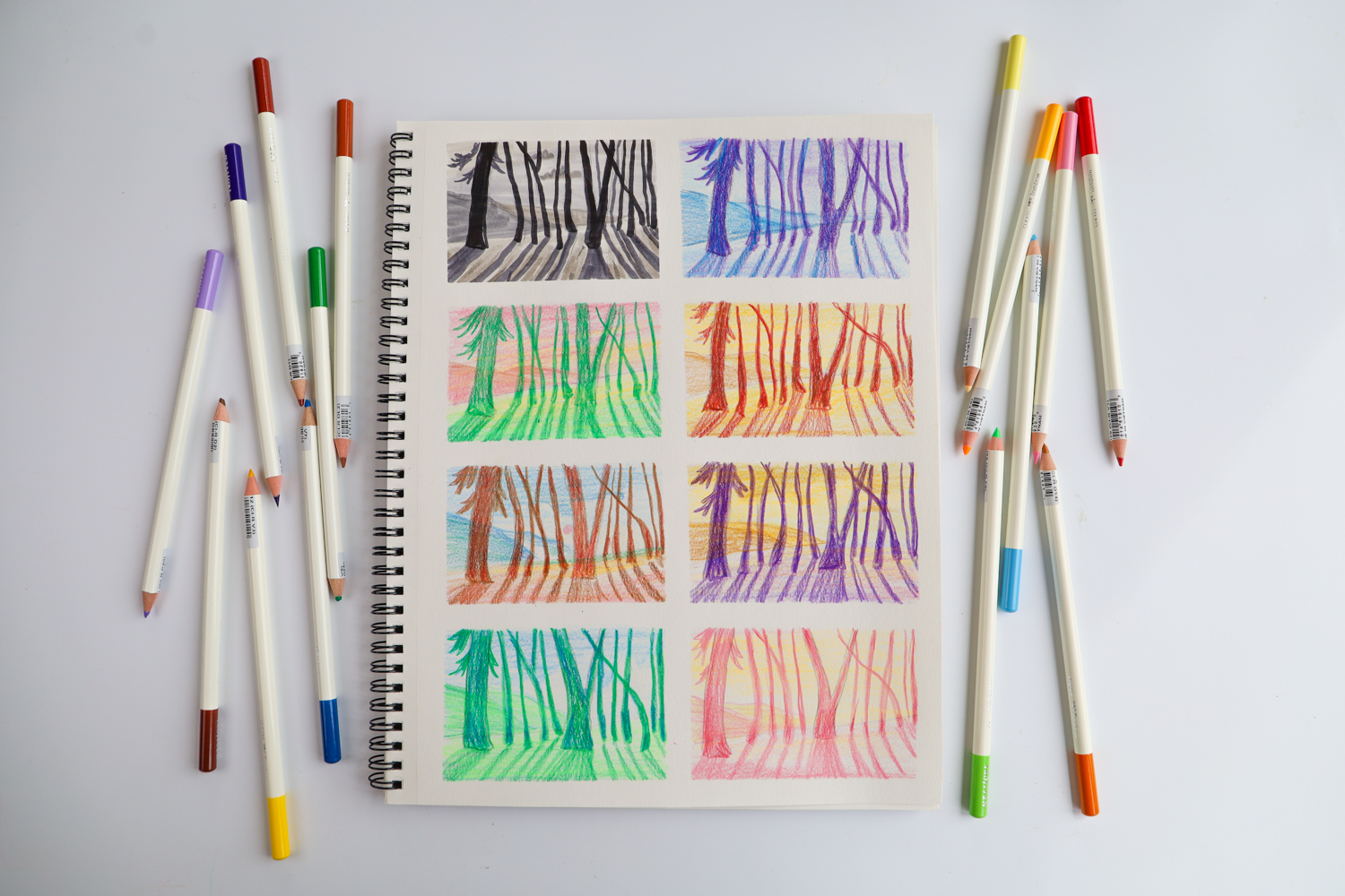
Use your pencil to sketch out a super simple version of your final design into each box. You don’t want to be putting a lot of detail into your studies. You just want the basic shapes so you can get a feel of the color, so try to keep it simple! I’m sketching a forest, so I just drew in my horizon, and a dozen basic trees.
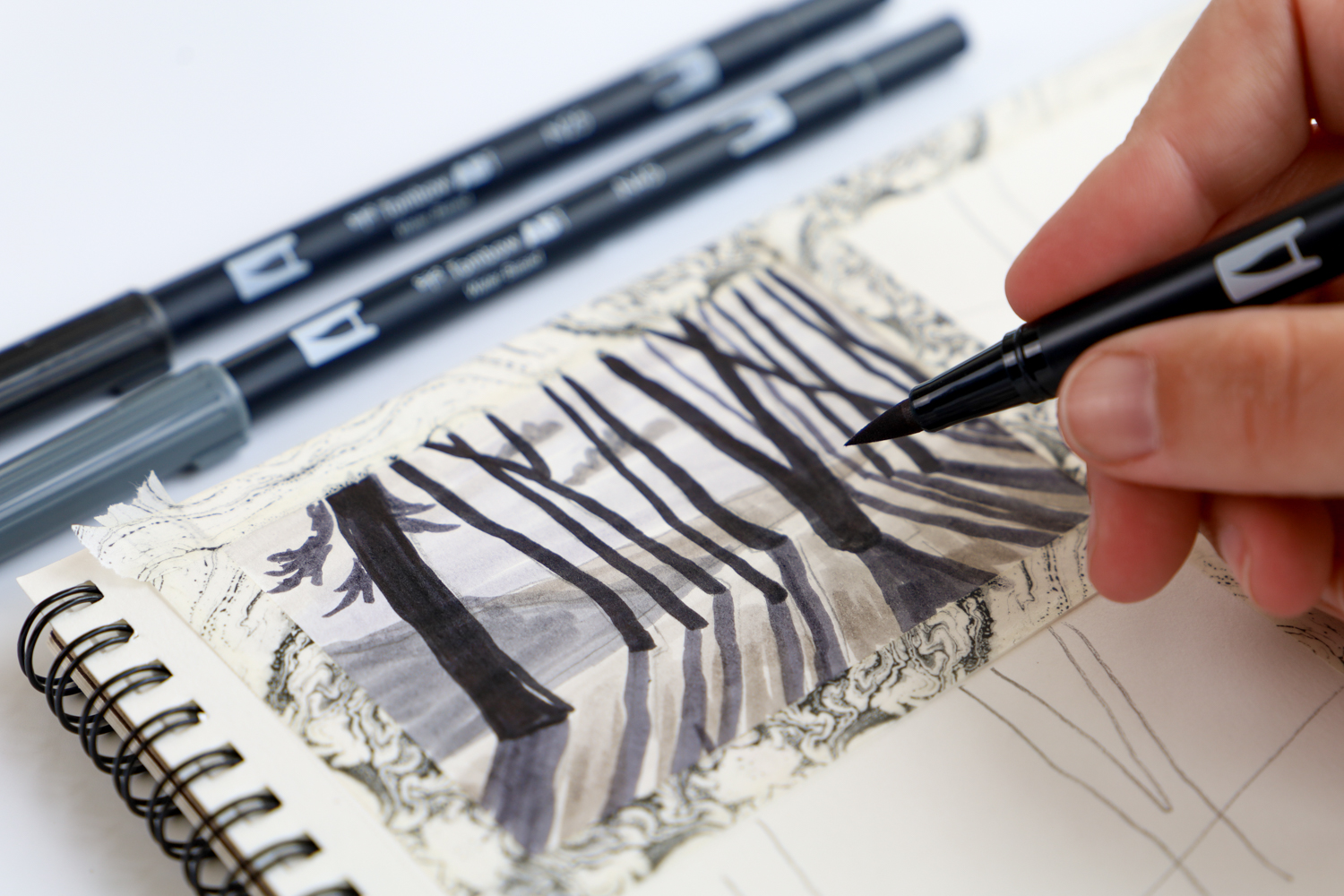
Step three:
Figure out your values. I like to use the Grayscale Dual Brush Pen 10-Pack for this, as it has a good range of grays from light to dark.
“Value” refers to the lightness or darkness of a color. Light gray = lighter value. Dark gray = darker value.
This is a crucial step, because once you figure out your values, you can just adjust the color in your final piece, making sure it has the same value.
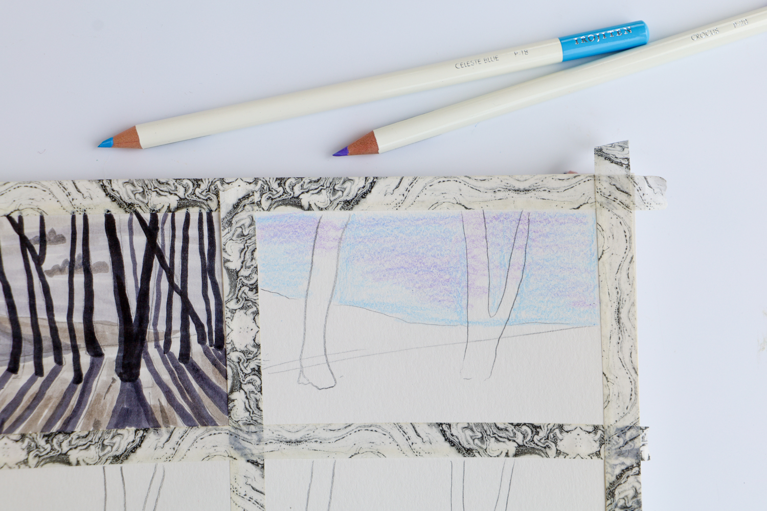
Step four:
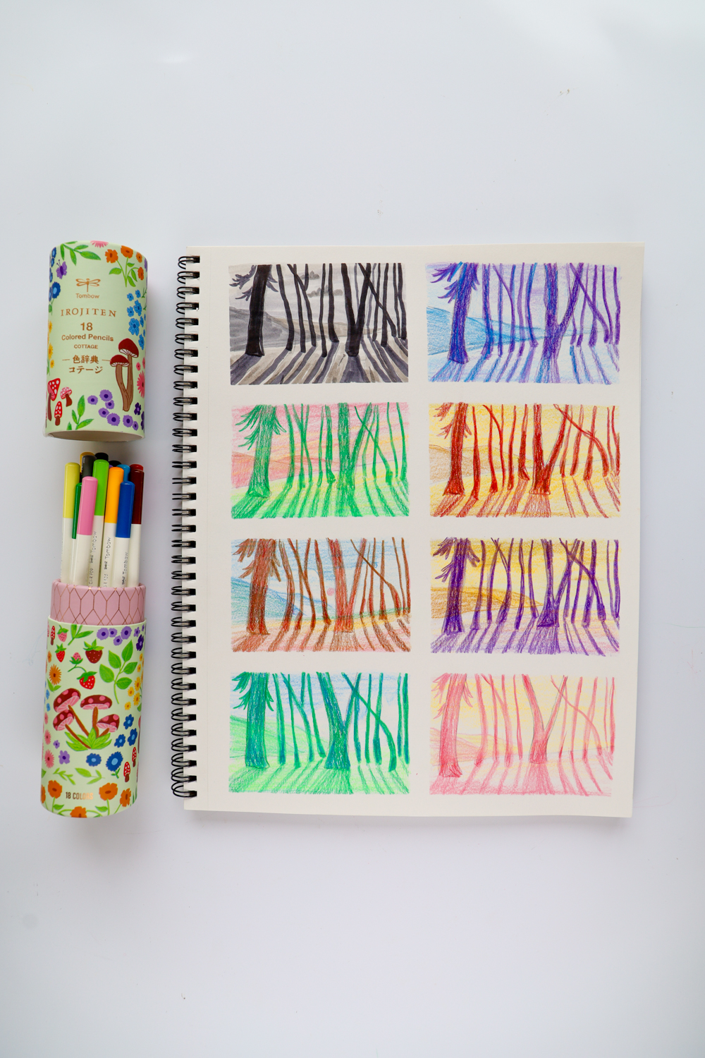
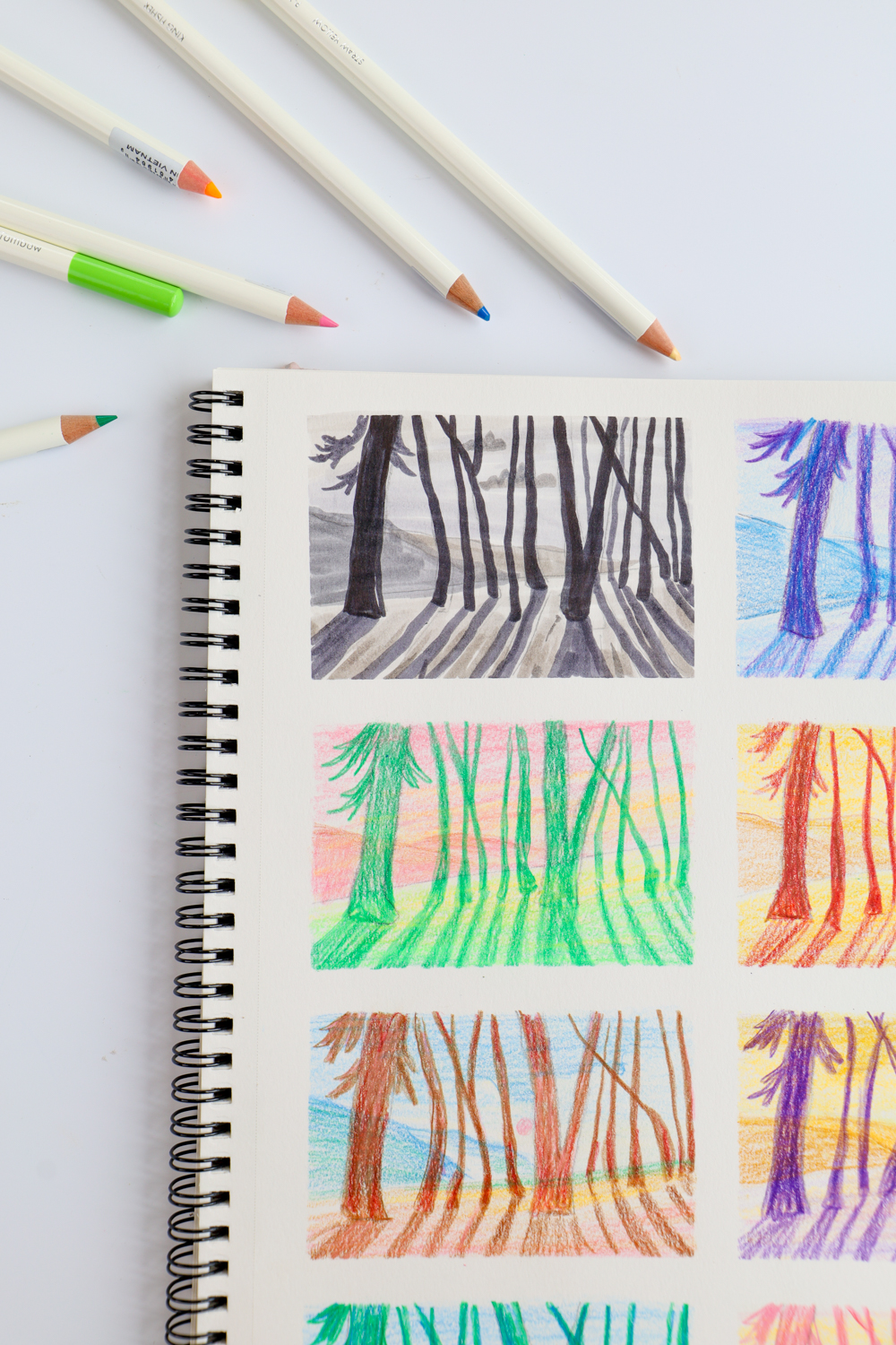
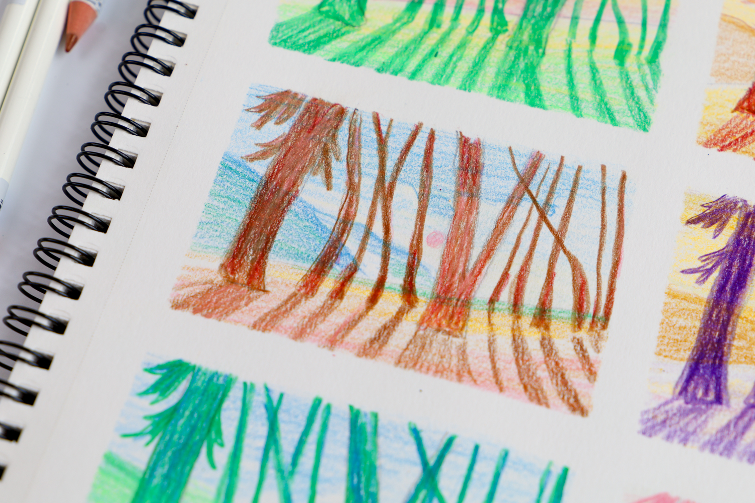
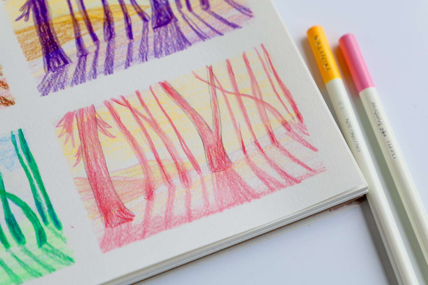
Next, grab your Irojiten Colored Pencils and start playing with different color combinations! I would choose only 2-4 colors per study (this depends on how colorful or detailed your final piece is too).
Refer to your value study, placing lighter colors in the lighter areas, and bolder/darker colors in the darker values.
Again- Keep it simple! This is just a study, not the final piece.
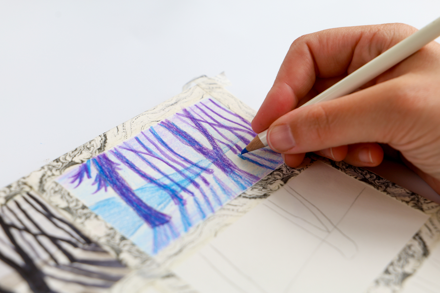
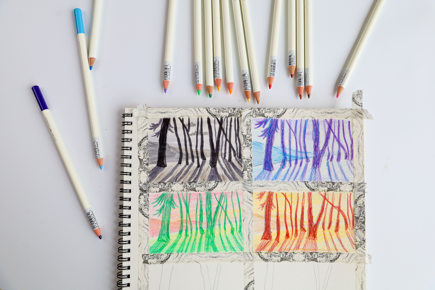
Now just continue filling in your grid, trying out different color combinations in each box!
Think about what emotions you want to convey in your final piece, and what each color mean to you!
Look at how my forest changes depending on my color combo. I can make it a cool, wintery forest, a spring day, or even give it contrasting moody reds and yellows.
Another option:
Split your piece into warms vs cool colors. Try creating your background of the piece in cool colors, and color the foreground in only warm colors to make it really pop off the page.
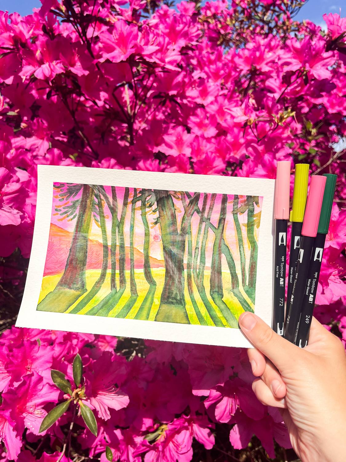
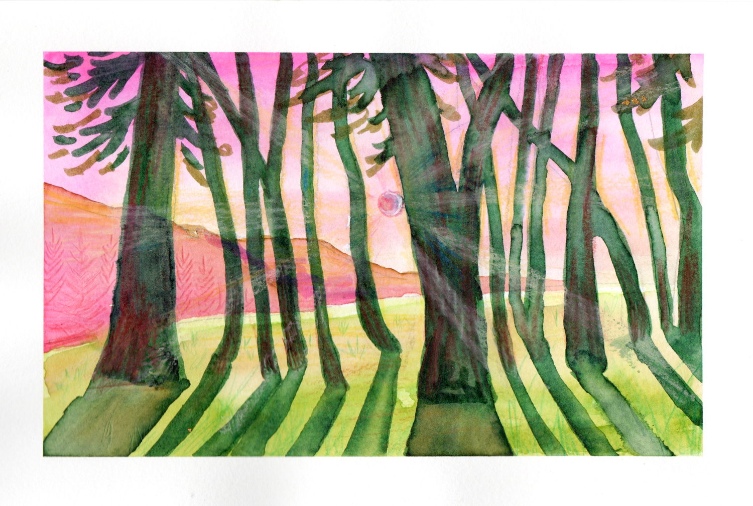
I decided to try out the third color study I did (with the pinks and greens) on a larger piece. Pink and green are my favorite colors so I already knew I would love them! So, Of course, When I was doing the color studies, I realized that combined with the forest, the portrayed a really warm and inviting Spring day, and I loved that.
For my final piece, I used Dual Brush Pens: 723, 772, 817, 725, 026, 131, 126, 098, & 249, and layered colors from the Irojiten Colored Pencils Cottage Desk Cup on top of the markers.
And that’s it! Color studies are such a fun (and super helpful) way to test out different color combos before committing to your final piece. Whether you want your art to feel cozy and warm or bold and dramatic, playing with color ahead of time makes a huge difference.
So, I hope this inspires you to try some color studies of your own—have fun with it, experiment, and see where it takes you! If you give it a try, I’d love to see what you create, so be sure to tag me @studio.katie and @tombowusa on instagram. Happy coloring! 🎨✨
If you’re looking for more tips like this, I think you’ll love this post, where I share how you can mix over 70 new colors with just 12 Colored Pencils!!