Today the color wheel inspiration continues. It’s been a fun week seeing all the different ideas on using the color wheel. I have an architecture and design background so learning about color was a big part of my undergrad degree. I remember one class where we learned about the psychology behind colors. What does that even mean? It means that colors can make you feel a certain way just by surrounding yourself with them. So cultures use this a lot. I found this amazing chart on Pinterest that explained the colors and the feelings they can evoke.

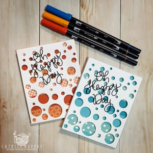
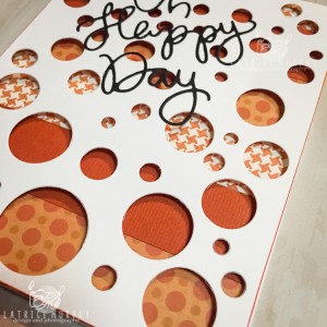
I’ve created two cards for you today. Both cards are the exact same design, but two different color schemes. Here they are.
Materials you’ll need:
Here is what you’ll need:
Tombow MONO Adhesive Permanent
Cardstock
Patterned paper
punches
Full card die
Let’s get started!
I chose tertiary colors: These are the colors in between the primary and secondary colors. See the chart below.

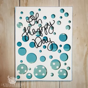
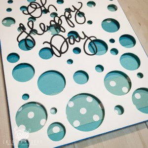
For the first card I used shades of Blue Green. The feeling this should evoke is positive, peaceful, calming or confidence.
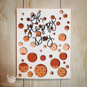
The second card I went bold with Red Orange. Shades of red are hot, energizing, warmth or romance.
Do you feel the difference by looking at them? I actually do and I love that! If I can make something that brings someone a certain kind of feeling that makes me smile. Send a card to a loved one with bold red, oranges and earth tones or a sympathy card with blues and purples. They will feel it through your creation. So fun!
What will you make today with all this Color Wheel knowledge? I’m excited to see more tomorrow and to make more Color Wheel inspired projects. Go get crafty!
