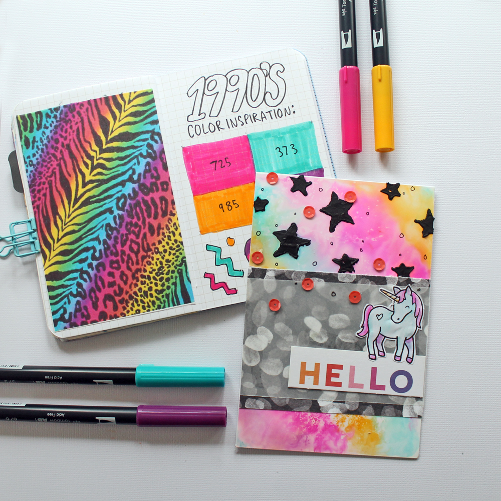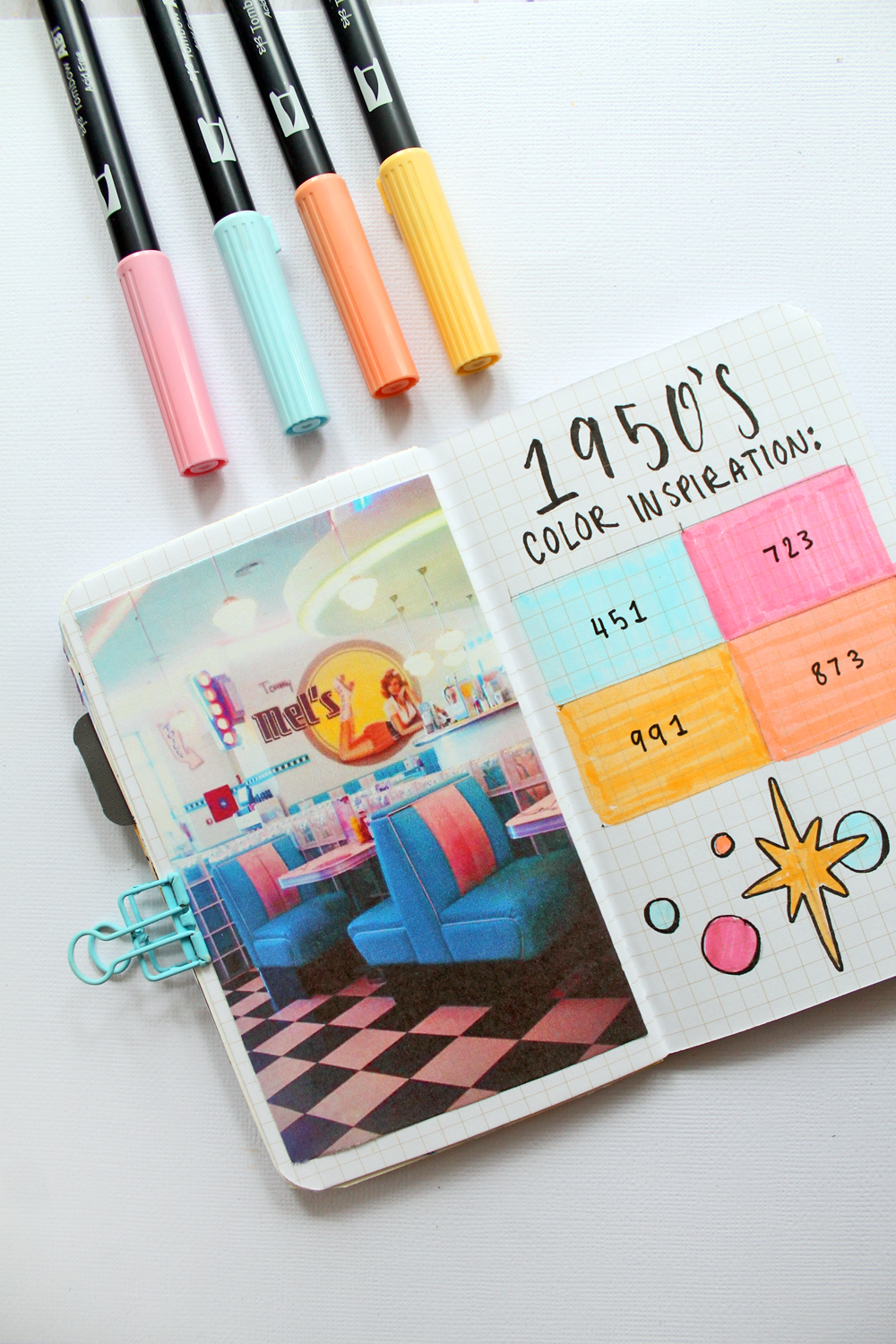
Hey Tombow fans, It’s Katie here! One thing I really love is color and choosing color schemes! Today I want to talk about color schemes inspired by past decades, and show you guys a few tips for choosing colors based off of a vintage photograph.
Supplies:
- Tombow Dual Brush Pens
- Inspiration Photos
- Journal or Paper
Choosing colors from a photo:
To create a color palette inspired by a photo, you’ll want to look at the photo and immediately decide what color stands out the most to you. That will be your first color.
Next, look at your inspiration photo and choose a secondary color that stands out for you. For my photo I saw a lot of blue at first, and then I chose a light pink for my second color. Continue adding in colors in the order that you see them.
For most color palettes I like to keep it pretty simple, and stick to 3-4 colors.
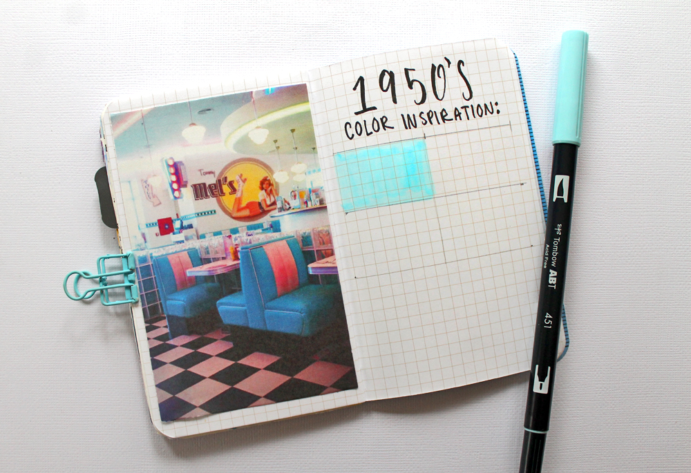
1950’s Color Palette:
For my 1950’s color palette I used a photograph of a vintage diner. I chose markers based off of the bright pastels in the photo. I used Dual Brush Pens: 451, 723, 991, and 873.
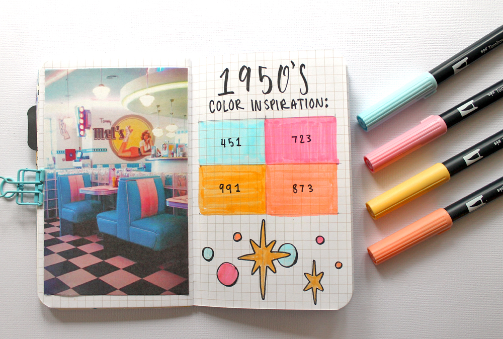
1970’s Color Palette:
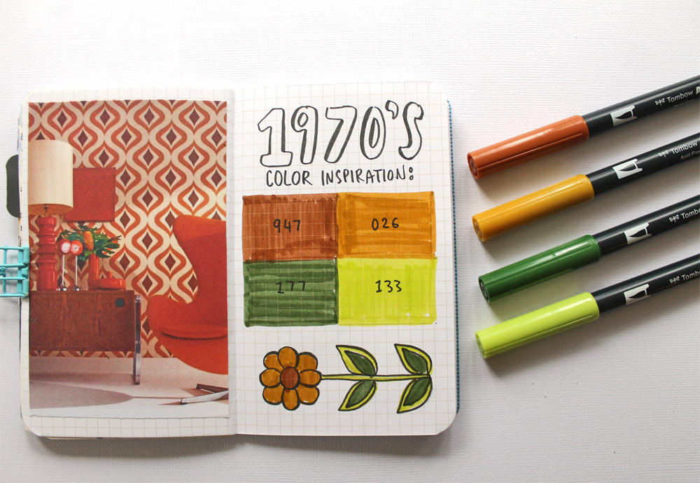
For my 70’s palette I used Dual Brush Pens: 947, 026, 177, and 133. My inspiration photo didn’t have much in the way of green in it, however I secretly love that 70’s avocado green so I included it in my color scheme.
1990’s Color Palette:
Bright colors!! I used Dual Brush Pens in: 725, 373, 985, and 676 for this palette.
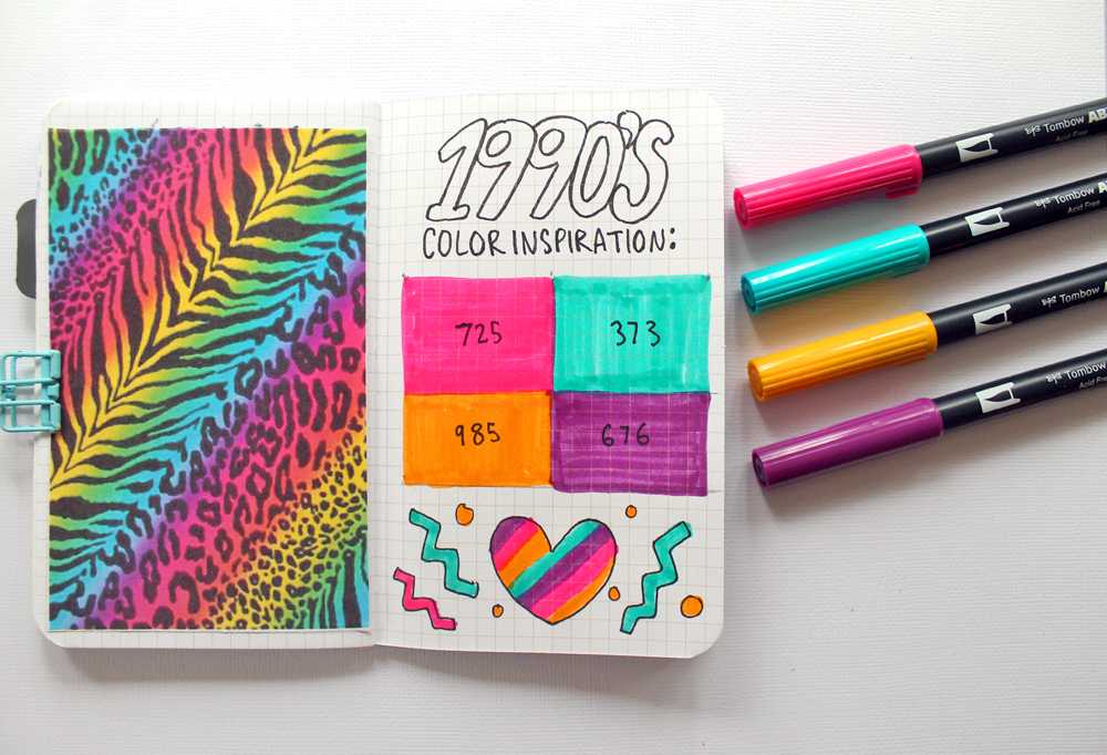
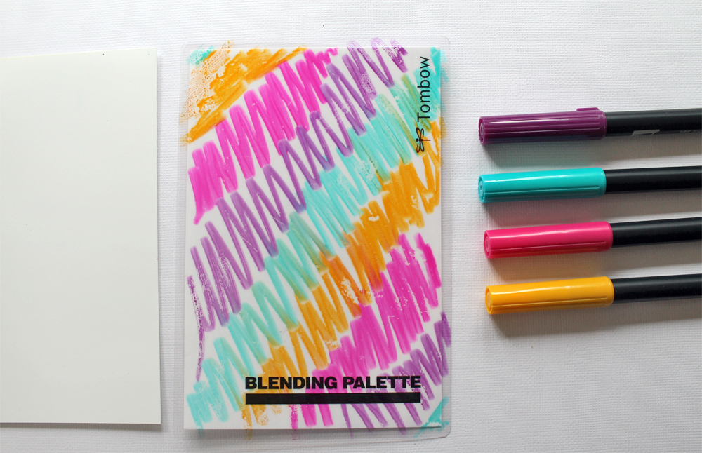
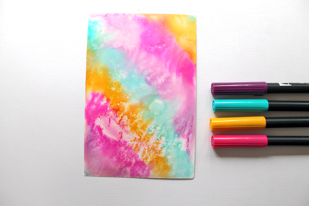
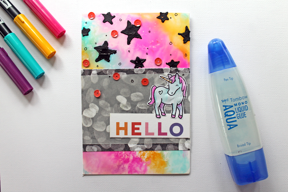
I am a 90’s kid, so obviously I love that 1990’s color palette. It reminds me of all things Lisa Frank. I wanted to create a handmade card based off of the colors I picked out, so I used the Dual Brush Pens and Blending Palette to create a splash background for my card.
To create a splash background, apply Dual Brush Pen ink to a Blending Palette. Mist with water and press down onto a piece of paper to transfer the ink.
What decades will you be creating a color scheme inspired by? If you would like to learn more about color palettes, Read 3 Tips for Choosing the Perfect Color Palette!
