“[S]topping a piece of work just because it’s hard, either emotionally or imaginatively, is a bad idea. Sometimes you have to go on when you don’t feel like it, and sometimes you’re doing good work when it feels like all you’re managing is to shovel [expletive] from a sitting position.” -Stephen King, On Writing: A Memoir of the Craft
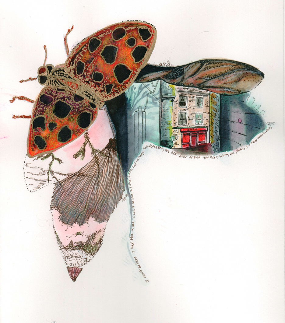
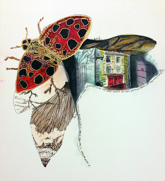
“Flying through the East of Edinburgh” (Arlene Ellis, 2014)
This was probably one of the most ego-bruising illustrations I’ve ever created. There were probably four or five instances in which I felt like I was not worthy of calling myself an artist. I know, very dramatic. All I could see were mistakes, but I continued drawing because I was excited to see how the illustration would turn out. And you know what? I’m really proud that I pushed myself through all the critical voices complaining in my head. One of the reasons I agreed to drawing a new illustration every night for seven days is because I wanted to challenge the misconceptions I have about my capabilities as an artist. It’s only the second day, but I can feel I’m growing exponentially just by experimenting with these dual brush pens. Check out last night’s journey with Tombow Dual brush pens.
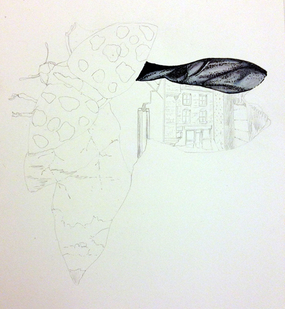
I began laying down the shadows with Tombow’s grayscale dual brush pens.
Then I overlaid some oranges and yellows to warm up the wing
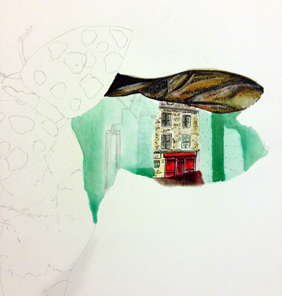
I added the green base color with a watercolor brush.
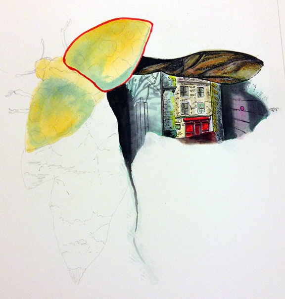
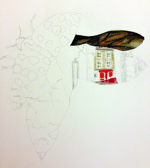
I started laying down the shadows and highlights of the ladybug wings with a watercolor brush.
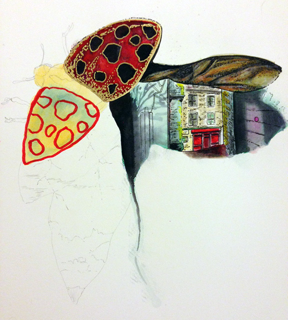
I used Deco Color Opaque Paint Marker in gold for the speckles.
The lower left mountain landscape references one of Harry Clarke’s (1889 – 1931) illustrations. He’s one of my favorite illustrators. I also tend to use gold in reference to Gustav Klimt.
You’ll notice that gold is more vibrant in the above photo than in the final illustration, that’s because I scanned the final illustration so the reflection of the light on the gold was lost. Plus, I didn’t have access to the best scanner this morning. I also touched up this area and the insect wings with some Prismacolor pencil crayons in the final illustration. Why didn’t I use Tombow’s pencil crayons? I didn’t know they existed until recently. I will definitely check those out soon!
Pingback: My 2nd illustration as a Tombow USA guest designer | Organic Lyricism
I feel a strong connection to how the Dual Brush Pens directly reflect what is in my mind and being. It is a bit spooky to see someone else produce what I am seeing without any conversation. Very much a definitive and striking quality of a tool.
Wow, this is amazing. Amazing all of the detail you achieved with light and shadow with these pens. Thanks for sharing.
Katie B.