Hey Tombow Fans! This is Jennie and in this post I’m going to share with you easy tips for making your scrapbook layouts even better! Maybe you are a beginner or you are a scrapbooking expert but either way I hope these tips help you!
- Study your adhesives! Of course I’m going to talk about adhesives in this post but they can really make a big difference on how your scrapbook layouts looks! For paper always use and adhesive runner. For your every day cardstock and patterned paper you can use the Tombow Mono Adhesive Permanent, Tombow Mono Adhesive + Permanent or the Tombow Power Mini Tape. For using textured cardstock or other specialty cardstock like glitter or corrugated you should use something stronger like the Tombow Mono Adhesive + Permanent or the Tombow Xtreme Adhesive. For embellishments you can use a few options. If you are using die cuts you might want to try the Tombow Mono Adhesive Dots which is better because it can be easily removed while you are trying out placement. For these die cuts you can also try the Tombow Mono Multi Liquid Glue or the Tombow Foam Tape. Adhesive Dots are great for gluing buttons, rhinestones and other heavier embellishments. If you want more details about adhesives read this post called Adhesives 101.

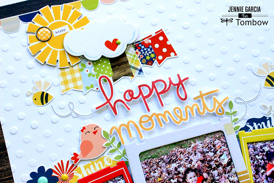
- Use different dimensions: A layout completely flat can be a little boring. Use the Tombow Foam Tape for important elements of your layout like a main photo, the title or a few small embellishments.
- Use a collection: If you have trouble matching colors and pattern buy a collection kit. The matching is done for you and it makes the process easier and faster.
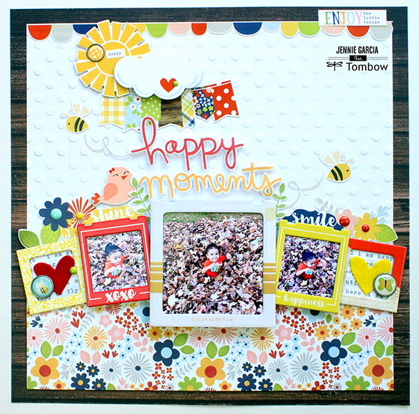
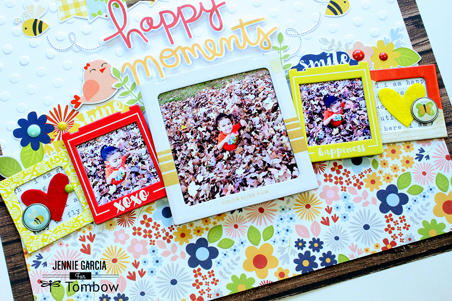
- Think about composition: In this scrapbook layout I tried to mimic nature. At the bottom at placed the flower pattern as my “floor” then I placed the layer of photos with flowers and animals around it. At the top I used the sun and clouds while I used the textured cardstock like the sky. You can get composition ideas from nature, magazines, products, paint chips, etc.
- Keep the elements together: Try to place all the elements in a way that they touch each other even if it’s just a little bit. It makes the layout look clean and less random.

- Use Balance: In this layout I used asymmetrical balance, that means that the bottom is heavier (has more elements) than the top. You can use symmetrical balance by keeping everything in the center. If most elements are at the bottom you should add a few elements on top to create balance.
- Make your photos cohesive: If you have a few photos from different days they might look mismatched. One way to fix this is to turn them all black and white. You can also leave one in color and turn the rest black and white. In this case all my photos are from the same day so I have 3 slightly different filters, not too much. I wanted the photo in the center to be sharper and the ones on the side a little washed out like the Polaroid quality.
- Watch your patterns: Pattern are awesome and very attractive but we need to be careful not to put everything and the kitchen sink on a page. In this page I have 3 main patterns: woodgrain, the polka dot texture from the cardstock and flowers. Don’t get me wrong you can put 10 patterns in a scrapbook layout, but little bits of each so the page is not overwhelming.

- Get in shape!: One of the most popular scrapbook layouts designs is the grid which is basically a square divide by more squares. You can also use circles or like I did in this layout, the triangle.
- It is all about the photo and the moments: It’s nice to make pretty layouts, but remember that the main reason we are doing this is to preserve memories. When my kids look at their album they never mention the products or techniques. They just enjoy the memories and the feelings they get when they look at the photos.
I hope these tips were useful! Happy Memory Keeping!


Hello! What scrapbook collection did you use in those layouts? Thank you.