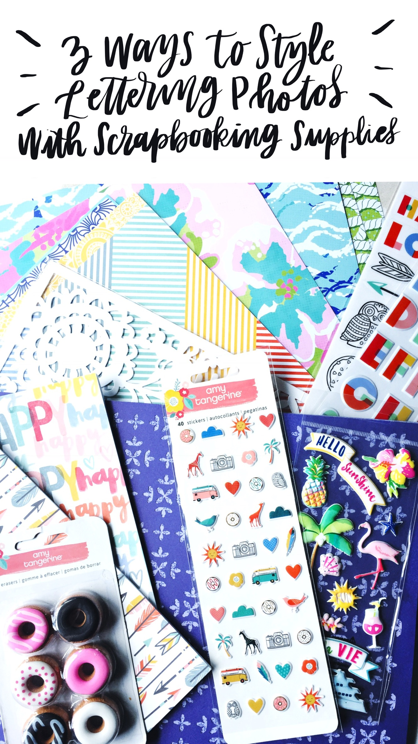
Did you know that scrapbooking supplies are perfect for styling amazing lettering photos that are social media ready? Hey there, lovelies… it’s Lauren ( @renmadecalligraphy ) again and I am going to share with you three different ways to use scrapbooking supplies to make your lettering pictures beautiful and totally Instagram-worthy!
It’s almost National Scrapbook Day and while I certainly like to scrapbook (and am pretty good at it… if I do say so myself), I don’t count the craft as a passion and very frequently find myself collecting scrapbooking supplies that I don’t intend on ever scrapbooking with. The cool thing about scrapbook paper and supplies is that you can use them for SO MANY different things. As a letterer, I most often use scrapbooking supplies to add interest to my Instagram photos. Today, I’ll show you exactly what to do to make lettering photos that pop with color, texture, and personality while creating a cohesive story on your Instagram feed.
WHAT YOU’LL NEED:
Tombow has some AMAZING partners that sent us a fantastic package of goodies to celebrate National Scrapbook Day. These goodies range from scrapbook paper to die cuts and embellishments from the following companies:
To create lettering pieces you will need:
- Tombow Fudenosuke Hard Tip Brush Pen
- Smooth white paper (I used Rhodia Pad)
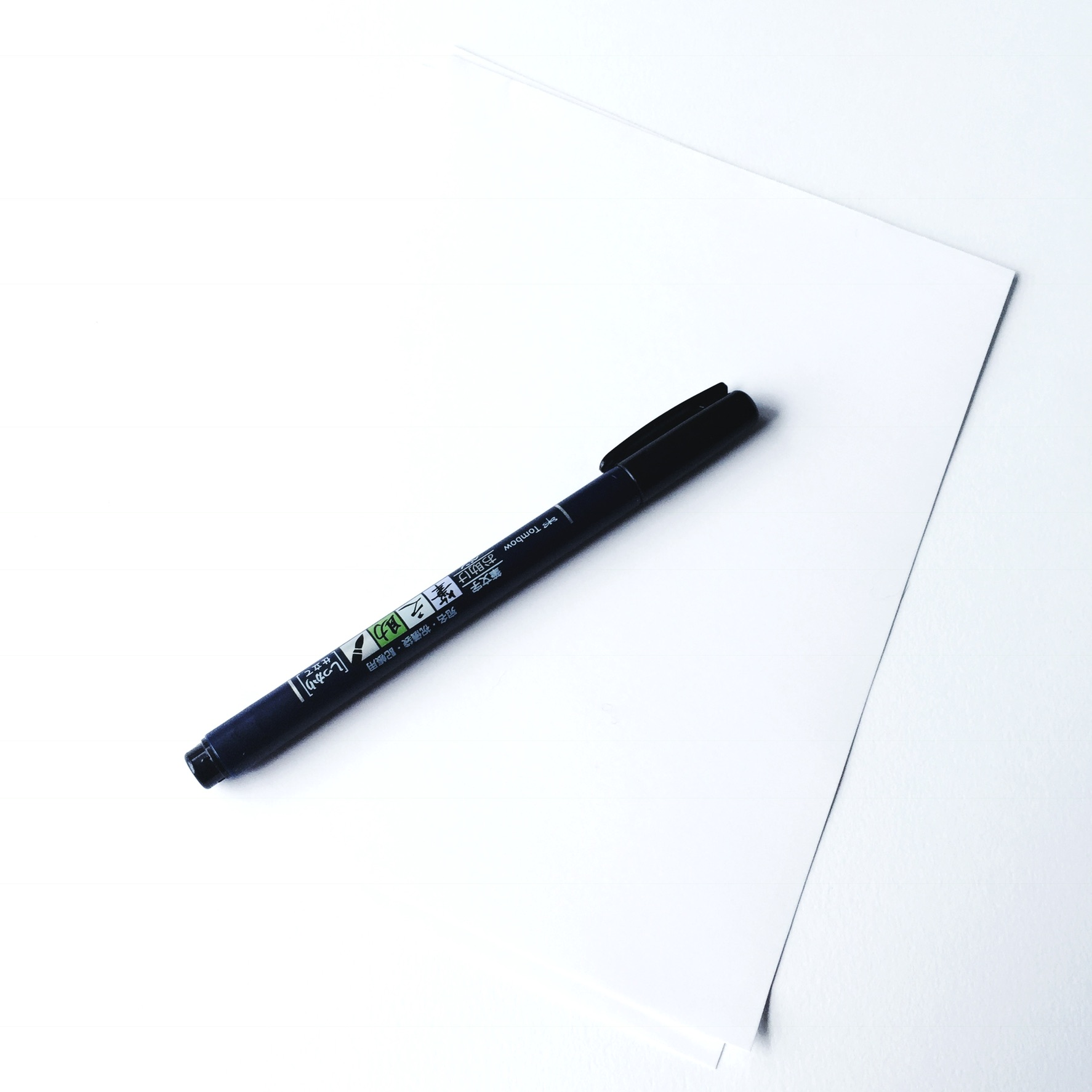
Before you can style photos with your lettering work, you must first create it. When styling with bright and vivid materials, make sure to keep it simple with the lettering. I like to mix lettering styles and the white paper really creates a nice pop against the items that are helping to style the photos. Write some fun and short quotes with the Tombow Fudenosuke Hard Tip Brush Pen onto smooth paper. I often create one piece at a time and style the pictures as I go, but if you are trying to save time, creating an entire batch of styled photos will not only save time, but also make your feed look more intentional and cohesive.
YOU MAY ALSO NEED:
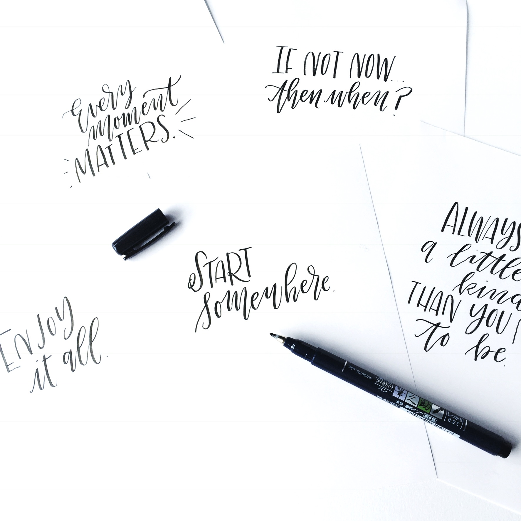
When styling photos, I often find that I have paper that won’t lay flat or a marker that won’t stop rolling away from me. In these cases, I like to keep the following adhesives closeby for help when I need it:
- Tombow MONO Adhesive+: When wanting items to stay stuck together, this adhesive is the perfect fit!
- Tombow MONO Dot Adhesive: This adhesive is special because the dot pattern creates a window of time where the item being adhered can be moveable. Once the items are where you need them, rubbing and putting pressure on these will make them stick together.
- Tombow MONO Removable Adhesive: This adhesive is perfect for temporarily placing items for the styled picture so they sit the way you want them. When this adhesive isn’t needed anymore, rub it off with your finger and the paper is as good as new.
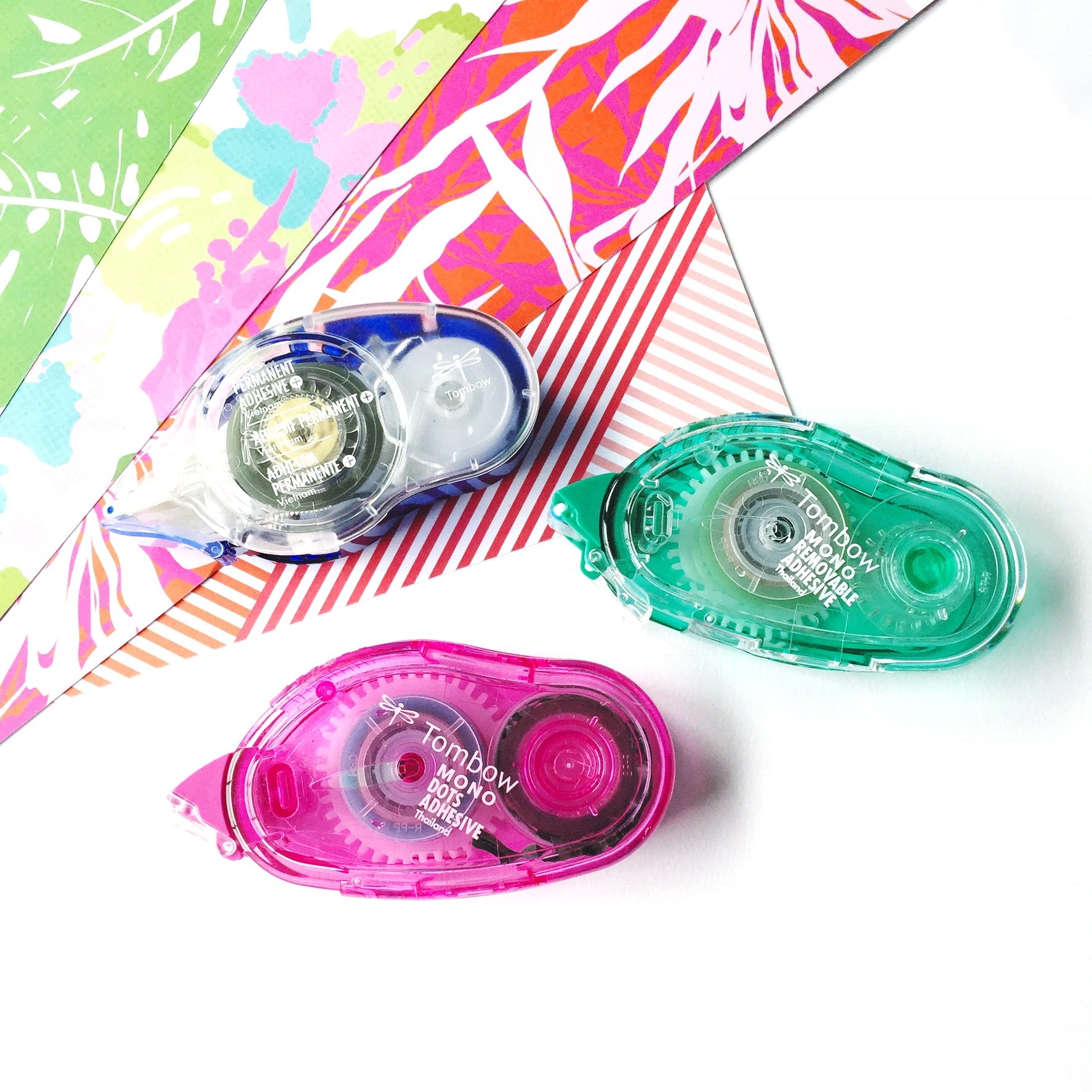
1. ADD COLOR WITH SCRAPBOOK PAPER
While clean white backgrounds can be very appealing to the eye, a simple piece of lettering can really pop agains a background of pattern and color. Scrapbook paper is the perfect addition to any picture. This can be done in several ways:
-Stack or layer the paper around the piece of lettering and showcase a variety of patterns in one post. All of these scrapbook pages are from the same collection by Paper House and complement each other very well in this photograph.
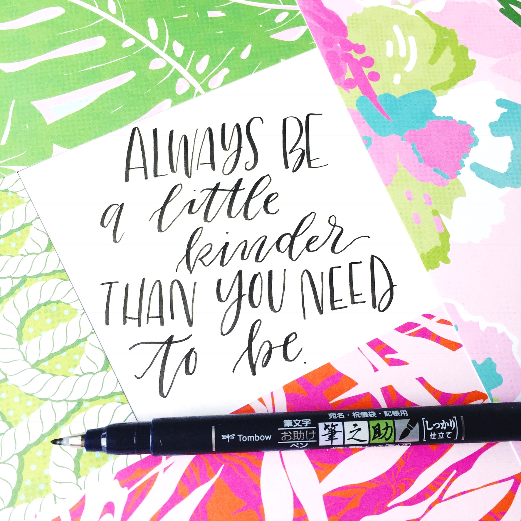
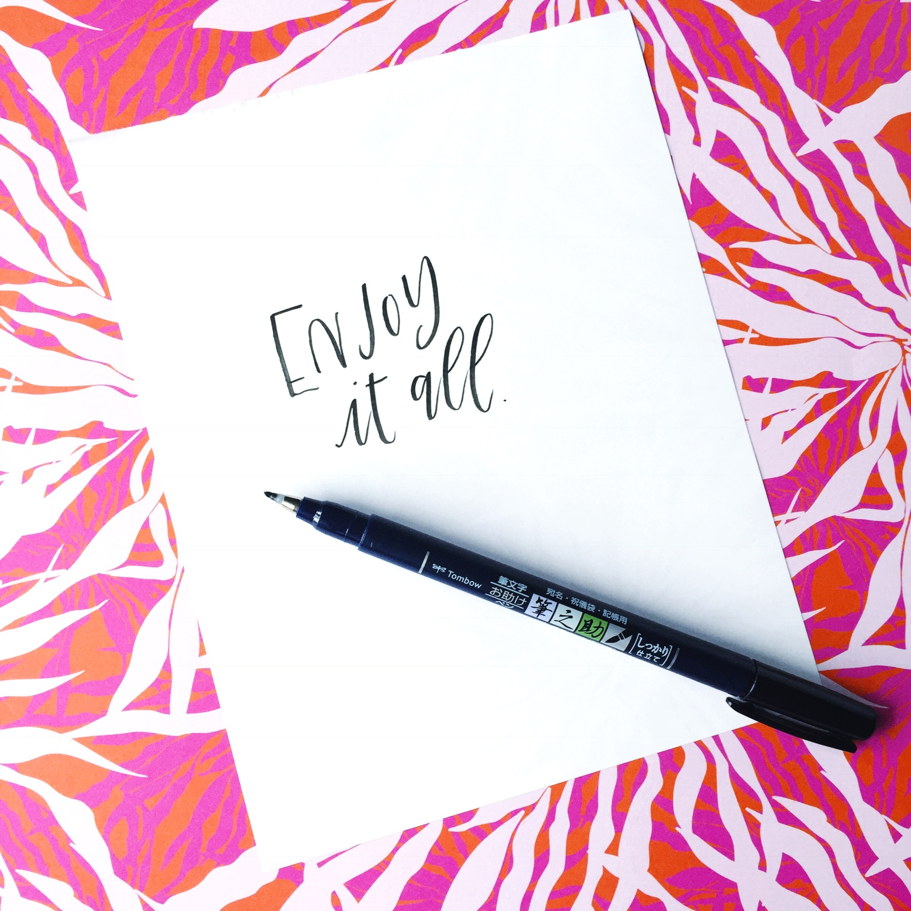
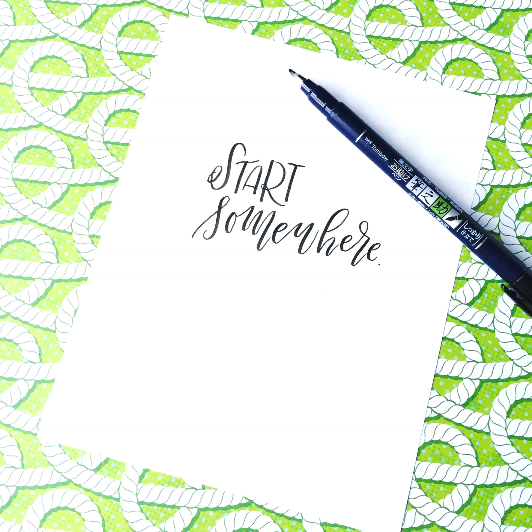
-Simply lay the quote on a single piece of patterned scrapbook paper. The design adds a lot to the quote, but also keeps it as the focus.
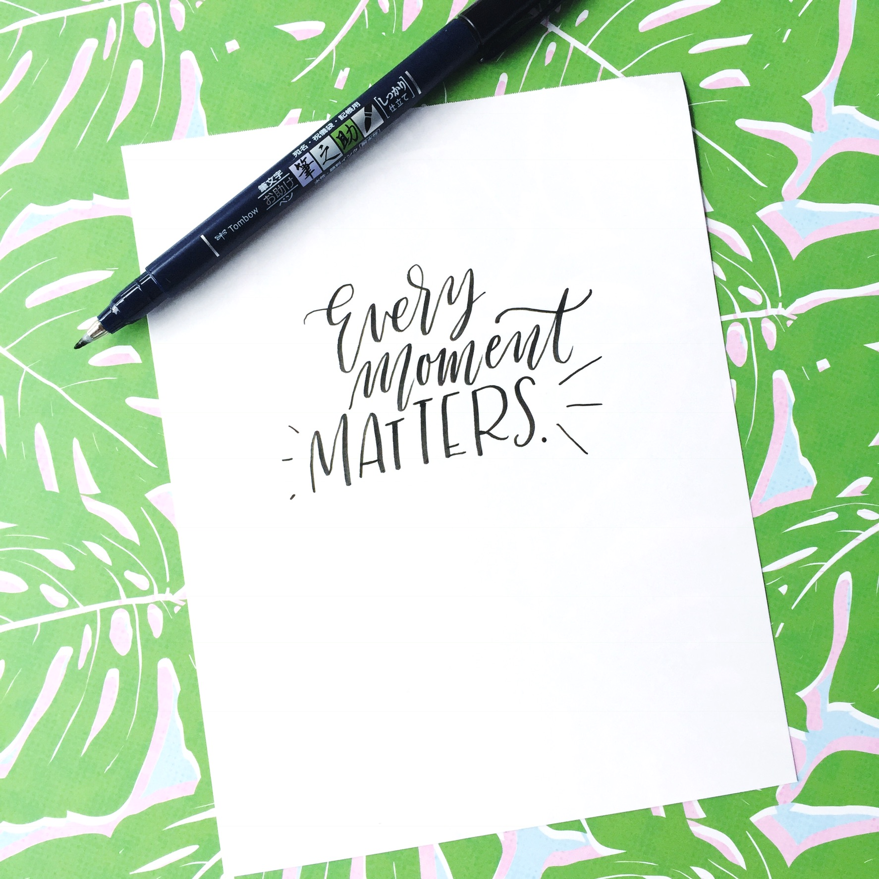
The colors you choose to showcase can really determine what your social media feeds will look like and what story they will portray. It’s a good idea to try to be consistent with the kinds of colors that you use, for this purpose.
2. ADD TEXTURE WITH DIE CUTS, STICKERS, & MORE
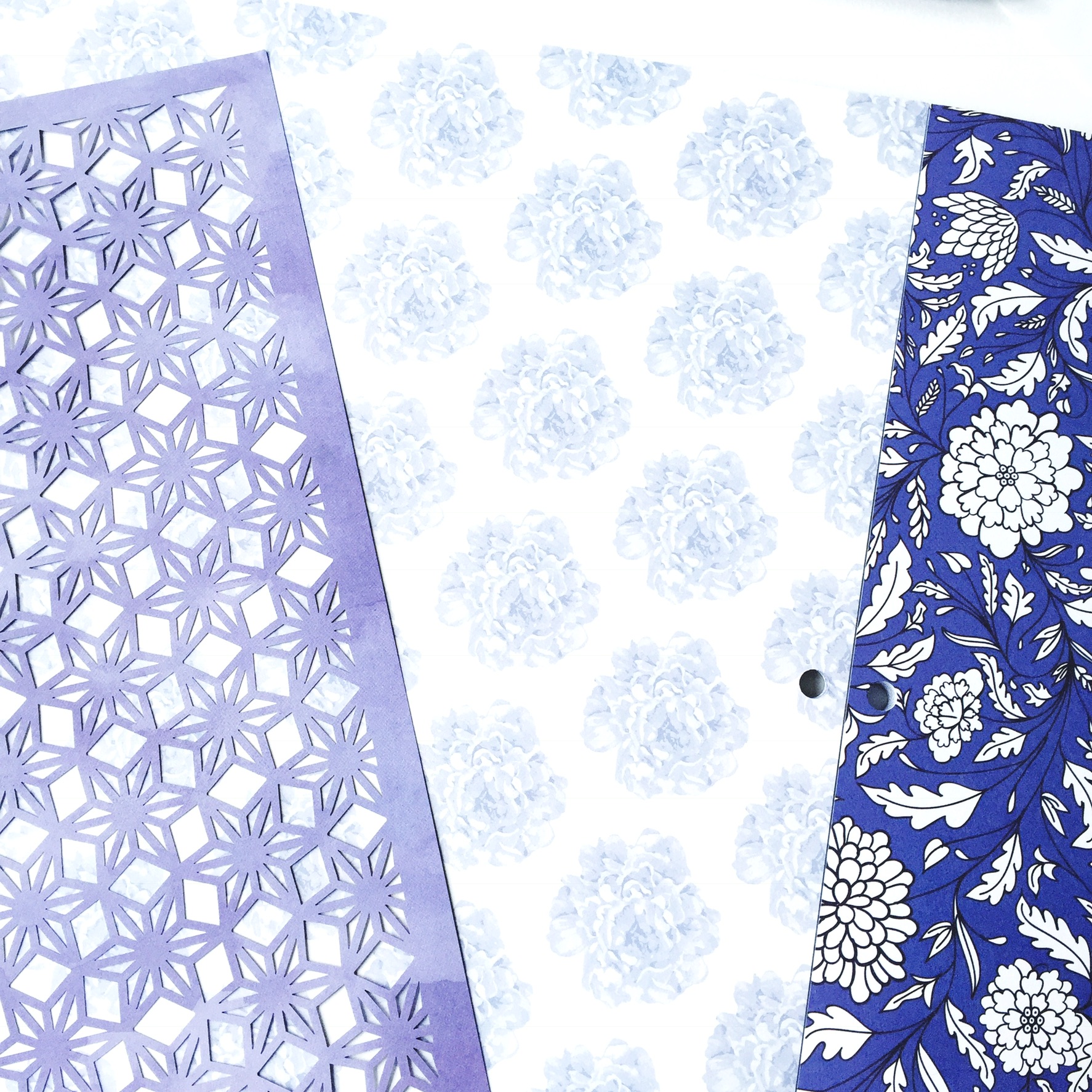
While scrapbook paper can add a lot of interest, sometimes you may want to add a little more pizzazz and creativity to your lettering images. Adding a little texture is a great way to create very interesting pictures for your Instagram feed. Die cuts are one of my new favorite things. The Blue China pack by Diecuts with a View is amazing because it has an entire collection of papers that all complement each other and have a very similar color scheme. This pack comes with many different papers that can be layered with the diecuts on top. What’s even cooler is that you can layer the diecuts over many different papers and create many different combinations for interesting lettering photos.
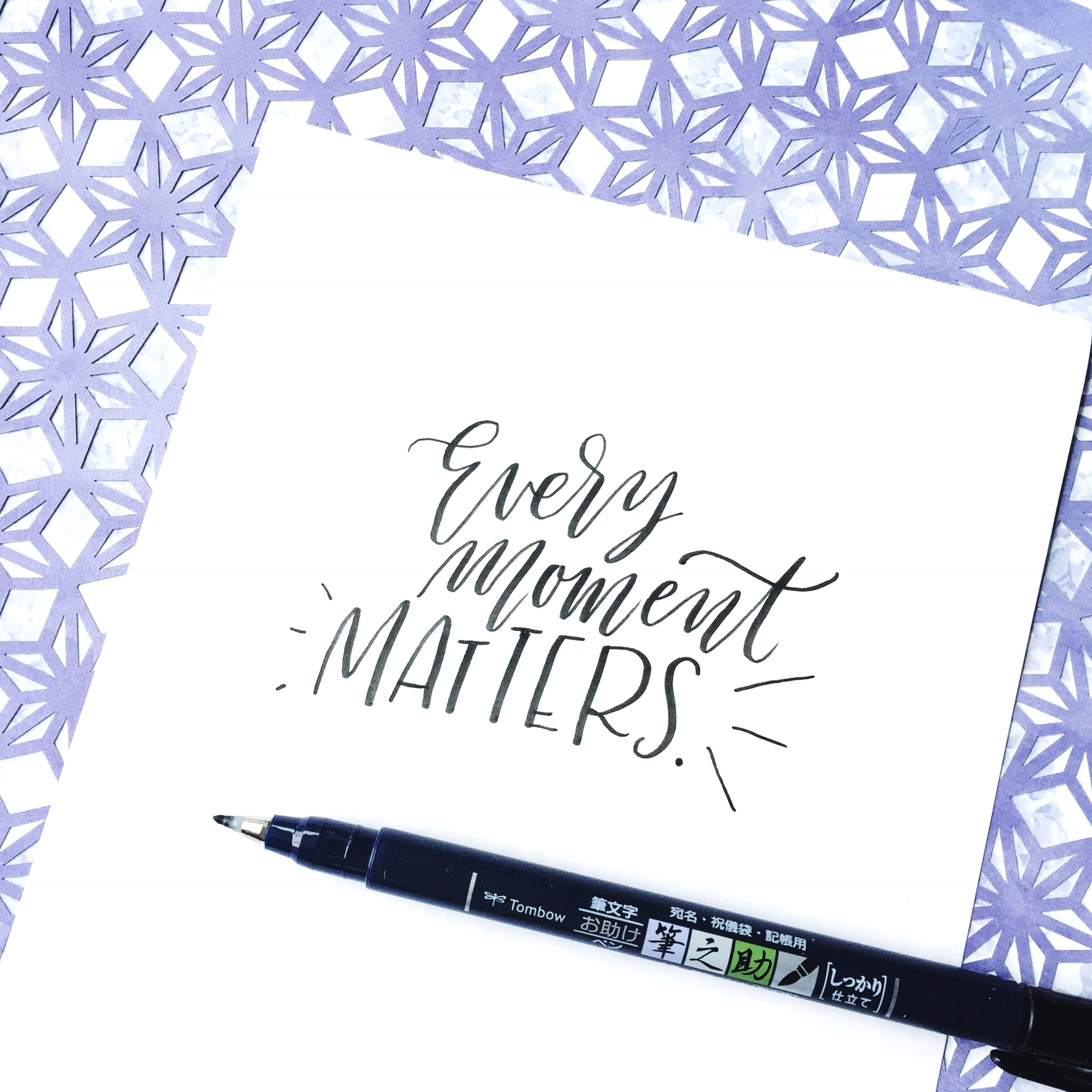
I love picking a subtle, simple patterned paper to put underneath a complex diecut paper. Lay your lettering piece on top, throw in your Tombow Fudenosuke Hard Tip Brush Pen and you have a very interesting lettering photo ready for Instagram in very little time.
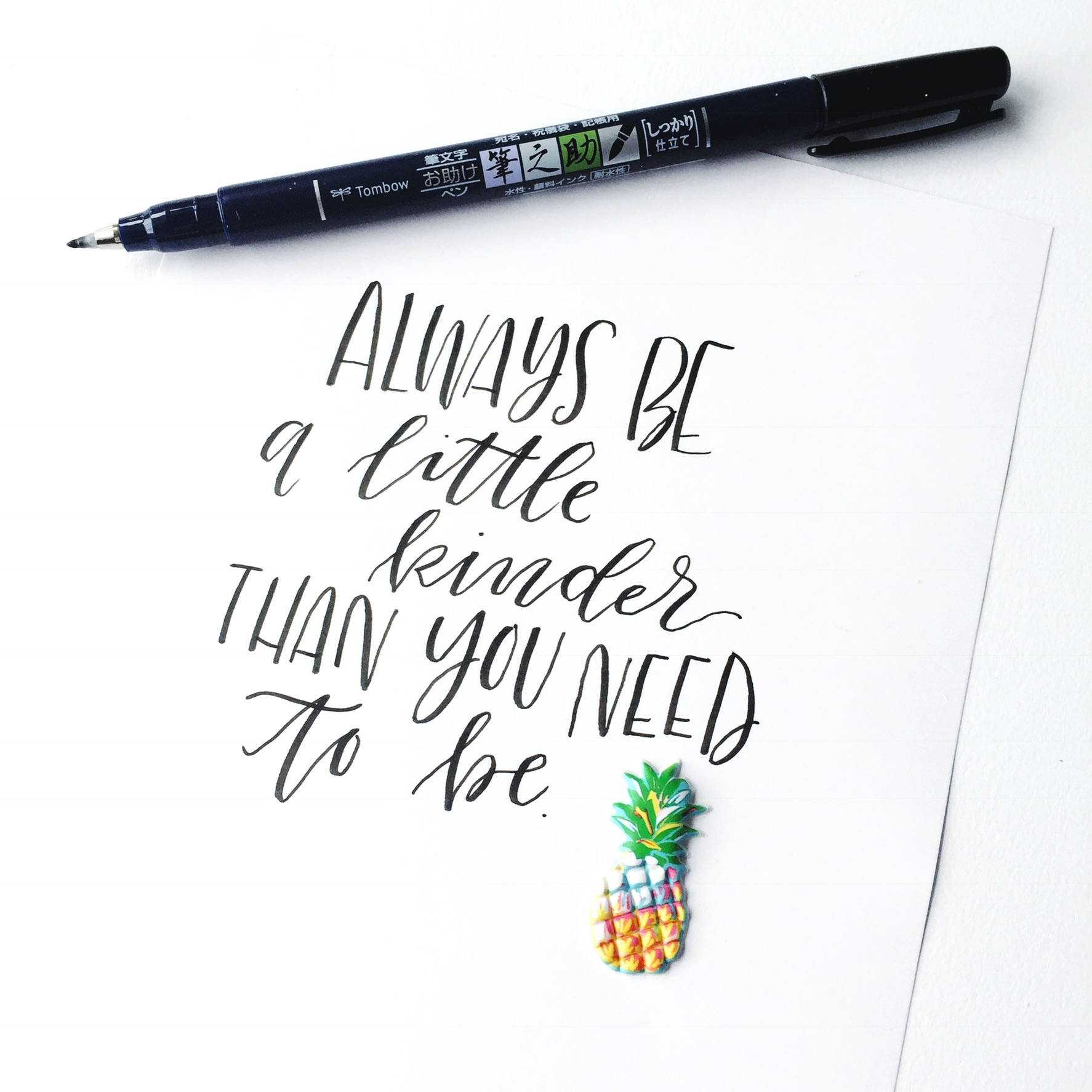
Another great way to add texture is by adding in stickers and other embellishments. The puffy pineapple sticker below is from a pack by Paper House. Adding one sticker can keep the background simple and keep the lettering as the focus of the picture, while adding a little dab of color.
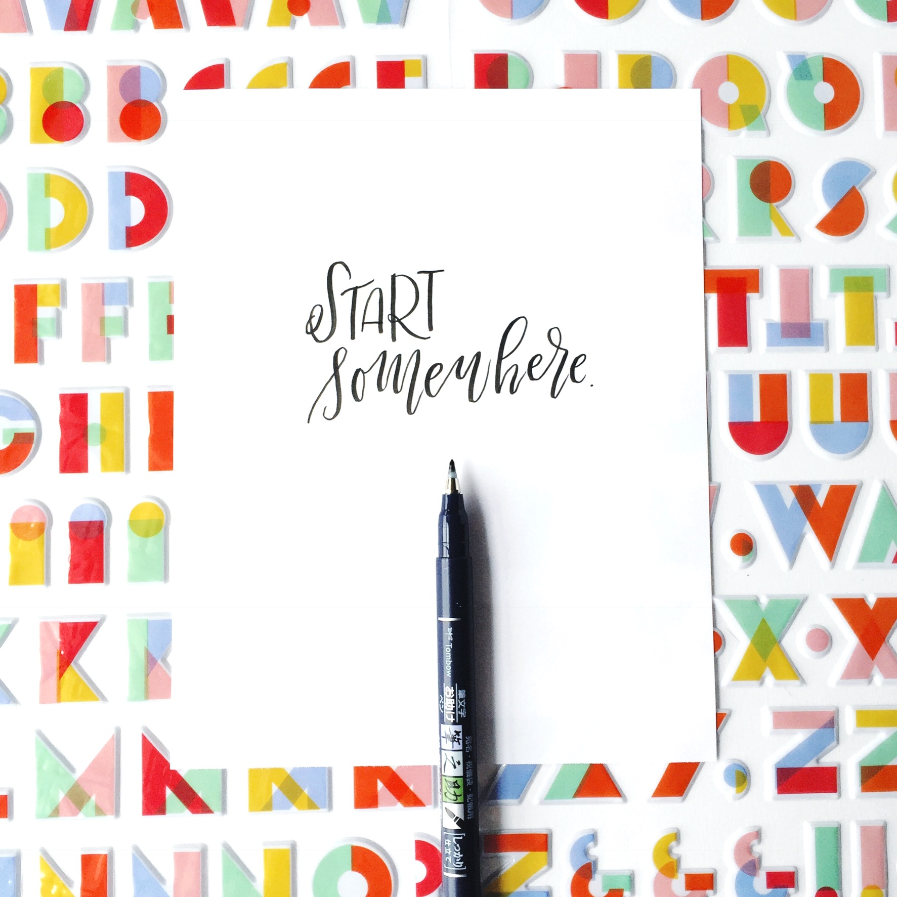
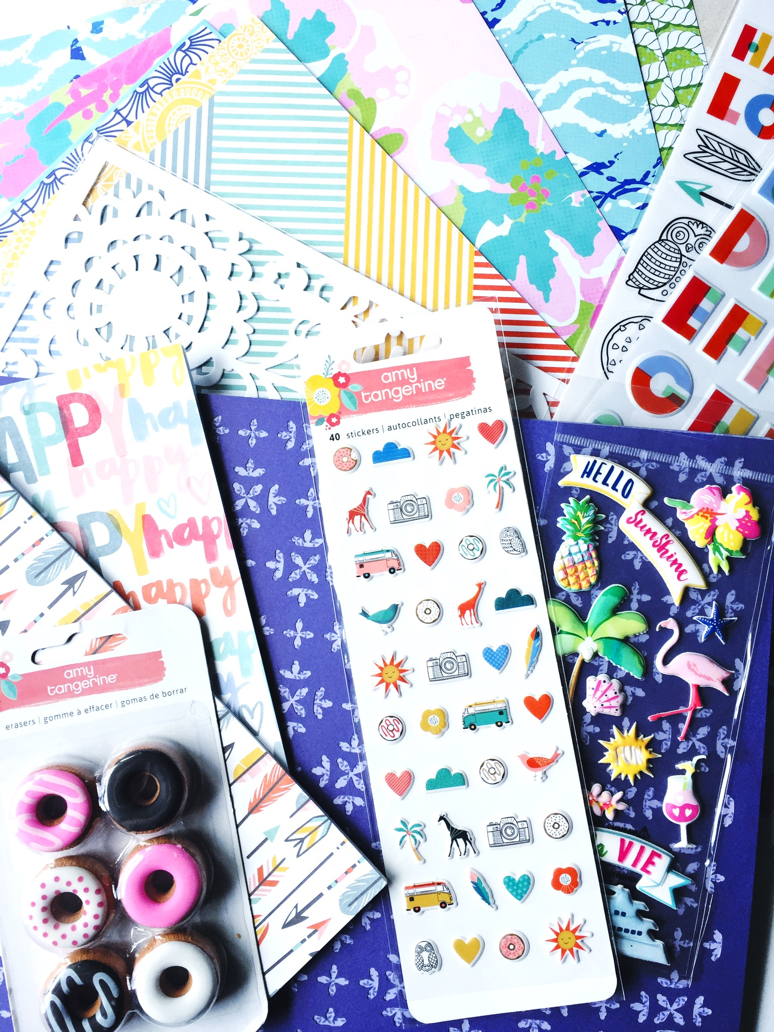
Sticker sheets, like these Thickers from Amy Tangerine are bright and fun and can be easily worked into a picture’s background without being used. Simply lay the sticker sheets down and place the lettering piece styled with the pen on top. This creates a picture with texture, using the stickers in a very creative way.
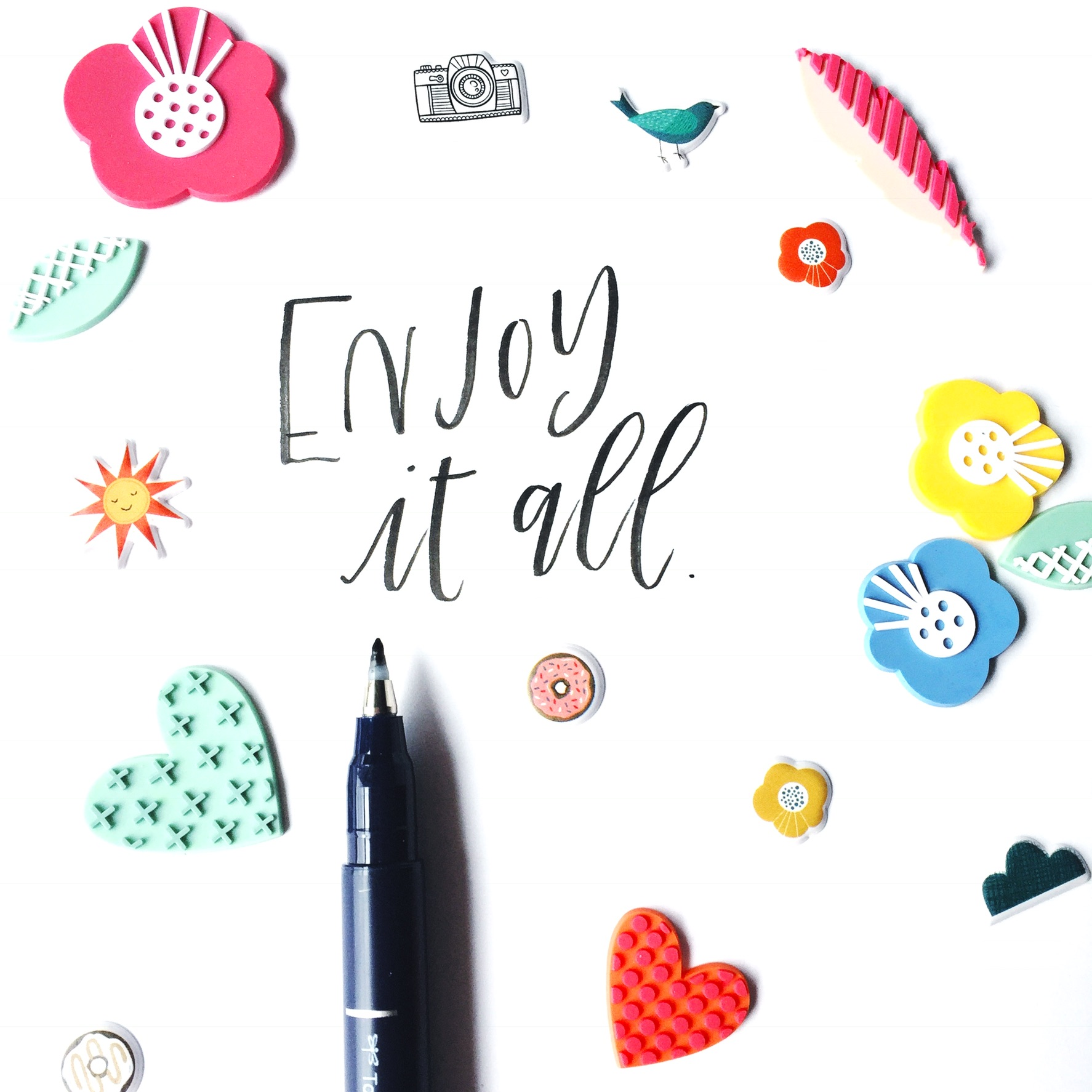
These rubber shapes and stickers also by Amy Tangerine are bright and can be used to create a collage of interest around the quote. This adds texture to the image and creates more of an eclectic look.
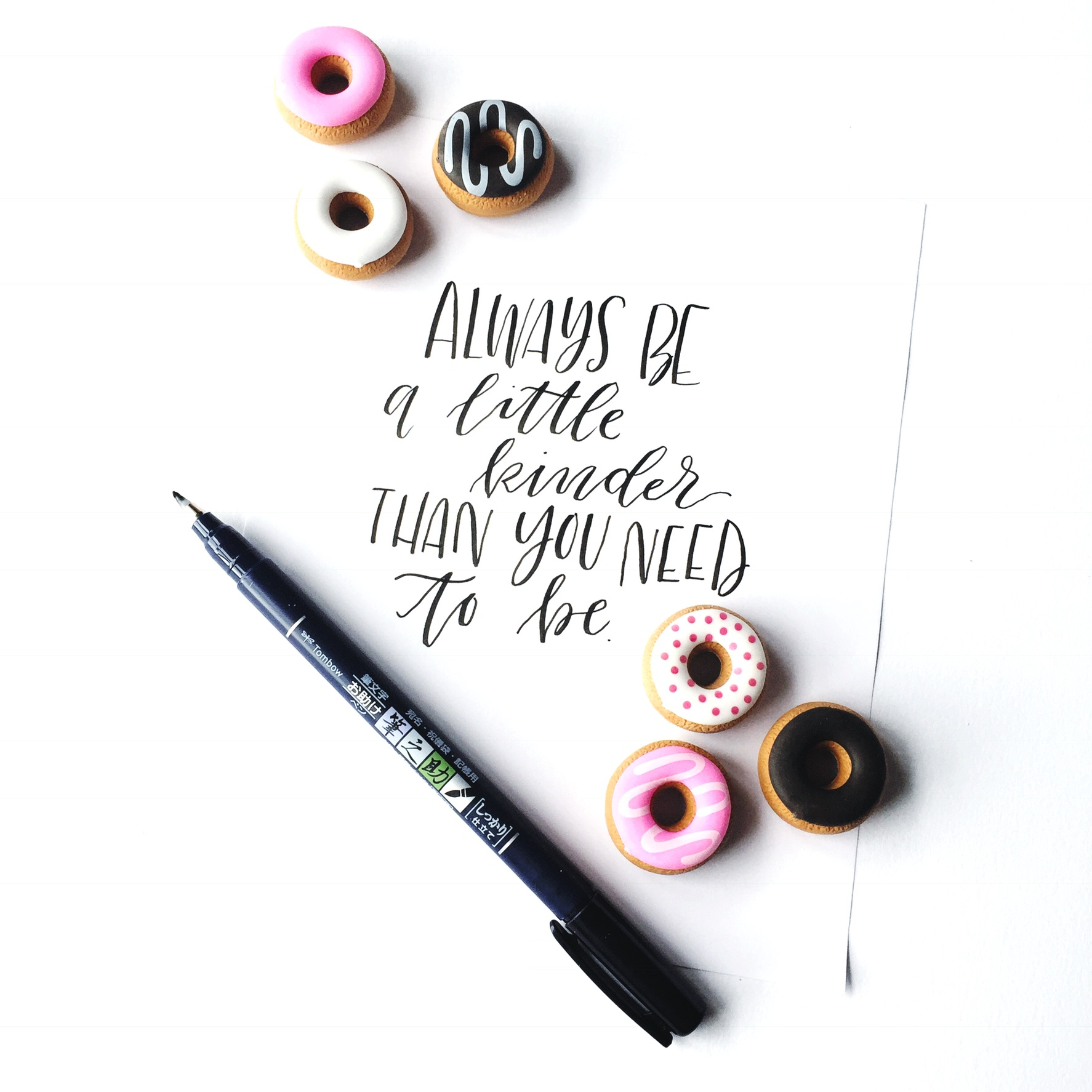
Sometimes companies that make scrapbook materials also have some fun extras that are a perfect addition to any Instagram feed! Of course, I love these donut erasers by Amy Tangerine! Adding little clusters of the object in the opposite corners of the lettering piece creates interest and balance to the picture. And let’s just face it… donuts are always a good idea!
Adding a touch of texture can really transform your image and add variety to your Instagram feed.
3. COMBINE COLOR AND TEXTURE TO TELL A STORY
Once you feel comfortable with using color and texture to style your photos, it’s important to combine the two together to tell a cohesive story on your Instagram feed. Identifying a color palette that you want to stay close to is a good idea to keep a consistent color scheme going. With the color scheme, adding in different and new textures from time to time can really add a lot of interest and variety to any Instagram feed.
One way to work in both color and texture is by forming a stack in one of the corners with the rest of the space being taken up by the lettering piece. Layering in stacks can really add a lot of layers of interest to a piece and make it look much more complex than it actually is. These booklets stacked on top of the die cut and scrapbook paper, all by Amy Tangerine, add height and a 3D feel to the image.
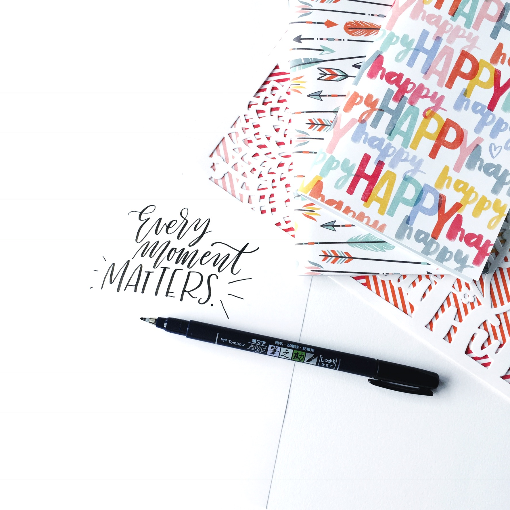
Another great way to tell a consistent story on an Instagram feed is by coordinating a color or pattern combo that is continued through your entire feed. The three images below would be awesome on a feed. It’s always a good idea to keep your Instagram feed looking light and bright. When using patterned papers alternate images with a clean white background and those with a bright background pattern. The three images below all contain scrapbook paper that came as a pack from Paper House. Sets of paper like this are an amazing tool to turn to when you are having trouble finding consistency in your posts on social media.

And there you have it! Easy and fun ways to style your photos using Tombow USA products and scrapbooking materials! A huge thank you to Diecuts with a View, Paper House, and Amy Tangerine for creating and sharing all of the amazing items I used in this post. So get out your scrapbook stash and start planning your feed! What story will you tell with your lettering? For more information about lettering check out @renmadecalligraphy on Instagram or visit renmadecalligraphy.com.

I would love the write like you thank you for those ideas
You ought to be a part of a contest for one of the highest quality blogs on the net.
I will recommend this website!
Pingback: Celebrating National Scrapbook Day 2017 - Tombow USA Blog