Hi there! It’s Bonnie here from Archer and Olive. One of the hardest (but most fun) part about create a new work of art is choosing the right color palette. Since Tombow’s Dual Brush Pens come in 96 different colors, choosing the perfect palette can seem overwhelming. Here are three tips that will help you create the perfect palette for your next piece.
Supplies:
- Tombow Dual Brush Pen Set, 96 Colors
- Color Wheel
Tip #1: Work with an analogous color scheme
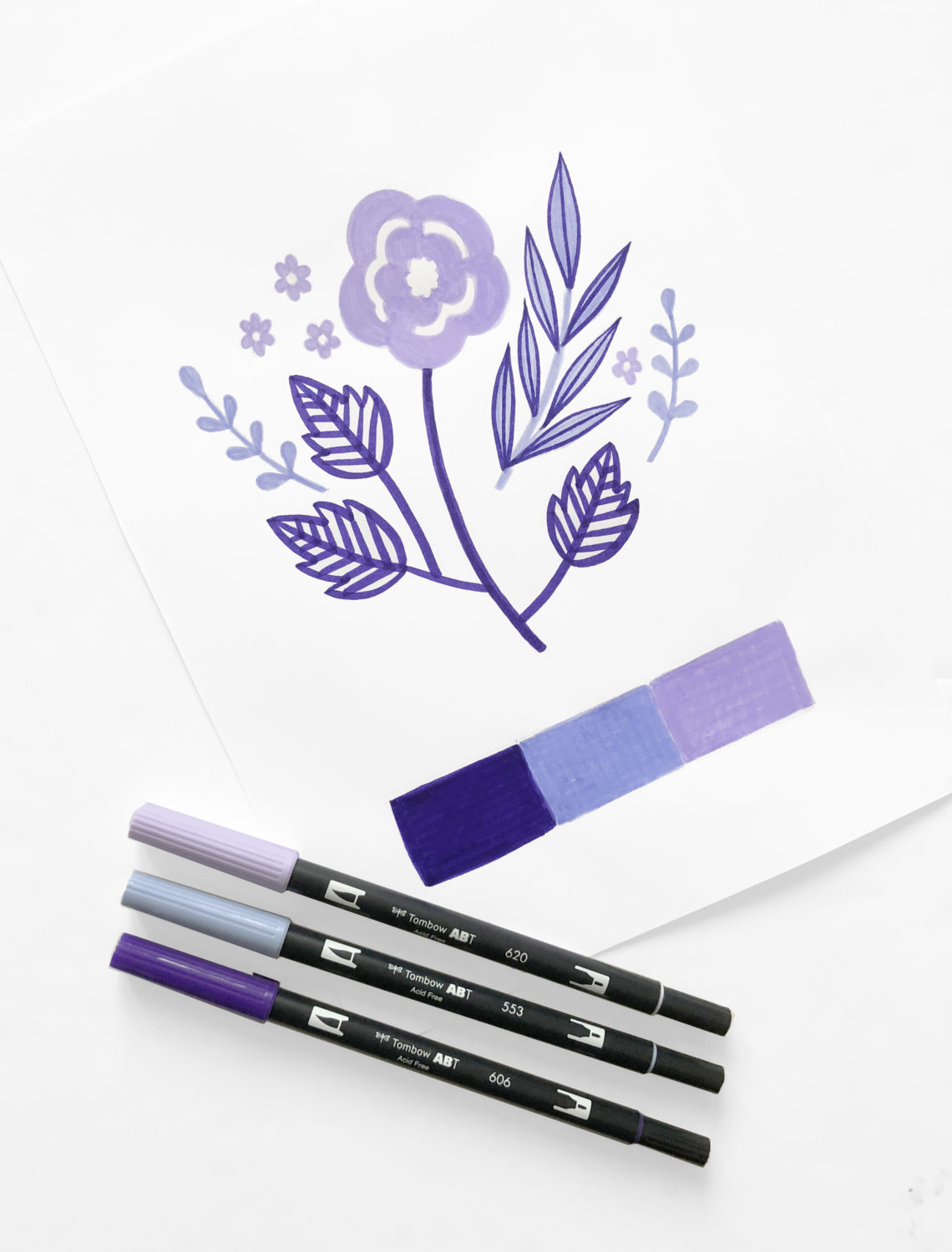
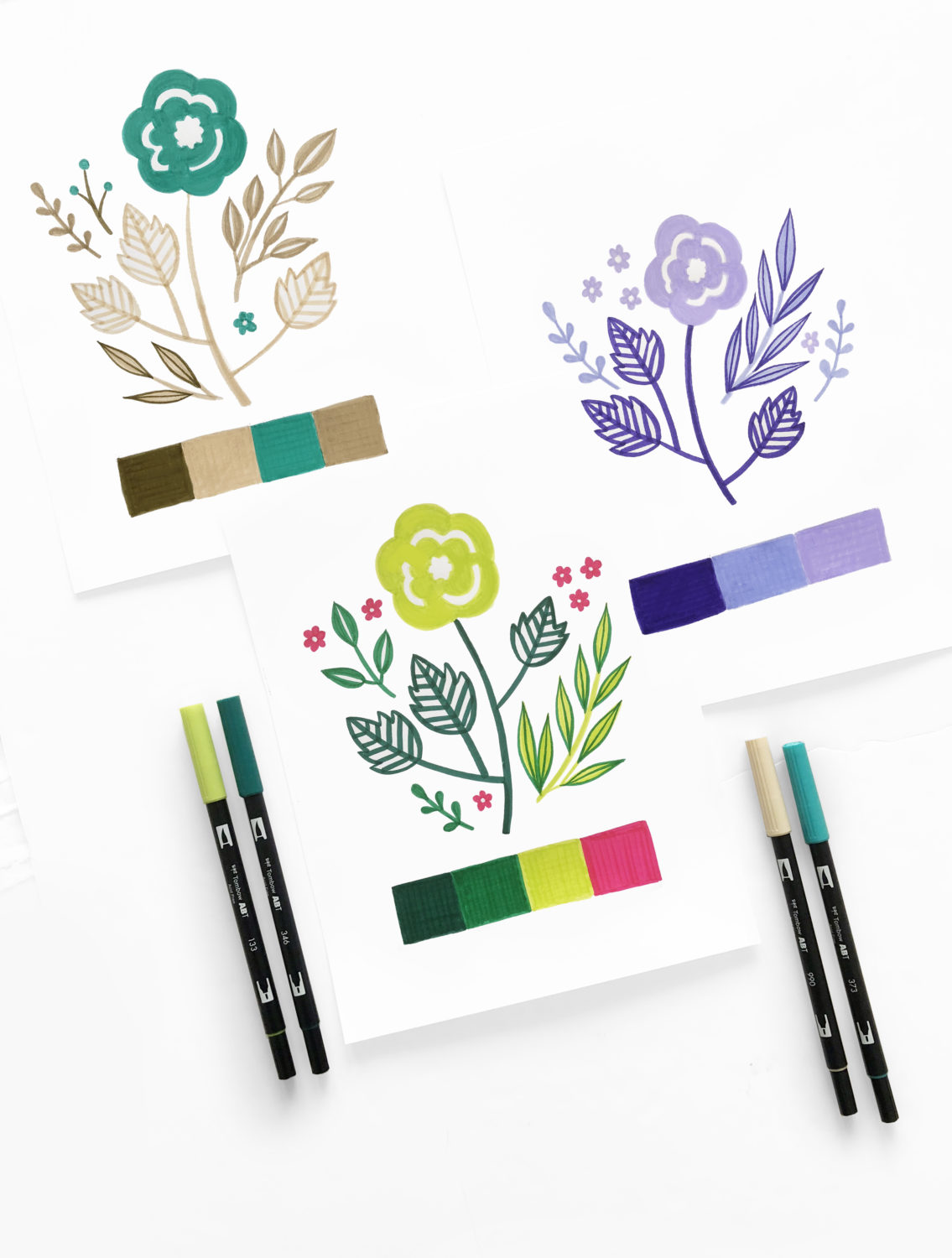
Analogous colors are those found next to each other on the color wheel. Choose colors that have a good range of contrast. For this piece, I’m working in various shades of purple. We have a pure purple (#606) which is very dark, a purple on the cooler side of the wheel (#553) which is also in the middle, and a warmer purple (#620) which is very light.
Tip #2: Work with an analogous complementary color scheme
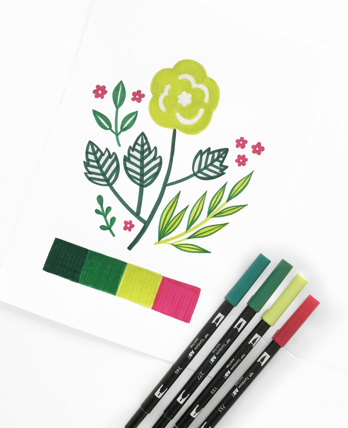
Similar to the analogous color scheme, choose colors that are next to each other on the color wheel. Add an additional color from the exact opposite side of the color wheel. Use the complementary color sparingly. Again, it’s a good idea to choose some light and dark colors. For this color palette, Im using #346, #277, #133, and #755.
Tip #3 Work with a neutral color scheme.
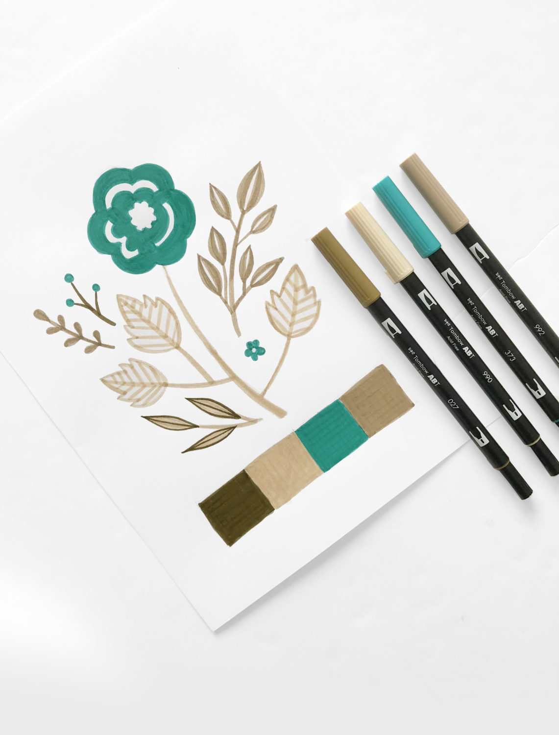
Neutral colors are those you don’t find on a traditional color wheel. Whites, black, greys, and browns are all examples of neutral colors. Once you have your neutral colors, choose one color from the wheel, to add a bit of color to your palette. To create this palette, I’m using #992, #373, #990, and #027
Pingback: 3 Vintage Color Schemes using Tombow Dual Brush Pens
Thanks! I’ll take a look.