Hi y’all, it’s Grace from Grace Anne Studio! Have you ever wondered how to create a color palette that’s cohesive and aesthetically pleasing? If you pay attention to color theory, you’ll find there are a few simple ways to make that happen! At a very basic level, “color palette” refers to the specific colors chosen for a color scheme. “Color harmonies” are used to combine colors in an aesthetically pleasing way according to the color wheel. They can be used to create a color palette or they can be created from within a color palette. There are six color harmonies that are seen a lot: complementary, split complementary, analogous, triadic, tetradic and monochromatic. We’re going to create our own color wheel and color harmonies with Dual Brush Pens.
Supplies
- Tombow Dual Brush Pens
- Tombow MONO Twin Permanent Marker
- Tombow MONO Graph Mechanical Pencil
- Tombow MONO Eraser
- Tombow Blending Palette
- Smooth paper
- Ruler
- Circle template
- Optional: Waffle Flower Color Combo Stamp Set and ink
Step 1: Layout
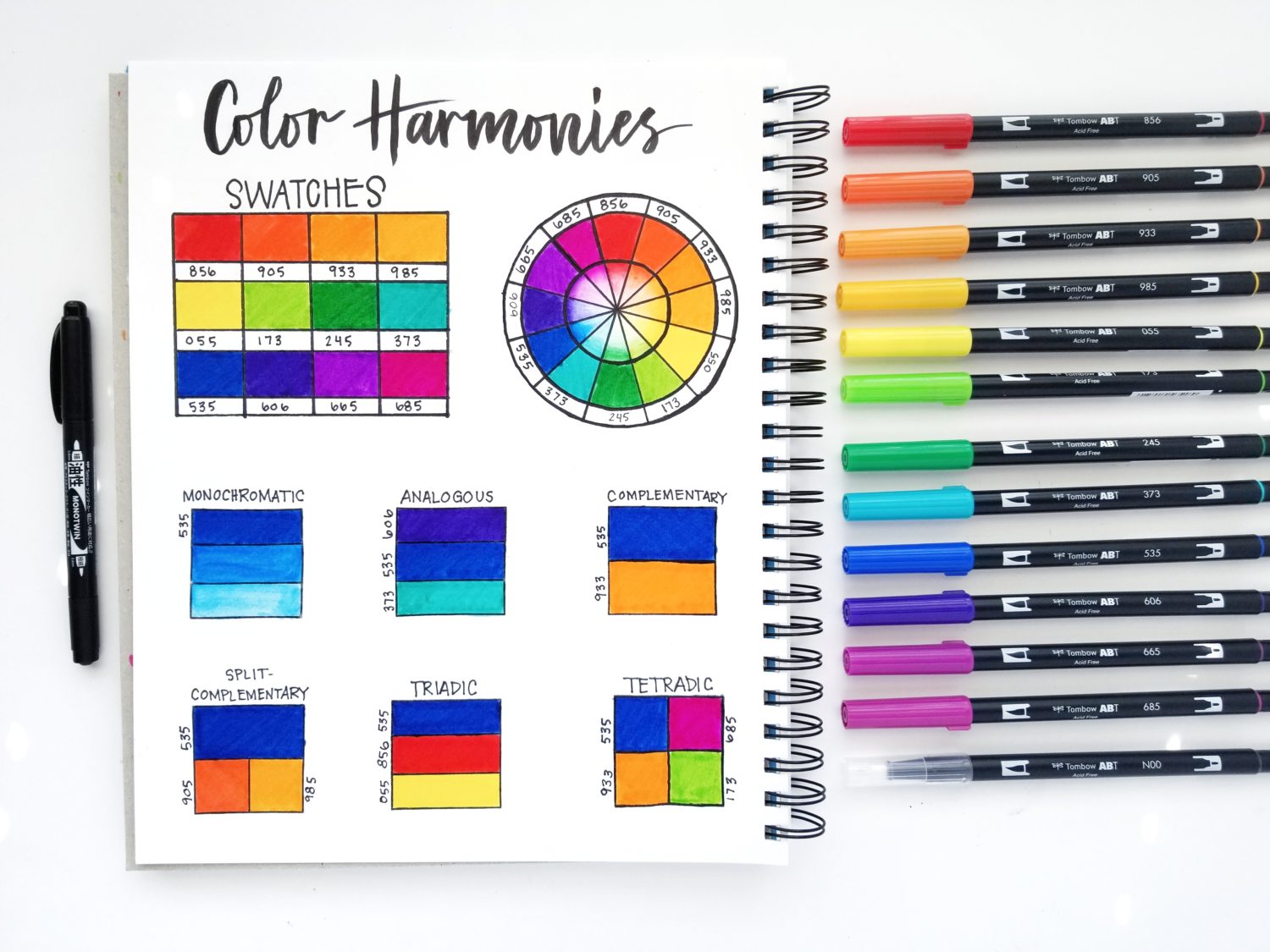
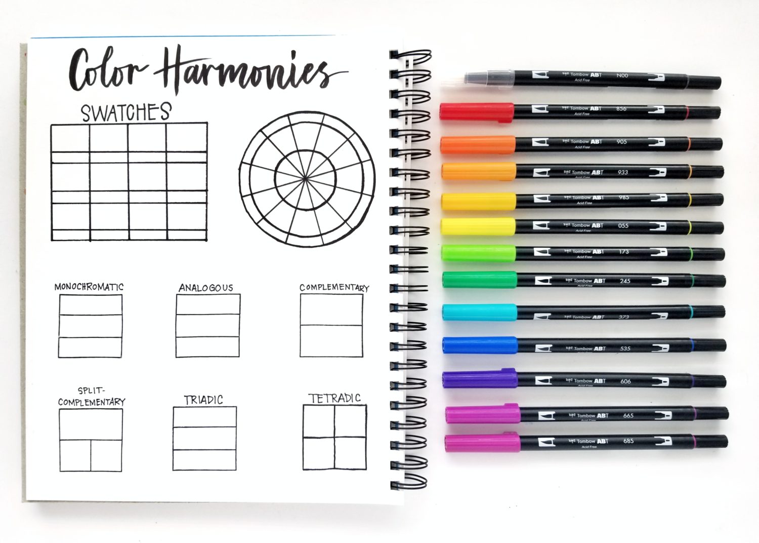
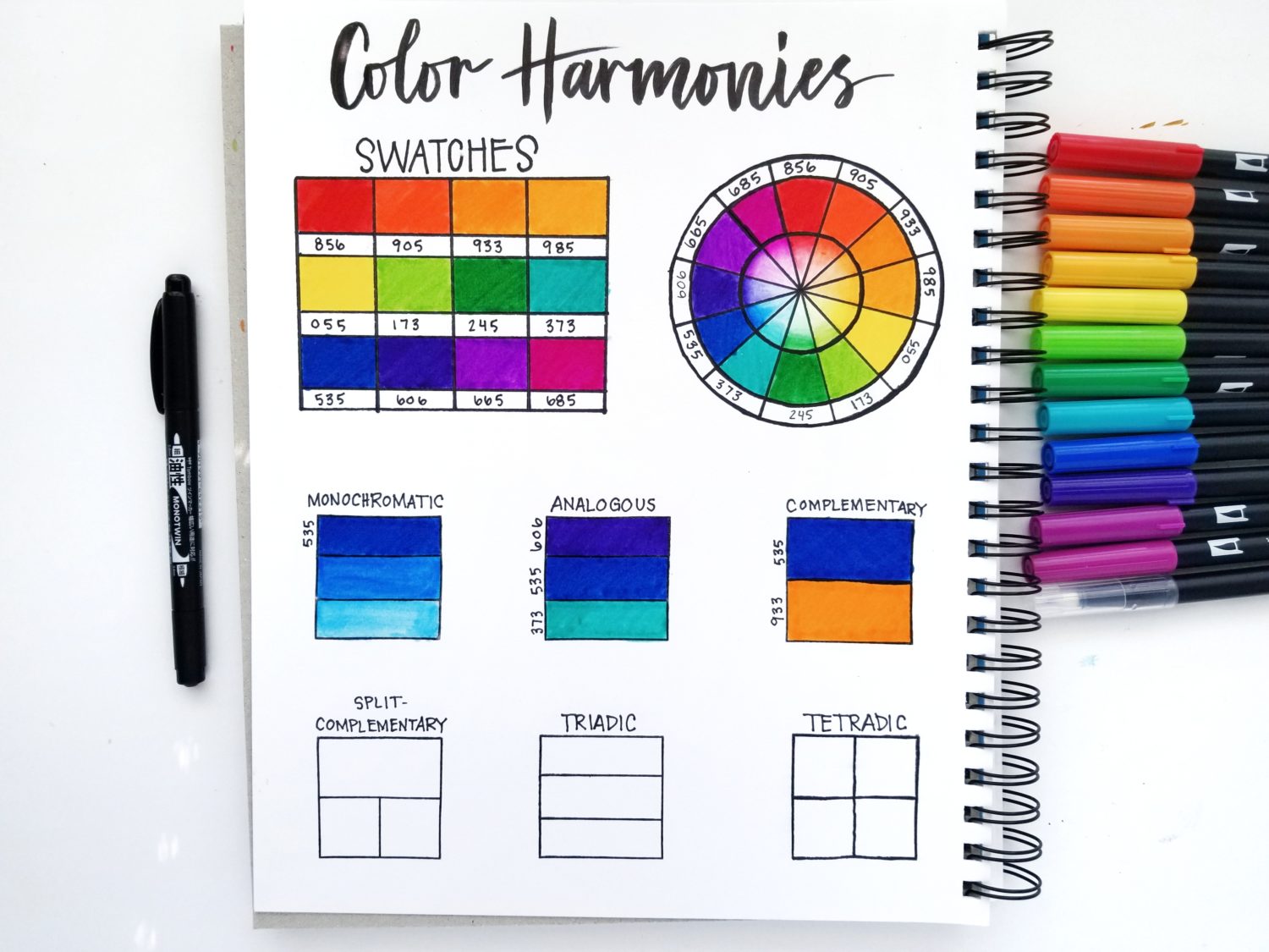
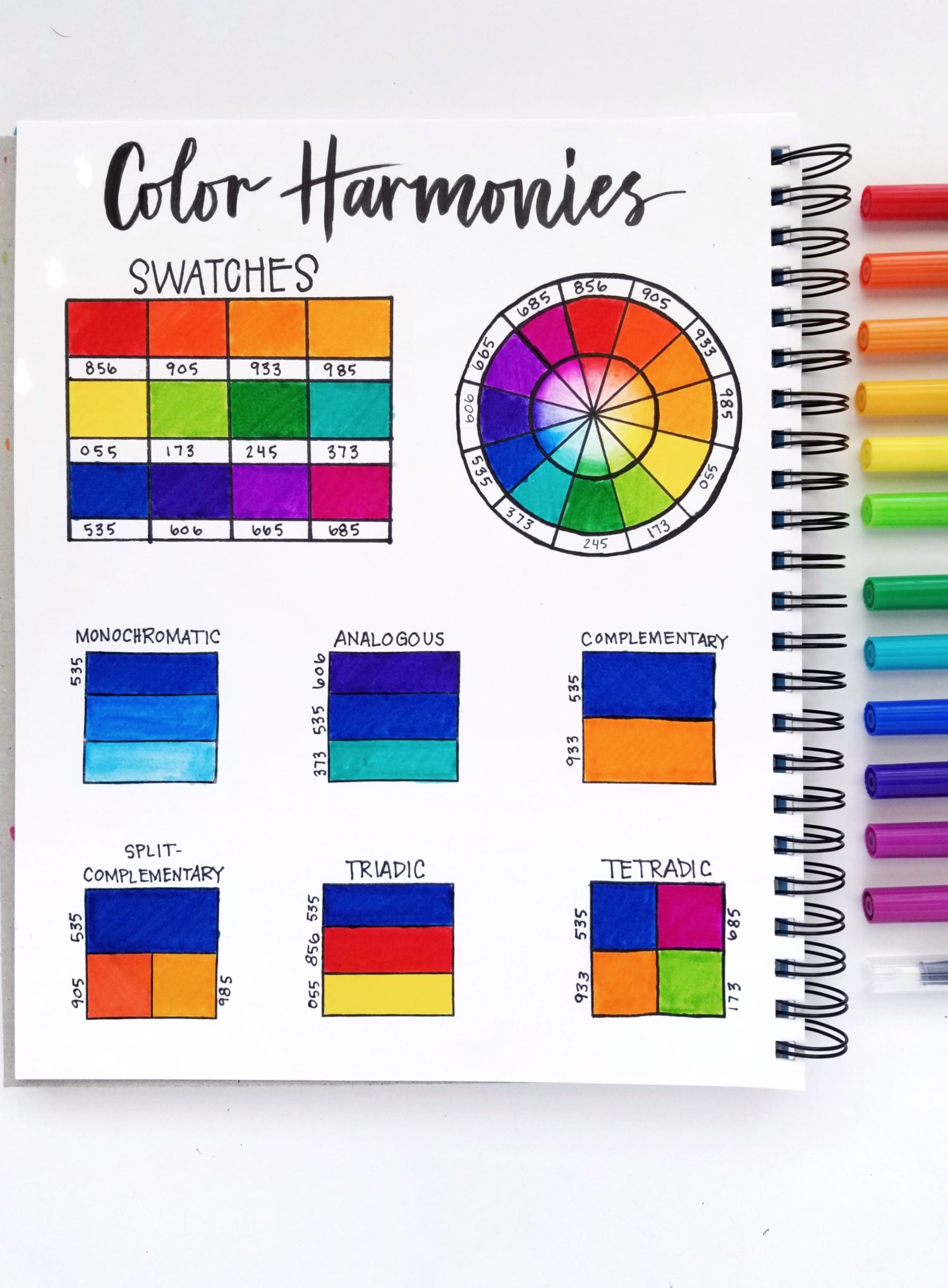
To start, use your MONO Graph Mechanical Pencil and a ruler to sketch out a section for swatching colors. My template is 1″ x 3/4″ rectangles with a 1/4″ row for color numbers. Next, use your ruler and a circle template to sketch out a color wheel. I knew I wanted to use primary, secondary and tertiary colors, so I made twelve sections for the color wheel. Go over your pencil marks with a MONO Twin Permanent Marker and erase any stray pencil marks with a MONO Eraser. Then, use your Waffle Flower Color Combo Stamp Set to stamp sections to fill in six color harmonies. Finally, add titles with your MONO Twin Permanent Marker.
Step 2: Swatch
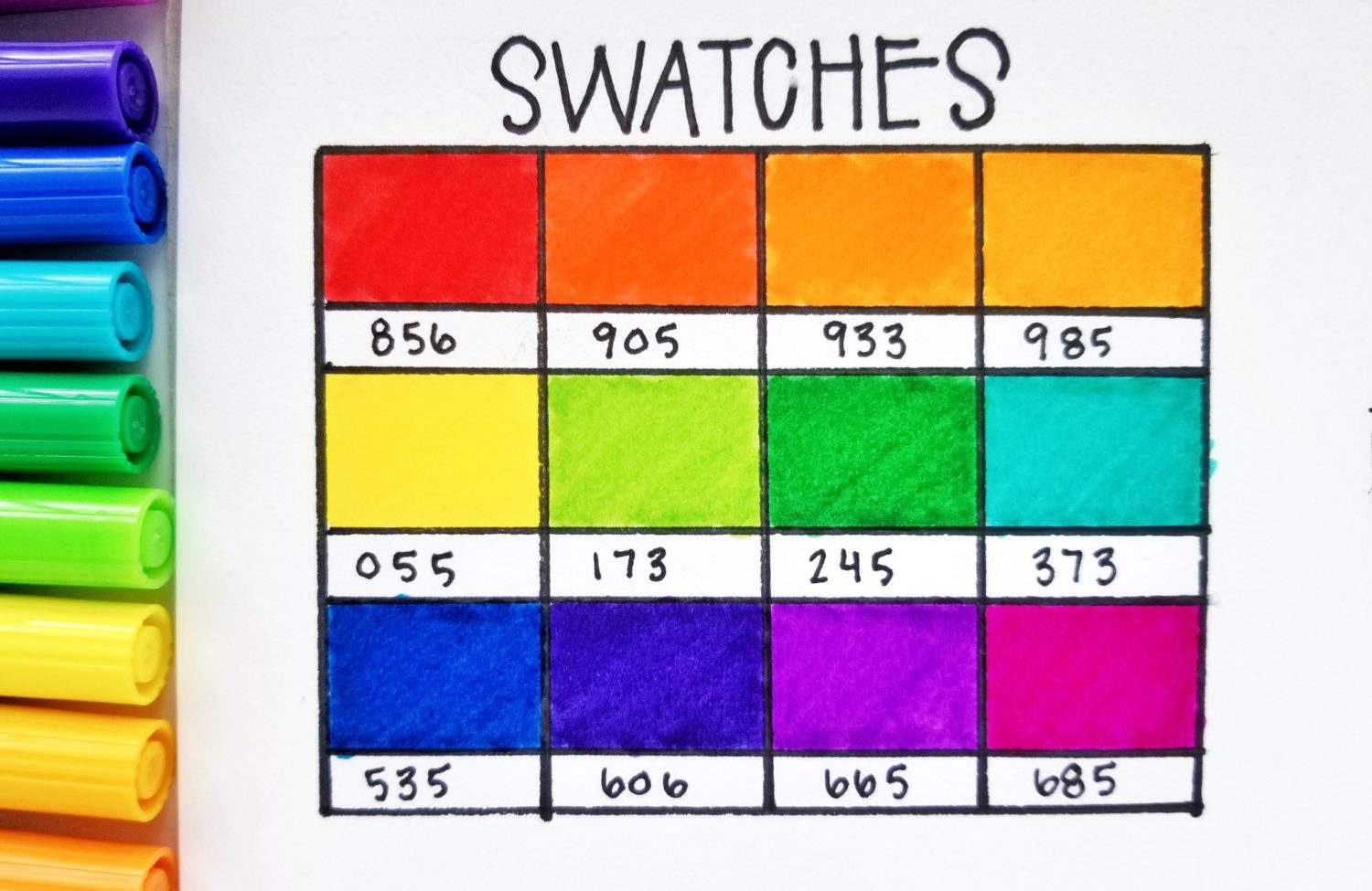
Now that your color harmony spread is ready, it’s time to choose colors for your color wheel. You can either use the colors I chose or create your own color wheel by testing colors. The color wheel should have the three primary colors, three secondary colors and six tertiary colors. Keep this in mind when choosing colors.
- Primary colors are red, blue and yellow. They are the pillars of the color wheel and can be mixed to create a plethora of other colors. However, they cannot be created by mixing other colors.
- Secondary colors are made by mixing primary colors. For example, red and blue make violet.
- Tertiary colors are made by mixing primary and the nearest secondary colors. For example, mixing yellow and orange will give you yellow-orange.
-

- Testing colors to create a color wheel.
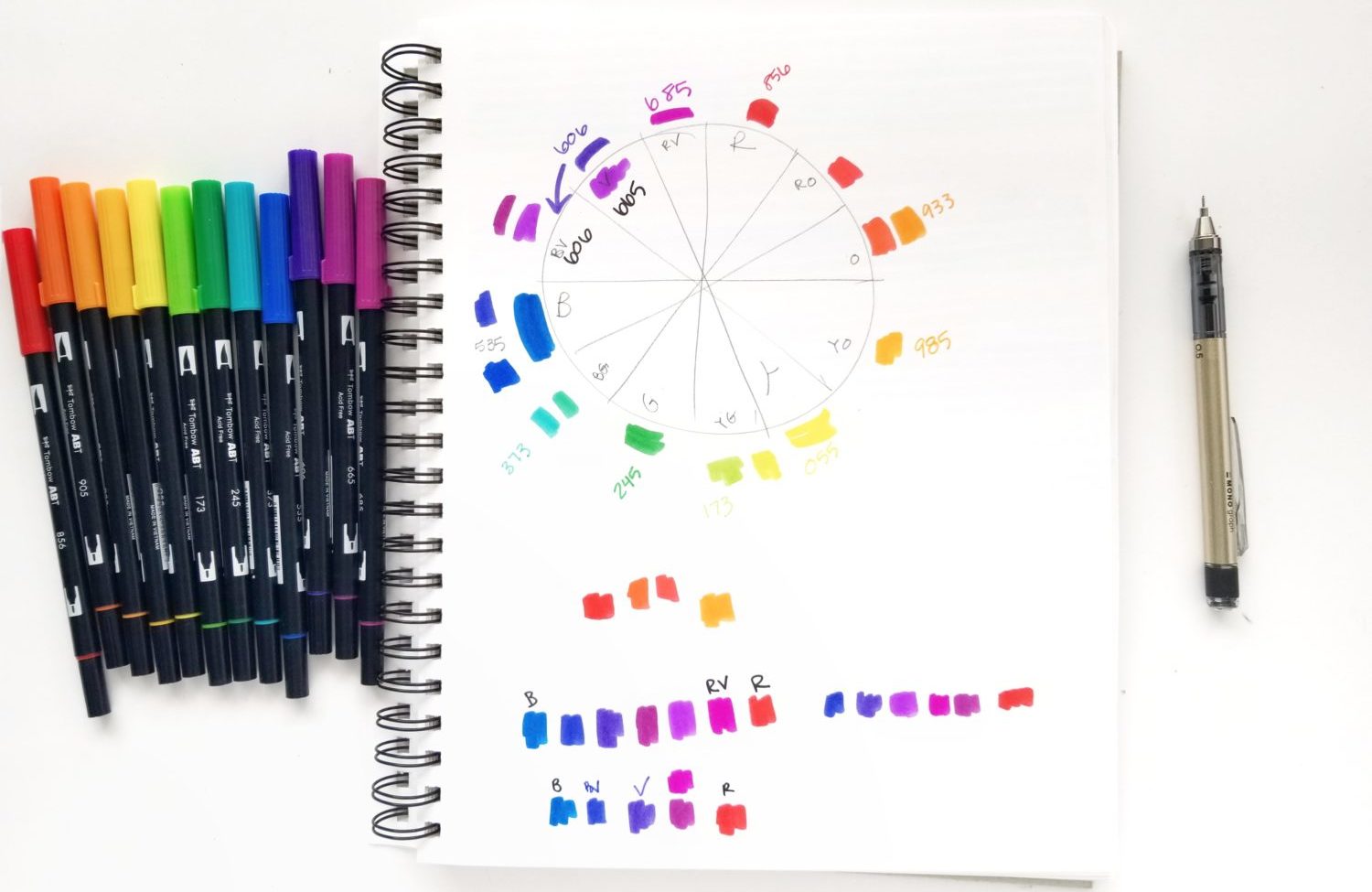
-
- The 12 chosen colors.
Step 3: Color Wheel
Once you have your colors chosen, place them on the color wheel template. Use the outermost ring for color numbers and the next for the pure color swatches. The inner ring shows monochromatic values. Create this look by coloring a little bit of each other near the middle ring. Then, use the colorless blender to slowly pull the color toward the middle of the circle. The middle should be white (the lightest value).
Color placement or order is important on the color wheel because this helps determine color harmonies. The primary colors (red, yellow and blue) are the pillars and should always be evenly spaced. Halfway between each primary color is the corresponding secondary color. For example, violet is halfway between red and blue. The tertiary colors are between the corresponding primary and secondary colors. For example, blue-violet is between blue and violet.
It’s important to find balance and harmony between the warm and cool colors for your color harmony to be successful. Cool colors are blues, greens and violets. Warm colors are reds, oranges, and yellows.
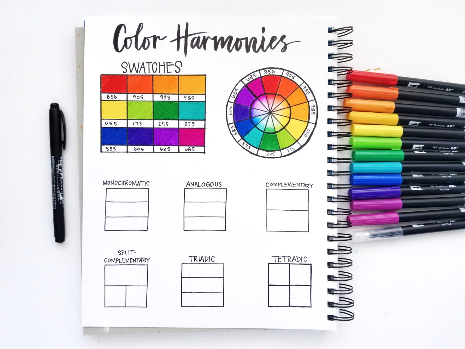
Step 4: Color Harmonies
Now that the color wheel is filled in, it’s time to choose color harmonies! Most color harmonies work best with a dominant color. I chose the Pantone Color of the Year (Classic Blue) as my base or dominant color. The Tombow Dual Brush Pen equivalent is 535.
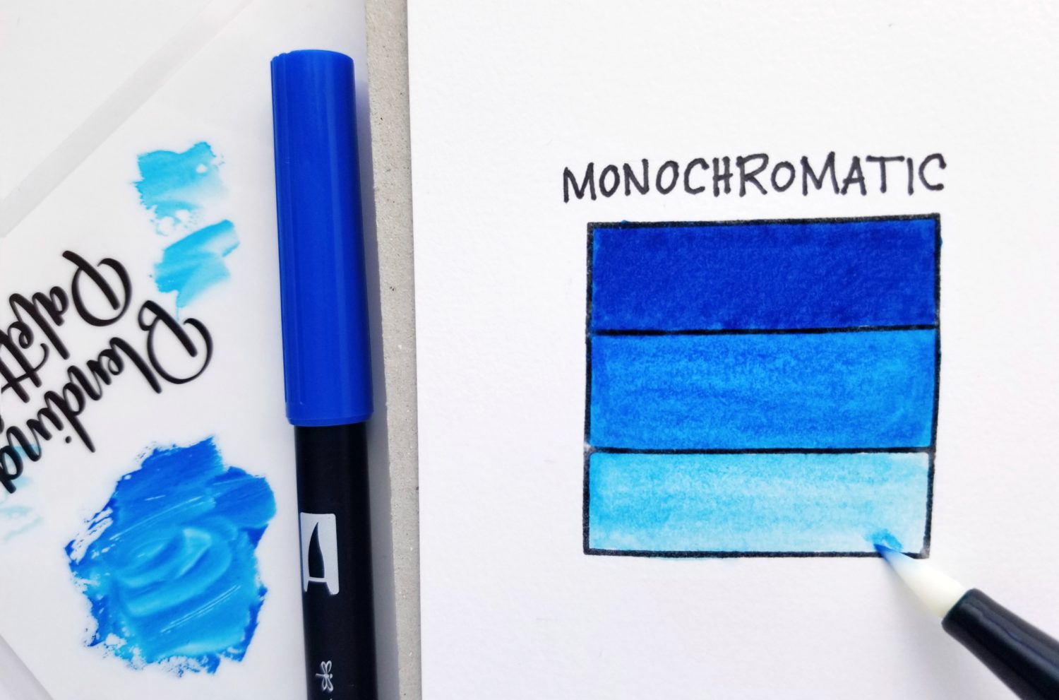
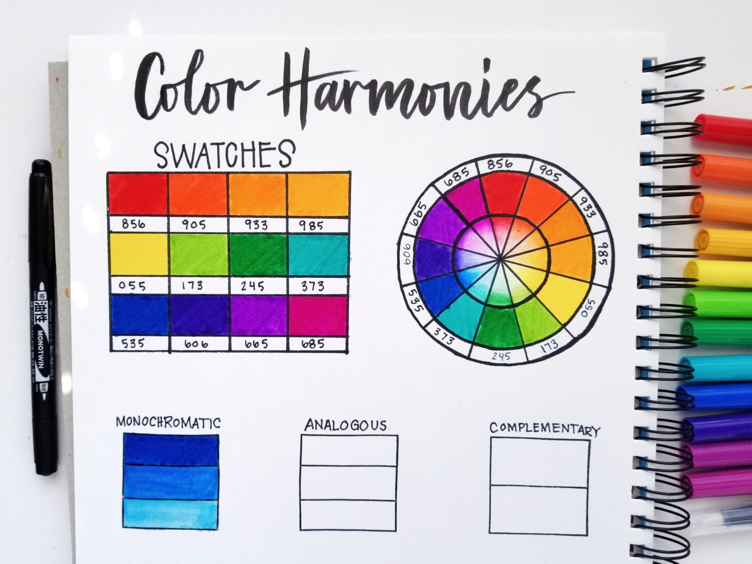
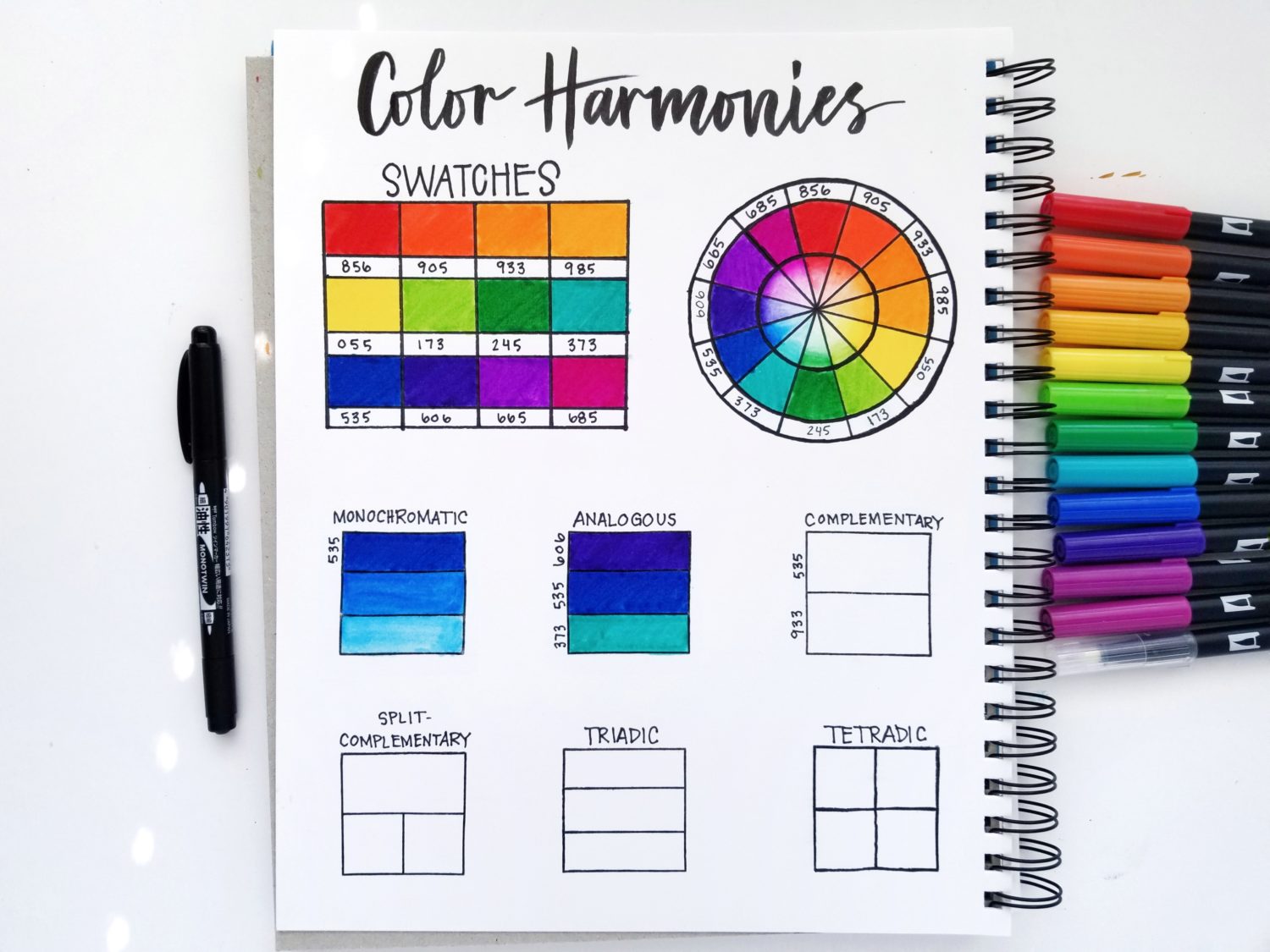
Color Harmony 1: Monochromatic
Monochromatic color means that there is one chroma (color) and variation is achieved by showing different values. Value in the art world is the degree of lightness or darkness in a color. To create monochromatic color harmony using Dual Brush Pen 535, color the top rectangle using the pure 535 color. Then add some color to a Blending Palette. Use the Colorless Blender to pick up some color and apply it to the middle rectangle. The result will be a lighter value than using 535 directly on paper. For the last rectangle, scribble some of the color off of the Colorless Blender onto the Blending Palette or a scratch sheet of paper. Then use what is left on the Colorless Blender to fill in the last rectangle. The result should be a very light value of 535.
Color Harmony 2: Analogous
Analogous color harmonies use colors that sit next to each other on the color wheel. I chose my blue-violet shade, blue and my blue-green shade. Any colors that sit next to each other on the color wheel qualify for this color harmony. Because having enough contrast can be a concern for this color harmony, it typically works best to choose a dominant and secondary or supporting shades.
Color Harmony 3: Complementary
Complementary colors are colors that sit across from each other on the color wheel. For example, blue and orange. Complementary colors compliment each other well, but they have a lot of contrast. It’s best to use these sparingly or only as a focal point.
Color Harmony 4: Split-Complementary
Split-complementary is the best of both worlds in my opinion. To use split-complementary, you choose two complementary colors and then split one of the colors into the two colors on either side of it on the color wheel. For example, blue and orange becomes blue. You still have the high contrast between the two colors, but it is toned down a bi. This makes the harmony more cohesive.
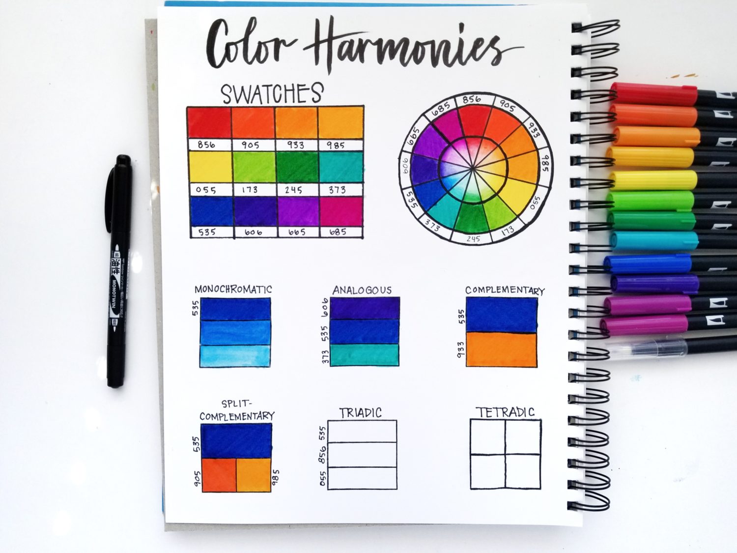
Color Harmony 5: Triadic
Triadic color harmonies are three evenly-spaced colors on the color wheel. For example, blue, red and yellow. Triadic color harmonies are typically very vibrant and benefit from having a dominant color.
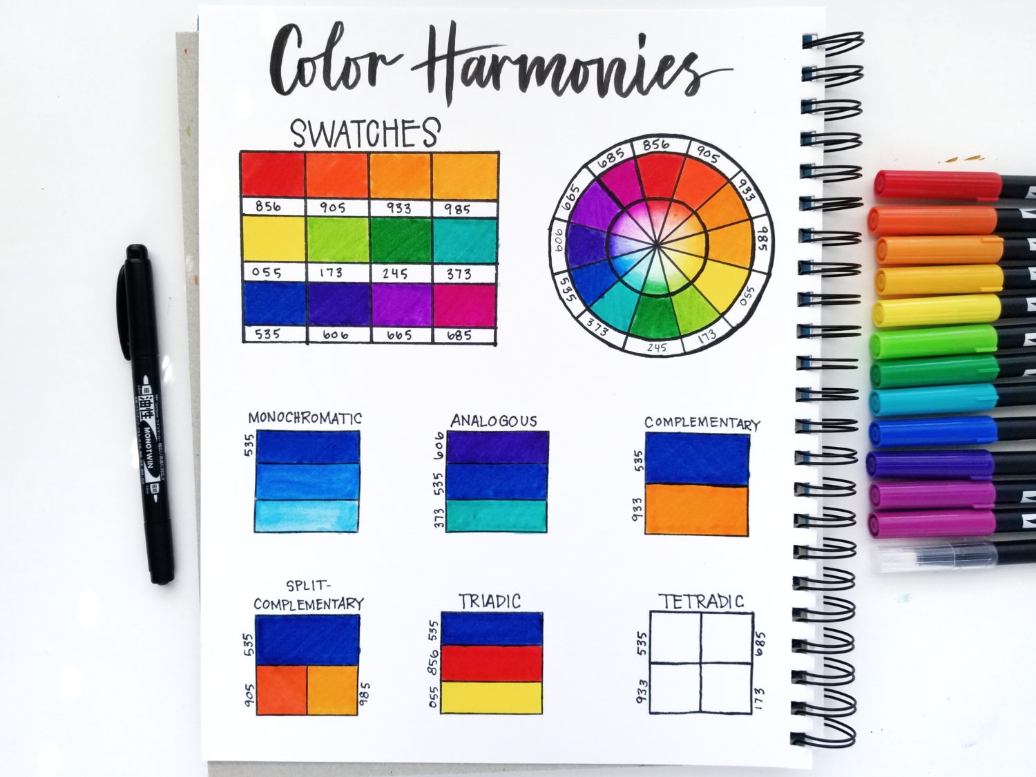
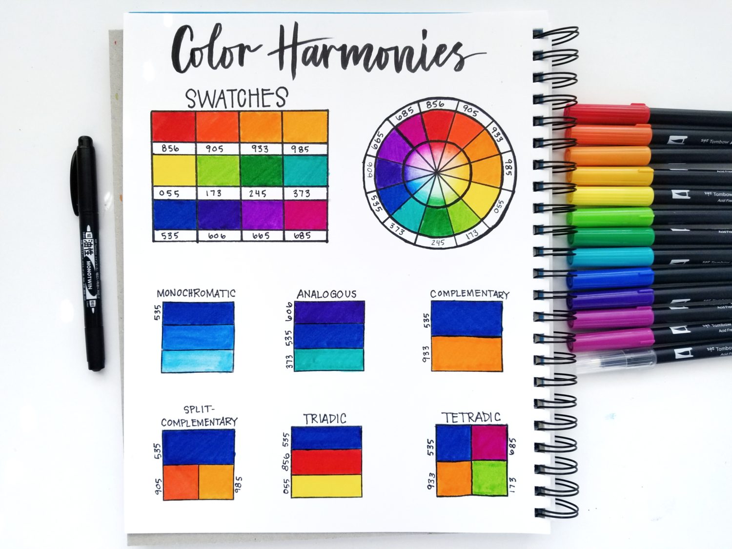
Color Harmony 6: Tetradic
Tetradic color harmonies are a pair of two complementary colors. There are two possibilities for this harmony: a rectangle or a square. A square tetradic color harmony uses two sets of complementary colors that are evenly spaced on the color wheel, creating a square. An example of this is blue and orange, yellow-green and red-violet. A rectangular color harmony uses two sets of complementary colors that create a rectangle on the colors wheel. For example, blue and orange and violet and yellow. Either way, tetradic color harmonies typically work best when dominant and supporting colors are chosen.
Step 5: Final Considerations
Once you have mastered the basics of color harmonies, it’s time to pay attention to the details. There are limitless combinations of colors, but please pay attention to the overall tone and the balance between colors in your design or composition. For example, your triadic color harmony is blue, yellow and red, however there are many tones for those colors. Using muted tones will give you a completely different feel that pastel or bright tones. All have their value, but it is definitely an important factor when choosing color harmonies or a color palette.
Thank you so much for reading along today! I hope you found this post useful and you feel empowered to choose your own color harmonies with Dual Brush Pens. If you post one on social media, be sure to tag @tombowusa and @graceannestudio so we can cheer you on! For more art lessons, check out the posts below:
- Value Scale Using MONO Drawing Pencils
- Drawing 101: Continuous Line Drawing
- 5 Simple Tips to Improve Your Drawing
- 5 Tips for Drawing with Brush Pens
- Create Custom Color Palettes using Dual Brush Pens
Happy creating!
Grace
Thanks for sharing this wealth of info!
This is amazing. I love my Tombows and fancy myself artistic, but I have always had trouble with color matching. Even in design school… Would you do more of these, with different base/monochromatic colors, for those of us with all the Tombows, but no courage?
It’s my pleasure!!
I love that idea! I’ll definitely work on it, but in the meantime, try searching for “color palette” on the Tombow USA Blog. There are several other posts on the subject also!
This information is so valuable. I feel like I have just taken a course on color. Now I am inspired to create some projects using my own colors. Thank you for such in depth information.