Hello everyone, it’s Ali LePere here! Today, I want to talk to you about hand lettering! To letter in different styles, we have to talk about increasing our visual vocabularies.
The definition for the word ‘vocabulary’ is “the body of words used in a particular language.” In other words, it’s your word bank! Knowing and being able to use many words means that you have a good vocabulary. Being able to draw from a good vocabulary means that you’re better equipped as a reader and a writer.
My definition for ‘visual vocabulary’ is “the visual components used in art”. These components include lines, shapes, colors, space, and many other things. Knowing how to use many components in art means that you have a good visual vocabulary! Being able to apply these visual components will make lettering different styles easier!
If you want to increase your visual vocabulary, follow along with this guide. I’m going to walk you through some basic ways to draw letters and also share how I practice lettering!
Lettering Supplies
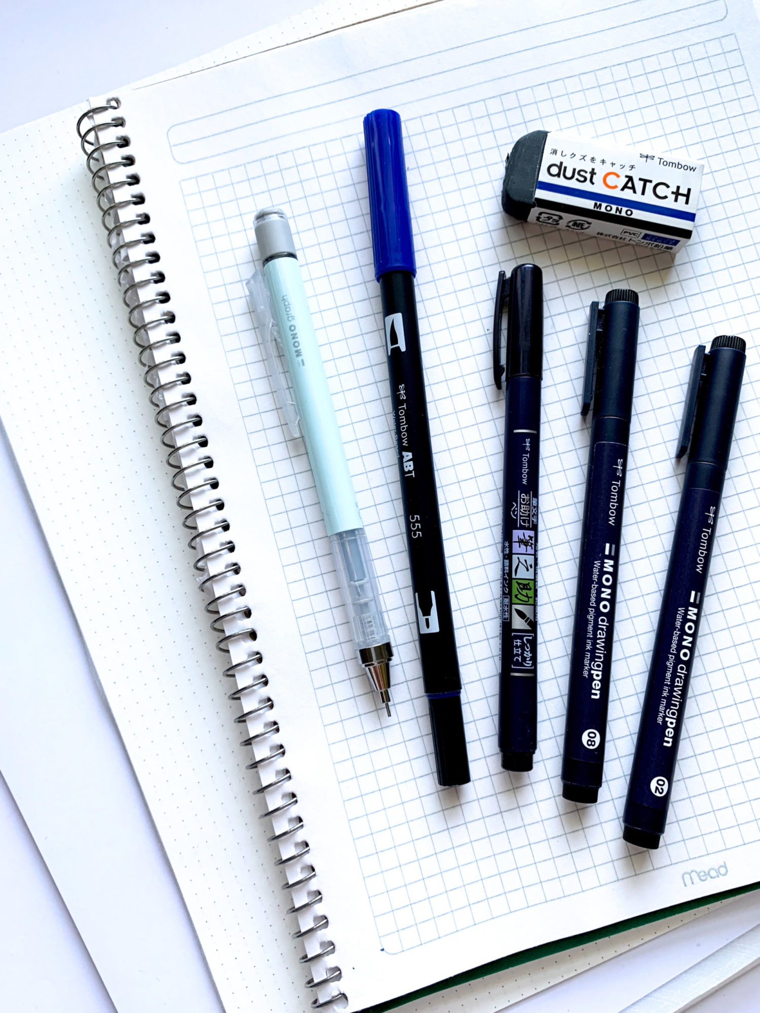
- Tombow MONO Graph Mechanical Pencil– every lettering piece begins with a pencil sketch. This is my favorite pencil of all time!
- Tombow Dual Brush Pens – the brush end is best used for brush calligraphy or coloring in large areas. The bullet tip is great to use for lettering exercises and lining!
- Tombow Fudenosuke Brush Pen– this marker is used for small scale brush calligraphy. It’s a great tool for beginner and professional calligraphers alike!
- Tombow MONO Drawing Pens – these pens come in a variety of sizes and I use them in almost all of my lettering pieces. They create crisp and black lines for inking over pencil.
- Tombow MONO Dust Catch Eraser– having an eraser on hand is important. Having this eraser that catches all those little eraser bits!
- Dot grid or graph paper – since the size of letters is important when practicing, having a grid will help you make letters more consistent in size and shape.
- Marker paper – if you’re doing brush calligraphy, using smooth marker paper will help keep the markers in great shape. Coarse paper can lead brush markers to fray
Extra Materials
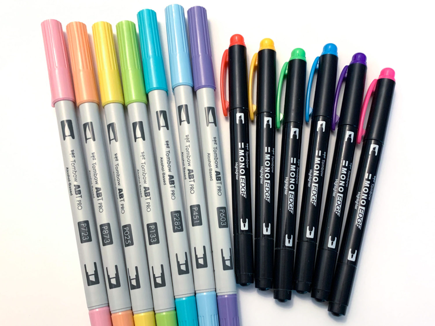
- Tombow ABT PRO Alcohol Based Markers– I use these for coloring illustrations. Later on you’ll see how I colored some decorative lettering with them!
- Tombow MONO Edge Highlighter– I use the extra-fine bullet tip to make notes on lettering and calligraphy practice pieces.
Lettering Height and Width
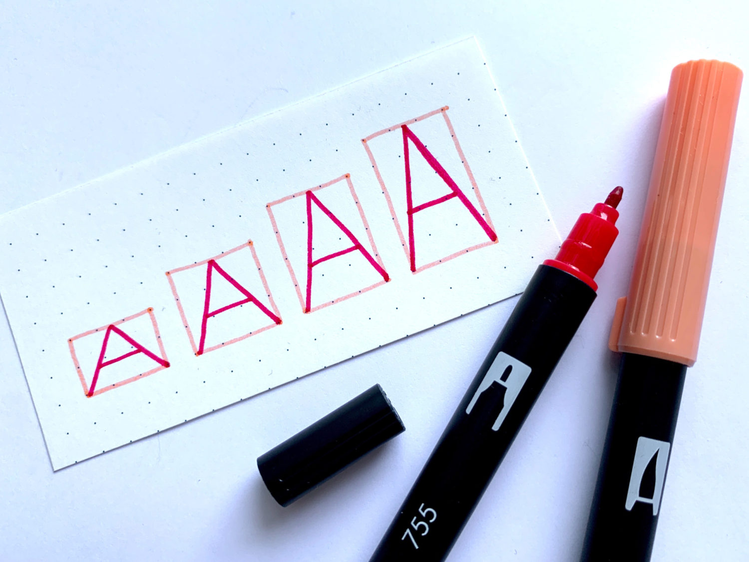
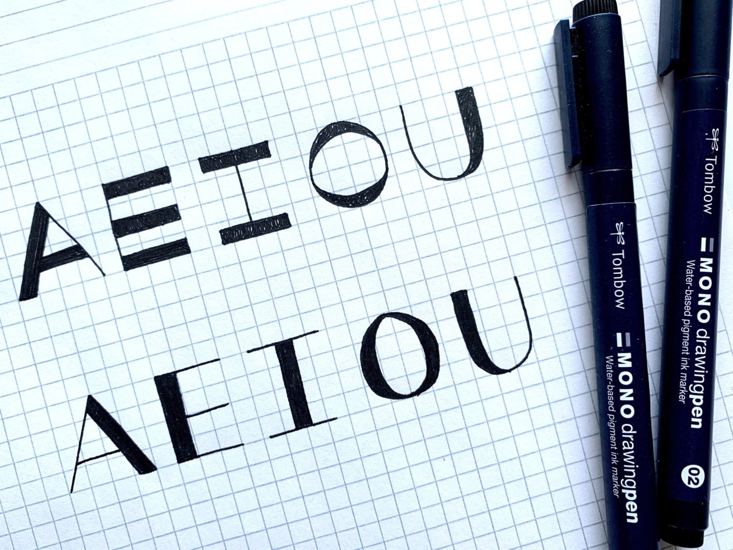
Adjusting the height and width of letters is often necessary when creating a lettering composition. An easy way to practice this is to start by drawing different sized boxes on graph paper or dot grid paper. Then, pick a letter you want to practice and draw it inside each box. In these examples, I used the bullet end of two different colored Dual Brush Pens.
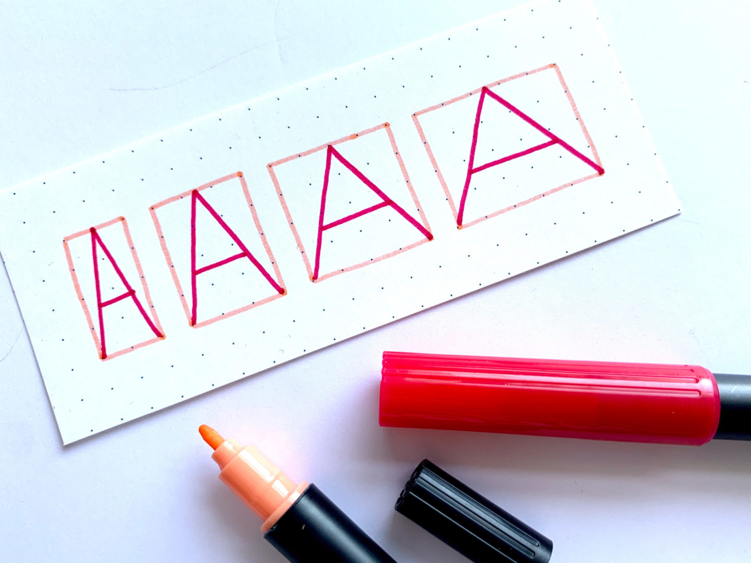
Seeing how different letters look at different heights and widths is important in developing your visual vocabulary. You’ll quickly learn which letters look good and not so good when they’re squeezed into the confines of a box. Below you can see how these kinds of simple adjustments can make a word more visually exciting!
Lettering Weight
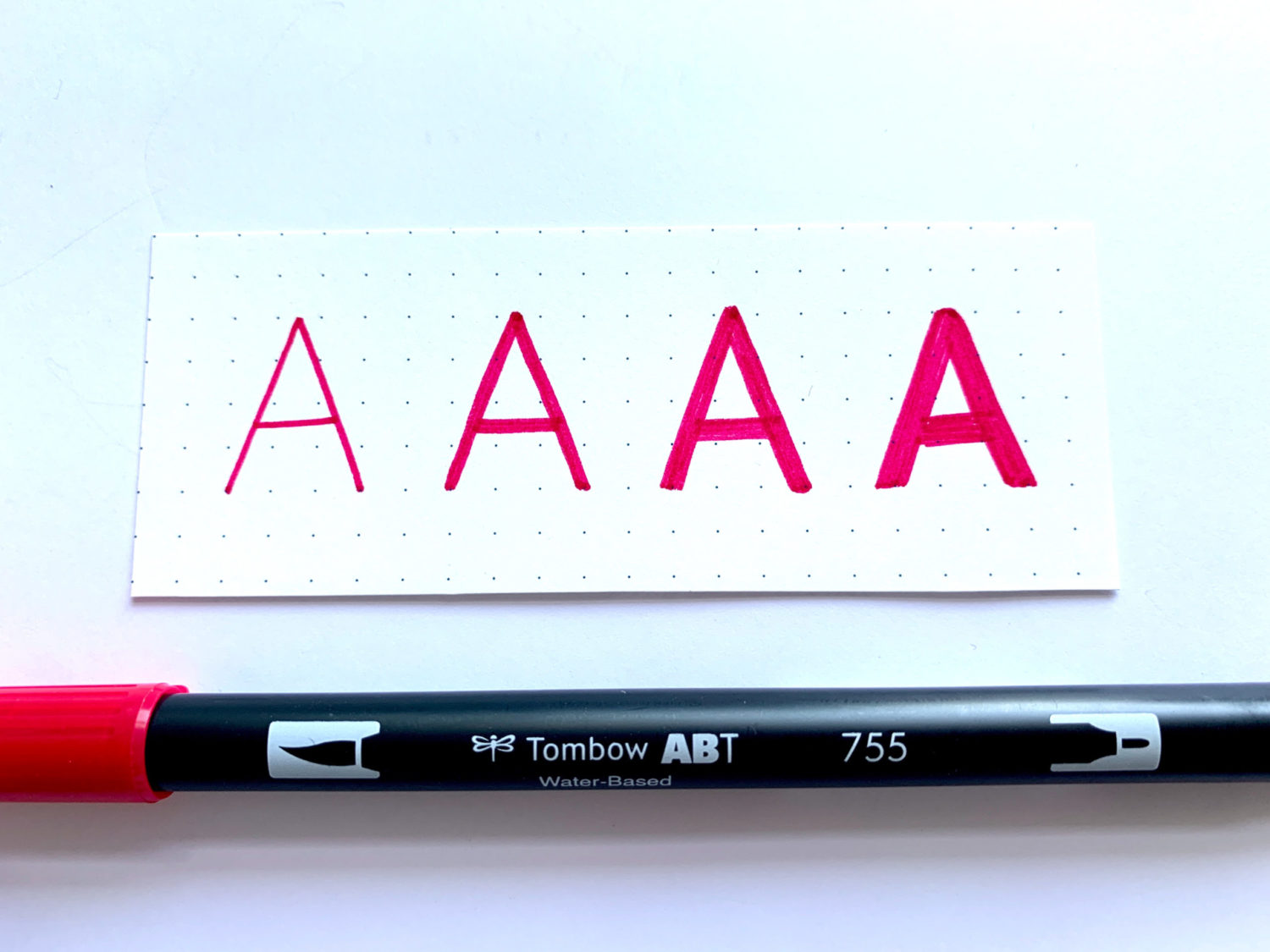
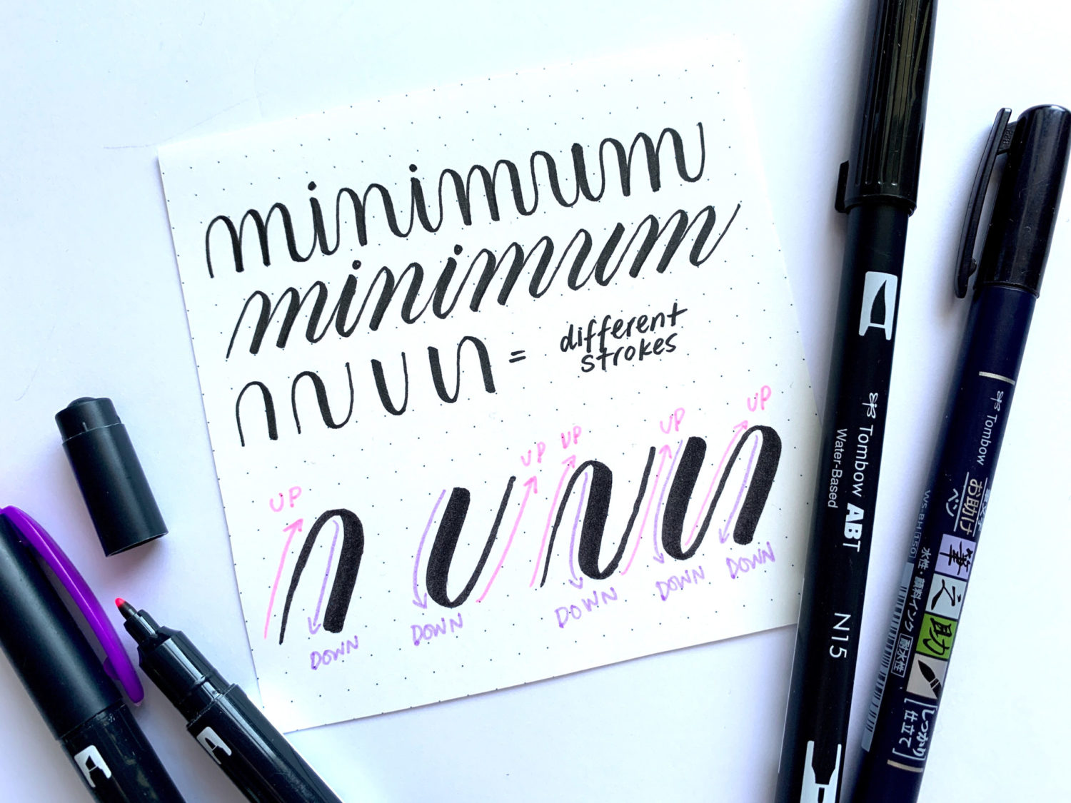
Letters are composed of different strokes. If you want to practice adding weight to your lettering, the easiest way to do so is to make every stroke equally thick. Doing this will give your lettering variety until you familiarize yourself with what the different strokes are supposed to look like.
In calligraphy, the tool I draw with and the pressure I apply is how I change the weight of the strokes in a letter. Unlike lettering, where it’s more about drawing each letter, calligraphy is about learning the right movements with the right tools. Upstrokes should be applied with light pressure, resulting in a thin line. Downstrokes should be applied with heavy pressure, resulting in a thick line. I used the Fudenosuke Brush Pen and the brush end of Dual Brush Pen N15 in this example.
While the letters in a typeface look different from those drawn by a calligrapher, the letters are still made up of strokes. If I add extra weight to a part of the letter that should be lighter, it looks all wrong. This is an area of lettering where it would help to have a font printed out as a reference for when you practice.
Uppercase VS Lowercase Lettering
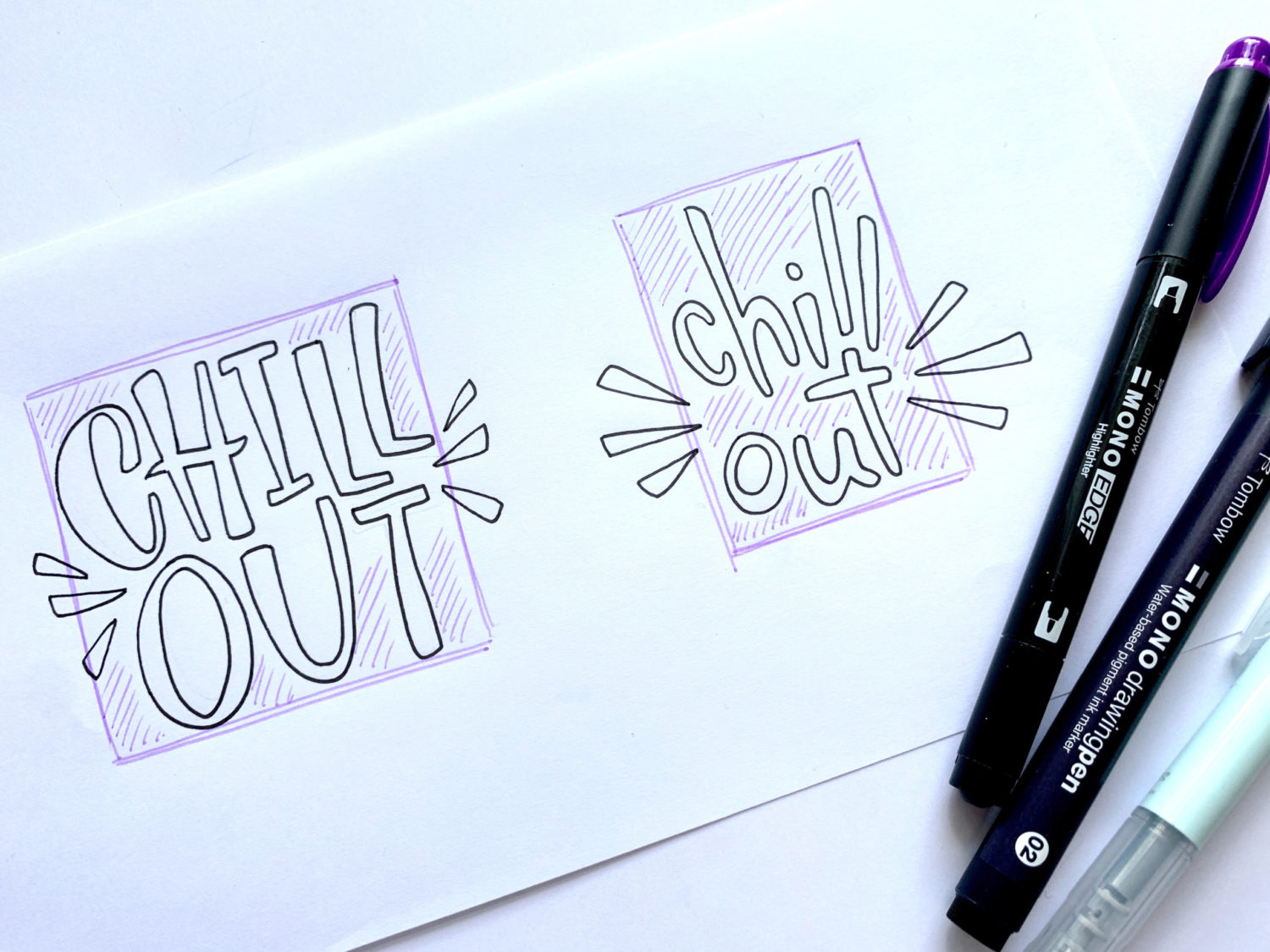
Most of my own hand lettering pieces are made up of uppercase letters. This isn’t because I’m YELLING! It’s simply because they are easier to work with. Without realizing it, our brains try to see the overall shape of a lettering composition. Since uppercase letters are all the same height, it’s easier to make shapes with them. Lowercase letters vary greatly in height. Compositions with a lot of them often look misshapen or full of holes.
To show the difference between a composition made up of uppercase and lowercase letters, I lettered the phrase “chill out” twice with the MONO Graph Mechanical Pencil. I inked over the pencil with MONO Drawing Pen 02 and erased the underlying pencil markings with the MONO Dust Catch Eraser. Then, I drew a box around the lettering using the MONO Edge Highlighter in purple. I shaded in the areas where there was remaining space. You can see how much more dead space there is in the lowercase example.
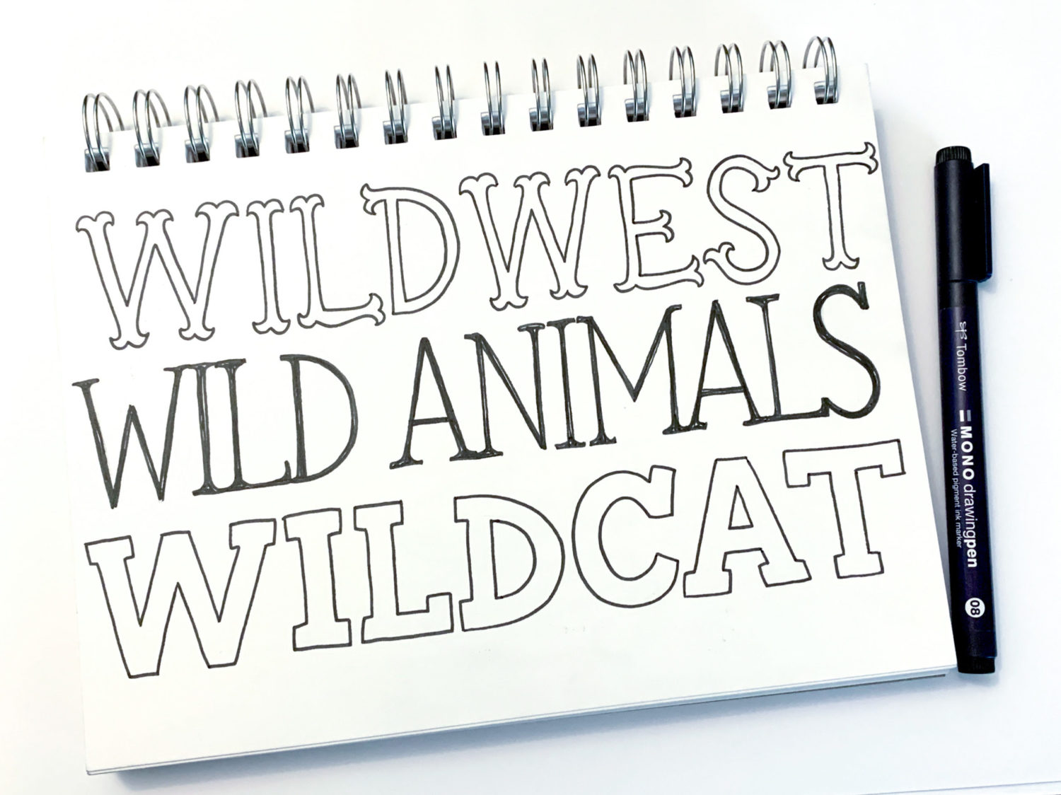
Serifs VS Sans Serif
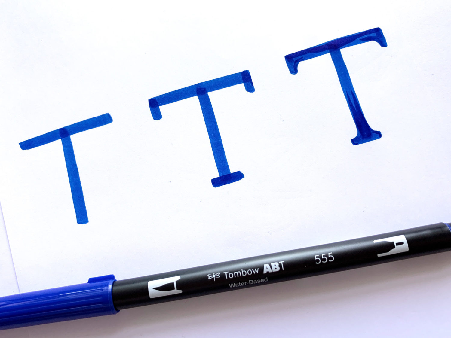
So far, I haven’t shown any examples of lettering with serifs. Simply put, serifs are those little strokes that stick out of larger strokes on a letter. That sounds strange, but you have seen serifs in famous typefaces like Times New Roman and Garamond. In the example below, I used Dual Brush Pen 555 to draw the letter T in three different ways. On the far left is an example of a sans serif letter or a “without serif” letter. In the center and to the right are examples of serif letters.
There are many different varieties of serifs and they’re a great way to add style to lettering. Just by adding serifs, I can create a mood for a lettering piece!
Decorative Lettering
As I mentioned earlier, lettering is essentially a form of illustrating. Once you’ve become familiar with the structure and shape of each letter, you’re ready to start playing. When it comes to decorative lettering, the possibilities are endless. This is the most playful and fun way to make letters, but it’s also the way that takes the most work. Below you can see a few different examples of decorative lettering. Whether you add slime, a pattern, dimension or alter some brush calligraphy, you’re making decorative lettering!
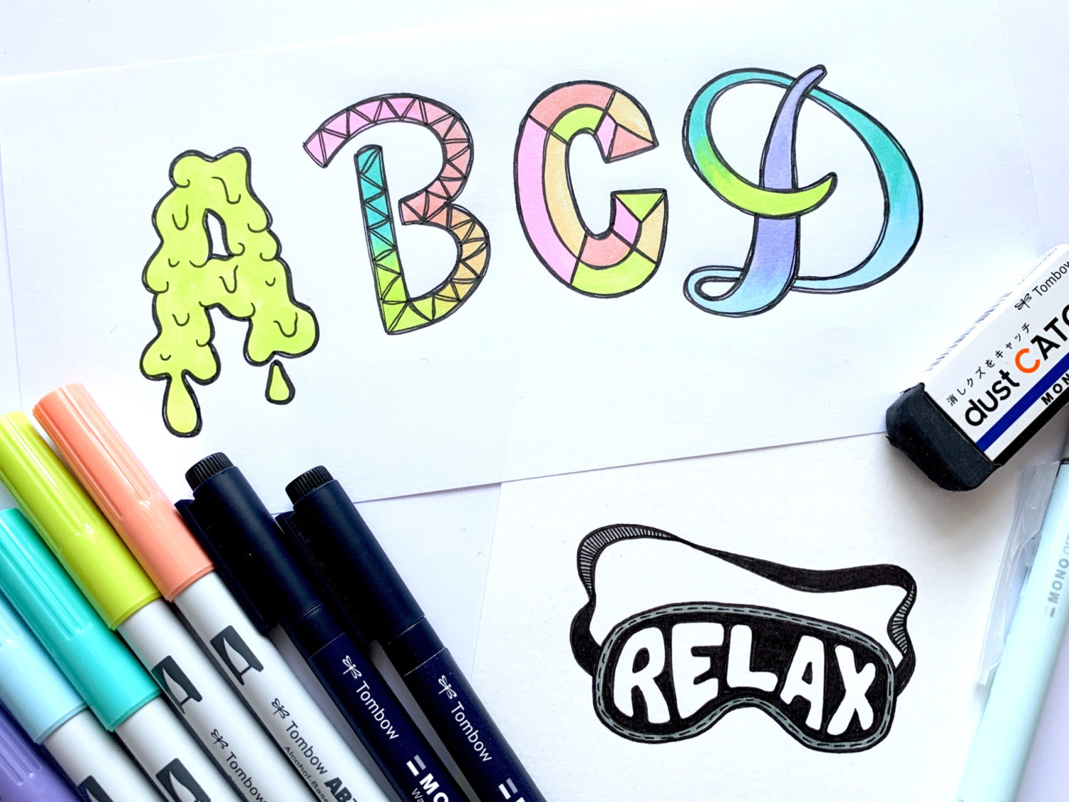
You’re able to tell what each letter is despite them all being different styles. The reason for this is that each letter has a foundation. Do you know what the brilliant part about hand lettering as an art form is? Almost everyone who has learned how to read and write has been partially educated in this art form. If you can read this, you already know what letters are supposed to look like. If you’re able to write, you already know how letters are formed. Since you have pre-existing knowledge about letters, you’re well on your way to becoming a lettering artist!
Lettering Exercises
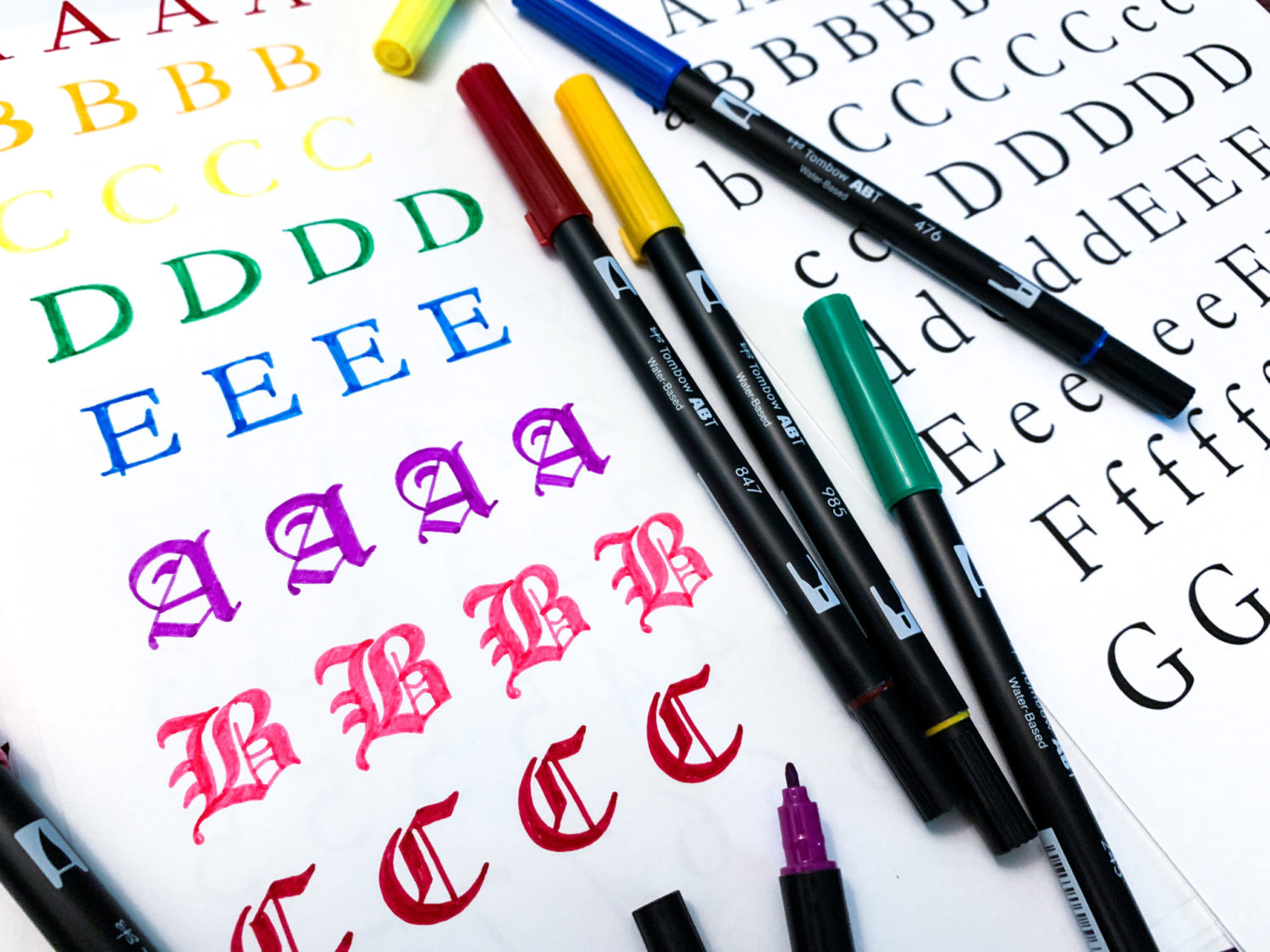
There are three ways I suggest practicing in order to train your brain to come up with different lettering styles. The first way is to print off references of letters and try to recreate what you see. I recommend starting with basic fonts. This isn’t the fun and flashy way to practice, but it’s the best way to learn the rules! Using Dual Brush Pens is a great way to make this method of practicing more exciting!
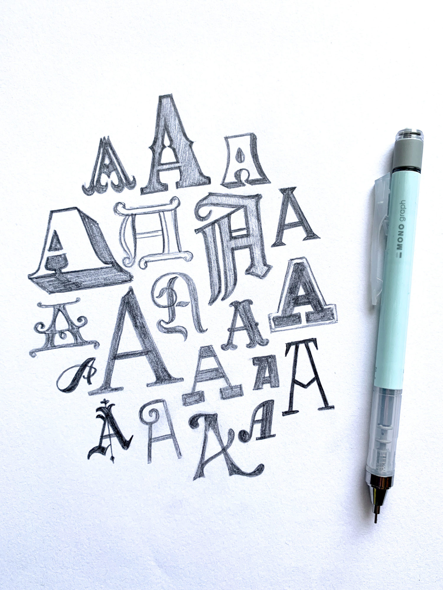
The second way to practice is to choose a single letter and draw it as many ways as you can. Start by trying to come up with different styles without using references. See what your brain can come up with. Then, start looking for sources of inspiration and try drawing like other lettering artists. Try doing this with all the letters of the alphabet! (Always remember to credit the artist you’re imitating if you’re posting your work!)
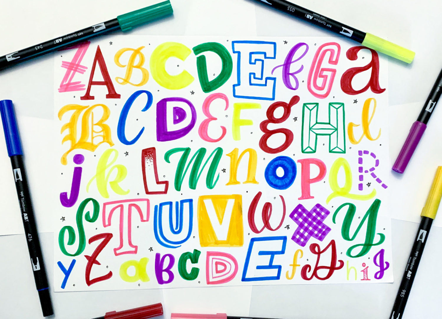
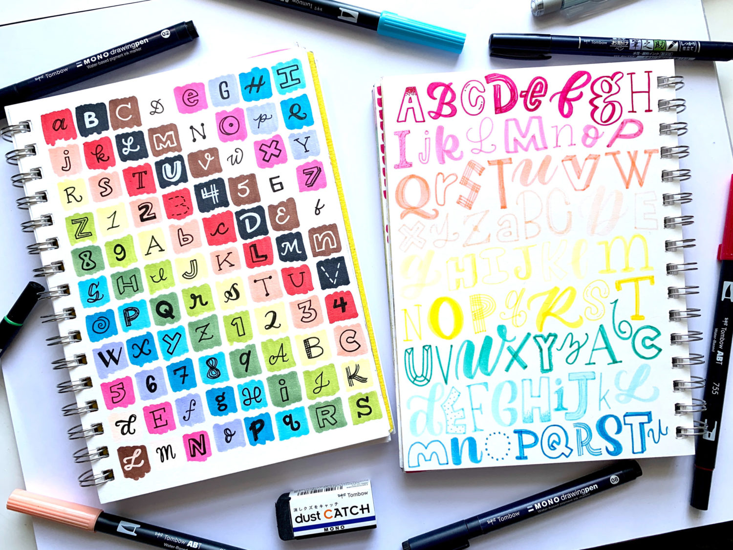
The third way to practice is to fill up a page in your sketchbook or art journal with the alphabet. Go in alphabetical order, trying not to repeat the same style. The more you do exercises like this, the more you train your brain to come up with different lettering styles!
Thank you for stopping by and learning to letter with me. I hope that you learned something new! If you’re interested in learning more about hand lettering, I suggest you check out the 5 P’s of Brush Calligraphy and Hand Lettering by Grace Myhre! 3 Tips for Purposeful Lettering Practice by Lauren Fitzmaurice is also a good resource! Make sure to tag Tombow when you post your lettering projects so we can cheer you on. Now go practice!
There are lots of websites prevailing on the internet. There are specific websites for medical purposes. If you are planning to develop a medical website and searching for medical website design then you must check the information here on this website.
Pingback: How to Make a Thanksgiving Bunting Banner - Tombow USA Blog
Ali, I’m a fan of yours. As usual, the article is flawless!
Thanks for posting this helpful article about design. That’s exactly what I was looking for