Hey y’all! It’s Grace from @graceannestudio, here to chat about the 5 P’s of Brush Calligraphy and Hand Lettering. I have a confession to make. I RUINED my very first Tombow Dual Brush Pen VERY QUICKLY! Let me set the scene: It was 2016, and I had just bought my first book on brush calligraphy. I was so ready to dive in. I had the book. I had the pen. “Let’s do this! I’ve been drawing forever, so this will be so easy,” I thought.
Spoiler alert: I was terrible. I used the wrong paper, could not for the life of me master thick to thin transitions, and to top it off, my husband couldn’t read my work! But guess what? I persisted. I practiced. I took classes. I connected with the lettering artist community on Instagram, and one day I looked back and was amazed at my progress!
Why am I telling you this? To remind you that everyone started as a beginner, and to help you avoid the pitfalls of brush calligraphy and hand lettering ASAP!
-

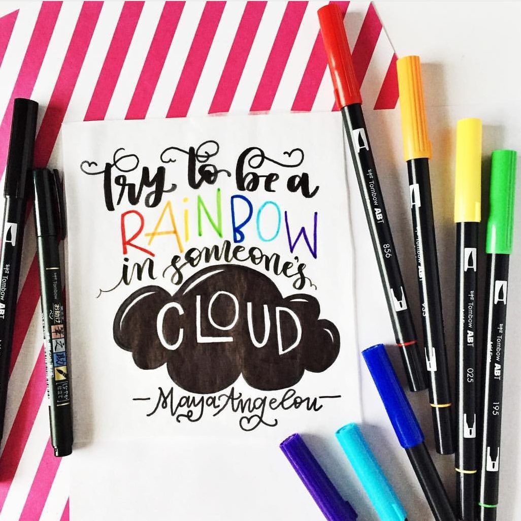
- 2017 Progress (Lettering for one year)
-
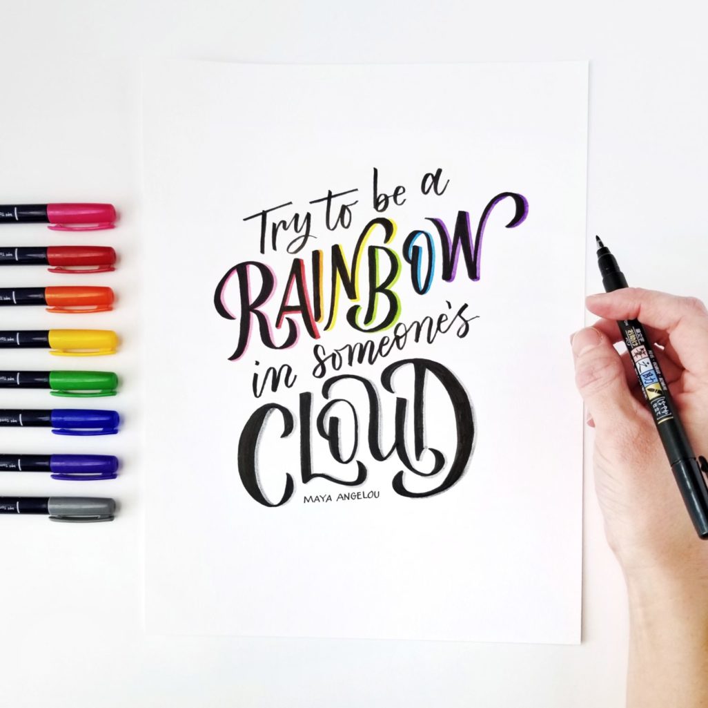
- 2019 Progress (Lettering for three years)
Materials
- Tombow MONO Drawing Pencil, 4B
- Tombow Fudenosuke Brush Pen
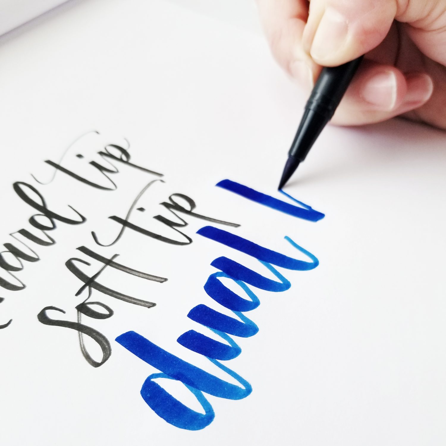
- Tombow Dual Brush Pen
- Smooth Paper
- Persistence
- Patience
1) P is for Paper
Paper is so important for extending the life of your pens! When you’re looking for paper, make sure the tooth or texture of the paper is extremely smooth. Regular copy paper might feel smooth, but it’s not! (Speaking from experience…) The paper brands below are my favorites, but you should always test paper yourself to see what works for you and your unique project.
- HP Premium Choice Laserjet Paper – Great for your pens and practice.
- Rhodia notebook or dotpad – Insanely smooth paper, and excellent for practice.
- Strathmore Tracing paper – A great cheaper option for practice, but watch out for smearing the ink!
- Strathmore Marker paper – Very smooth paper and great for practice, but it can smear also.
- Canson Mixed Media Paper – A smooth, thicker paper. Great for IG posts or temporary pieces. Of all the papers listed here, this one is the roughest on Dual Brush Pens. I use it most for watercolor or blending with Dual Brush Pens. For straightforward lettering, I find it is better for the Fudenosukes than Dual Brush Pens.
- Tombow Dot Grid Notebook – Smooth paper, and great for an on-the-go option.
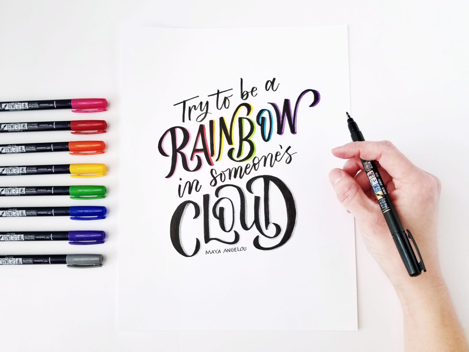
2) P is for Pens and Pencils
Pens and pencils are by far the most fun part of lettering! As you practice, you’ll develop your own style and figure out which pens work best for you. The pens below are a great place to start exploring.
- Tombow Fudenosuke Brush Pen, hard tip – The best pen to start with. The hard tip is more forgiving, and helps keep strokes consistent when you’re learning.
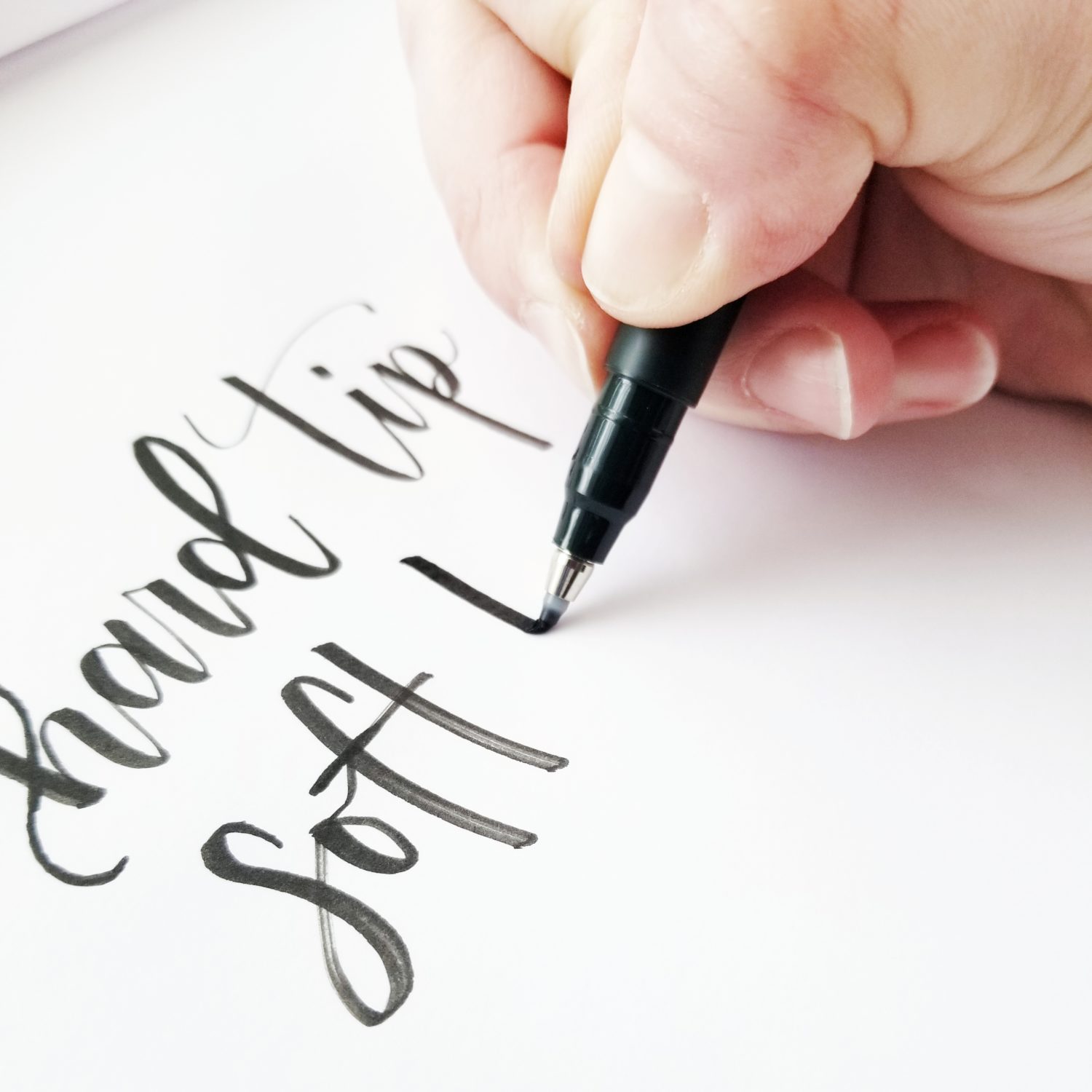
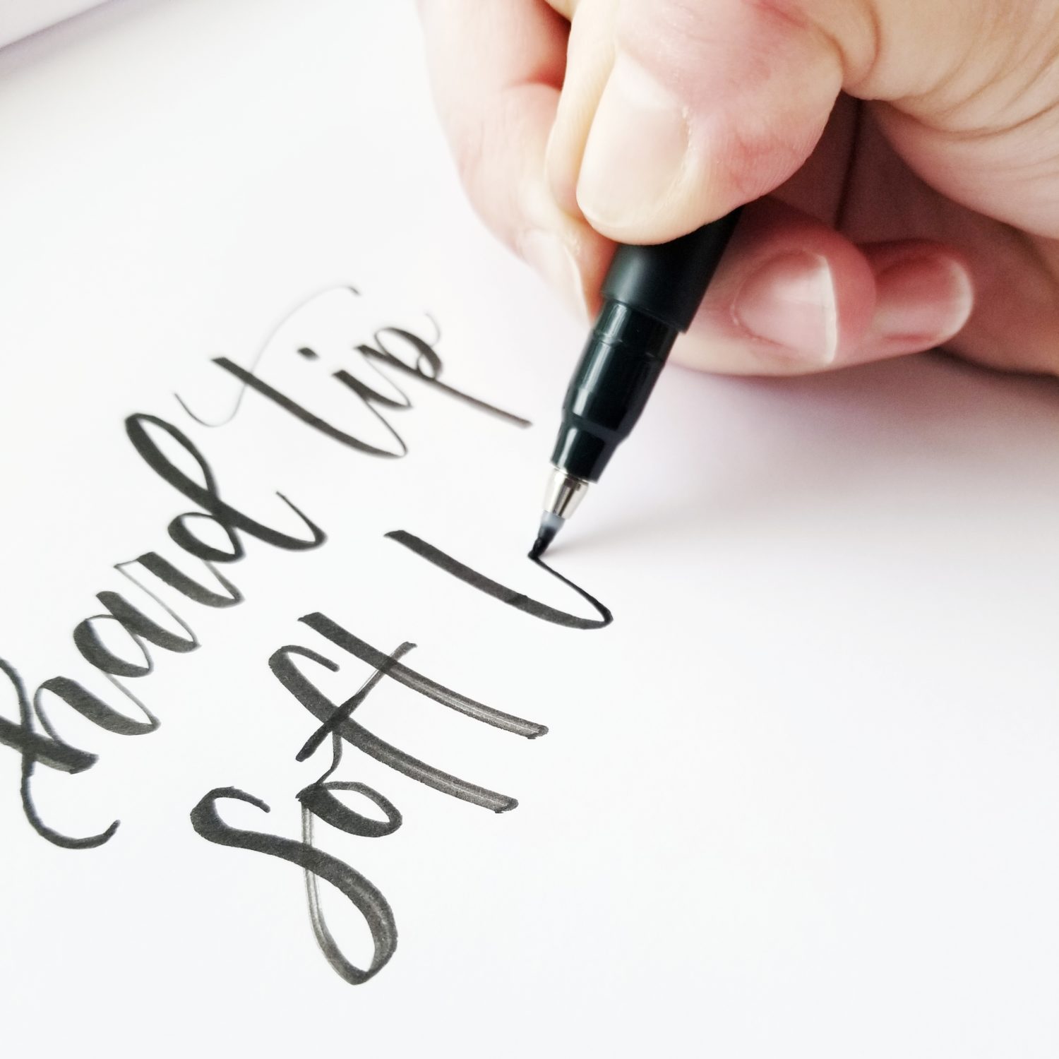
- Tombow Fudenosuke Brush Pen, soft tip – A great choice when you’re ready to graduate from the Tombow Fudenosuke hard tip. It’s more flexible and gives a little thicker downstrokes than the hard tip.
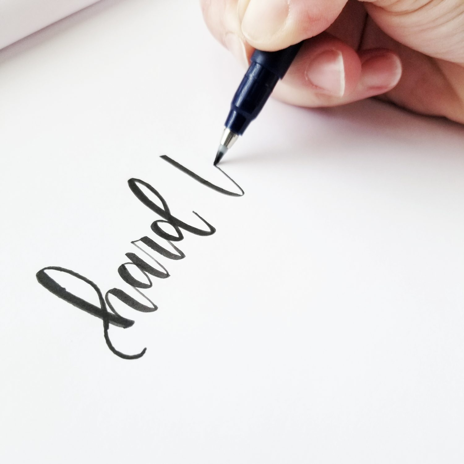
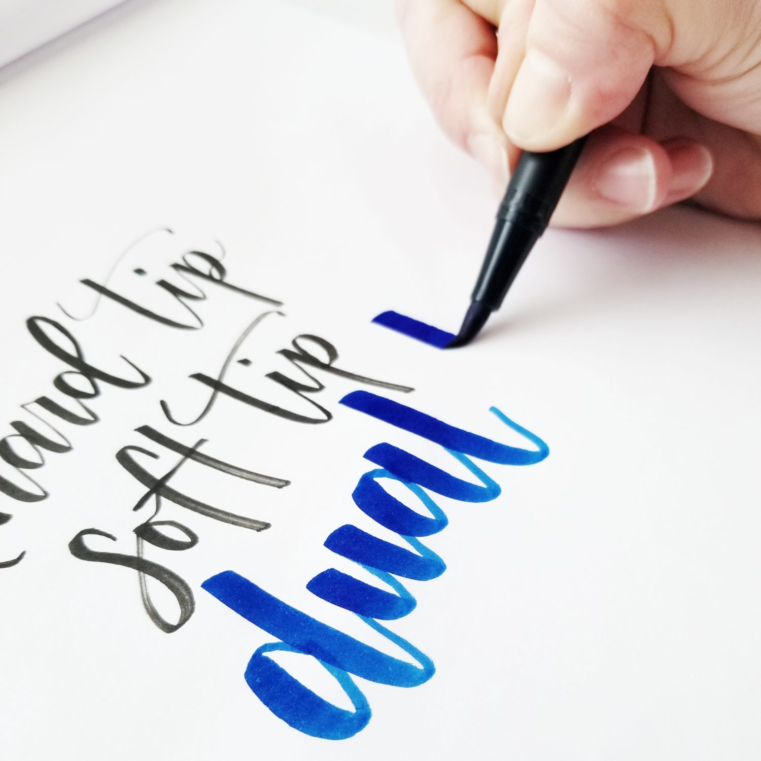
- Tombow Dual Brush Pen – This is a very large pen, and it’s incredibly versatile. You can do everything from simple lettering to creating complex watercolor pieces with this pen!
- Tombow MONO Twin Permanent Marker – Permanent marker with two thicknesses. Great for monoline lettering.
- Tombow MONO Drawing Pens – Great for monoline lettering and sketching in details or flourishing.
- Tombow MONO Drawing Pencil – Don’t underestimate a pencil! It’s great for building muscle memory, working out compositions, and playing with letter forms. Grade 2B or 4B is a good softness. There’s just enough give to get thick and thin lines, but not so much you have to constantly sharpen it.
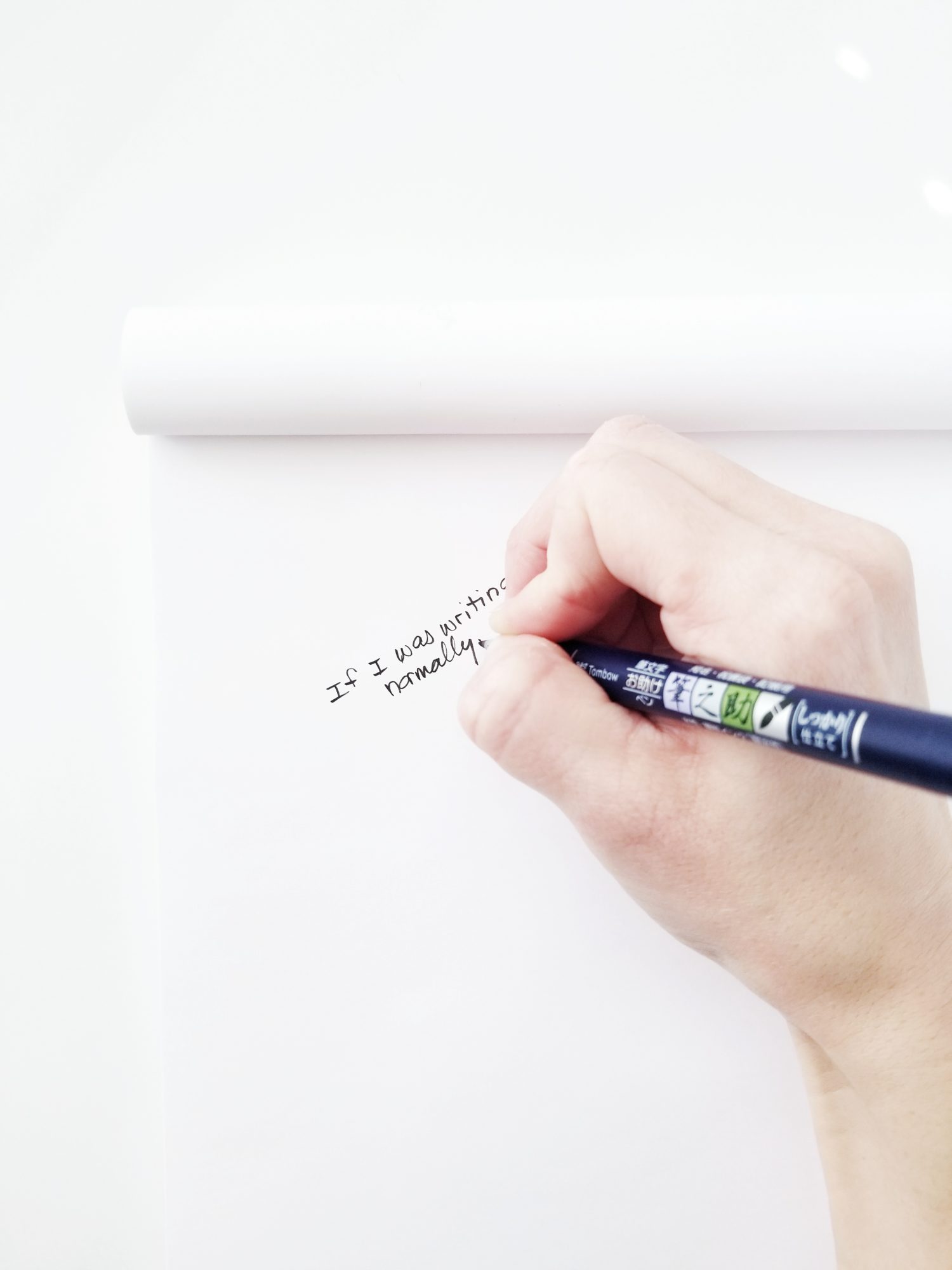
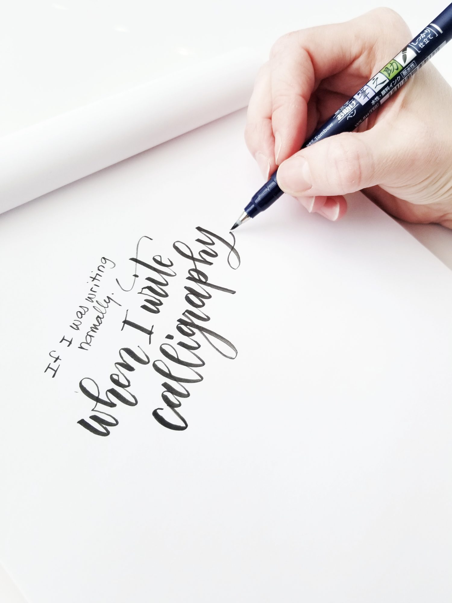
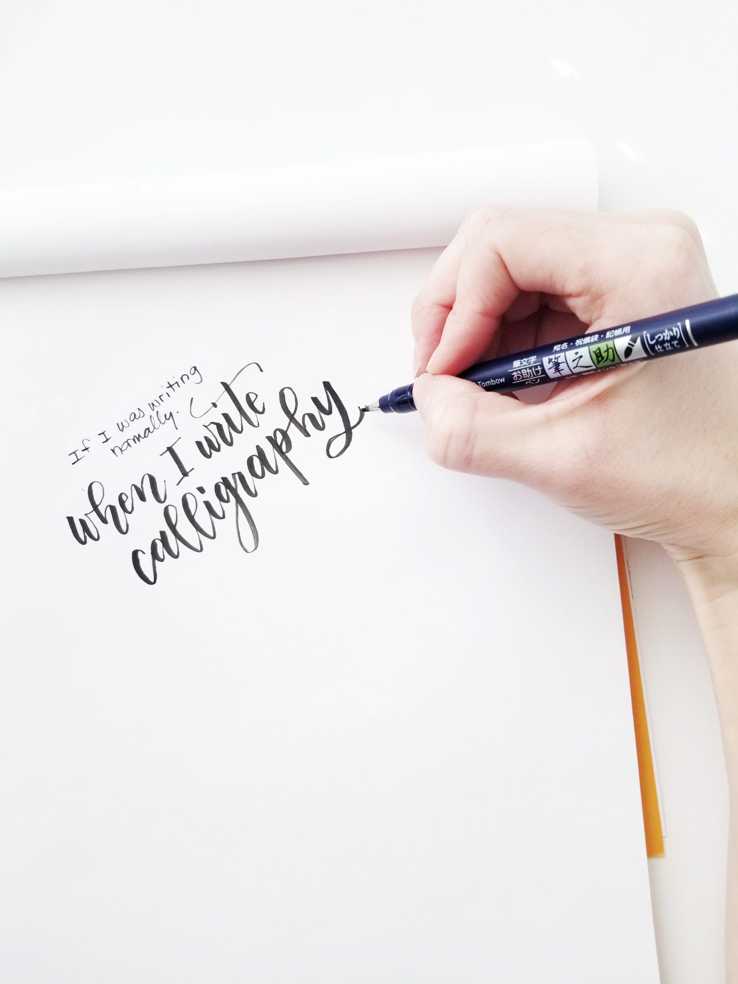
3) P is for Pen Position
Calligraphy and hand lettering are NOT the same as handwriting. Let me repeat, they are NOT the same. You can have messy handwriting, and still letter. The difference starts with pen position.
When you write, let’s say your grocery list, your hand is probably scrunched, the pen rests above your index finger’s knuckle and is almost perpendicular to the paper – and you’re writing almost directly under your hand. For brush calligraphy and lettering, pen position is completely different.
First, your hand should be elongated and the pen should rest between your index finger and your thumb. Next, the pen should be closer to a 45-degree angle than a 90 -degree angle. This will maximize the thickness of your downstrokes and help keep your thicks and thins consistent and smooth. Finally, as you write, your hand should be ahead of the lettering, not on top of it. (Keep in mind, I’m right handed. If you’re a lefty, check out Lauren’s post Tombow like a Lefty!) This new pen position WILL NOT feel natural at first. Keep at it and be persistent. Soon, it will be second nature and you’ll wonder how you ever held the pen any differently.
-
- Handwriting: Scrunched hand, tight grip near nib.
-
- Handwriting: Writing almost above letters at a 90 degree angle.
-
- Hand Lettering: Elongated hand, grib further back on pen.
-
- Hand Lettering: Writing to the side of the letters at a 45 degree angle.
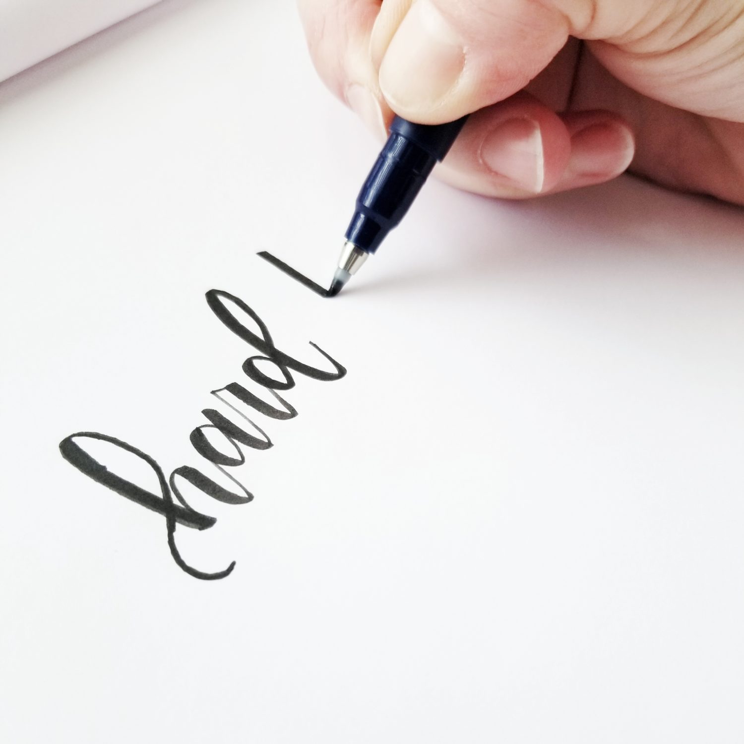
4) P is for Pressure
Don’t be afraid of pressure when you’re working with your Tombow pens. They’re built for it, and when you use them correctly, the results are amazing! When you’re working on brush calligraphy, be sure to use light pressure on upstrokes and heavy pressure on downstrokes. This will give the signature thicks and thins we all love. Keep in mind, proper pen position is the key to evenly applying pressure!
-
- Tombow Fudenosuke Hard Tip: Downstroke
-
- Tombow Fudenosuke Hard Tip: Upstroke
-
- Tombow Fudenosuke Soft Tip: Downstroke
-
- Tombow Fudenosuke Soft Tip: Upstroke
-
- Tombow Dual Brush Pen: Downstroke
-
- Tombow Dual Brush Pen: Upstroke
5) P is for Practice
Practice makes progress. It’s not feasible for everyone to commit to hours of practice a day, but any little bit helps. Letter your grocery list, your to-do lists, write your kid’s name in calligraphy and teach them cursive! However you’re able, commit to practicing, and one day you’ll look back and be amazed at your progress too.
For more lettering tutorials, check out Mandy’s posts on Building Lettering Confidence or Blending and Shadowing Techniques! Be sure to tag @TombowUSA and @graceannestudio if you share your progress!
Happy lettering!
Grace
2019 Lettering + Composition
This is definitely helpful! I just started to letter and I love it! Still trying to build confidence and trying to find my own unique style.
Pingback: 3 Ways To Master Pencil Calligraphy - Tombow USA Blog
Hi, Caitlin! I’m so glad this was helpful! Just remember, practice makes progress!
Pingback: 5 Steps to Better Lettering: Compositions
Pingback: Harry Potter and the Basic Lettering Tips - Tombow USA Blog
Pingback: Pop Art Inspired Lettering - Tombow USA Blog
Pingback: Spring Banner with Rolled Flowers - Tombow USA Blog
Pingback: How to Create Reliably Wonderful Compositions - Tombow USA Blog
Pingback: A Practical Guide to Lettering in Different Styles - Tombow USA Blog
Pingback: 5 Exercises to Improve Your Handlettering - Tombow USA Blog
Pingback: Easy Mountain Inspired Art You Can DIY - Tombow USA Blog
Pingback: Buffalo Plaid Lettering With Dual Brush Pens - Tombow USA Blog