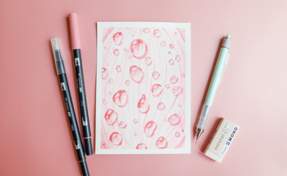
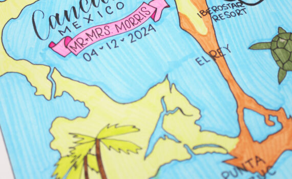
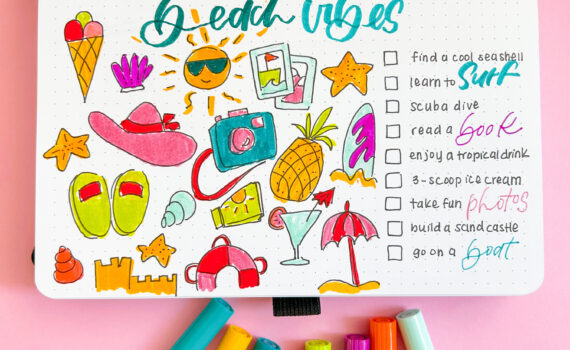
my heart…..by melissa cash
TOMBOW Foam Tabs
These acid-free double sided adhesive tabs are great for adding dimension to many projects, the small tab is 1/5 x 1/5 and the large tabs are ½ x ½, they are also great for layering and can be stacked for added dimension. They are suitable for most surfaces including paper, glass and metal. They are also crush resistant and instantly bond and hold.

http://www.facebook.com/tombowusa
http://twitter.com/#!/tombowusa
I think I speak for all the scrapbookers and crafters out there when I say that most of the time the projects or layouts we make are for other people. We work so hard to tell all the stories about our children and family that we often forget about ourselves. Once in a while we should make a page about ourselves, that way when future generations see them they can get an idea of who we were. I am the first one to run away from a camera, always behind them, never in front of them, but I HAD, not wanted, HAD to take a picture of myself. Since it came out pretty decent I made a layout about things I currently love. This week we had to use turquoise, one of my favorite colors!!
After I gather all my supplies for a layout I start by matting the picture, but instead of using just white cardstock, I used Tombow’s Dual Brush Pen to draw some stripes and then added the photo to do some doodling around it. Before I assemble I everything I doodled the base, the 8 1/2 x 11 patterned paper and the strips of paper with the things I like. Before gluing everything I like to lay everything down to see where it looks better. After I decided, I stamped the heart and the eye so I could use the last one instead of the letter “I”. I also used some die cuts that I assembled using the Mono Multi Liquid Glue, it was great to use the fine tip specially for the black piece of the bird. The fine tip of the Mono Multi Liquid Glue allowed me to glue these detailed parts easily without making a mess. I made some embellishments with my Spirograph and the Dual Brush Pens and glued other embellishments in the center with my Mono Multi Liquid Glue which works great with paper and embellishments like the rose I made. The 8 1/2 x 11 paper, the octagons on the corners, the doily, the mat and the photo were glued with the the Stamp Runner Dot Adhesive. For the turquoise rope I used the Mono Aqua Liquid Glue since it dries completely clear you won’t notice where is the glue, the staples on the corners are just for decoration because there is no way that it will keep the shape without glue. The rest of the embellishments were glued with the Mono Multi Liquid Glue or with Tombow Foam Tabs for a little extra dimension. I used Tombow Foam Tabs for the shadow in the die cuts to make them stand out.
I really love the vibe of this layout!! The Dual Brush Pens help the page feel like it’s moving. This was a nice idea, maybe I’ll make one once a year so future generations can make fun of our likes.
I hope you love my loving project!!
Take Care!!
here we go…another layout! these color challenges have been great! isn’t great to feel accomplished!?!
this layout used the color TURQUOISE, which is quite possibly my favorite color. one thing i love about turquoise is that it can be so many things… summer time when paired with oranges and blues, winter when paired with silver and white, spring with pinks and reds, and fall with browns and greens. it can be used for boys or girls. it is the color to use for tropical pictures and even baseball pictures…okay, if you are a Marlins fan.
anyway, it worked perfectly for these pictures of my daughter dancing in a (extremely cold) winter festival performance.
i used the Tombow Dual Brush Pen #343 to doodle a few snowflakes. i looked back on some of Marie’s instructions on using the pens for doodling and attempted some of those techniques.
the pictures were adhered with Tombow MONO Adhesive Permanent Runner, the snowflakes were popped up with Tombow Foam Tabs, the metal letters were glued down with Tombow MONO Multi Liquid Glue, and lastly i used the Tombow Glue Pen to “draw” over each of the snowflake doodles. push the roller ball tip down until glue starts to flow, and then trace the lines previously drawn. when the glue from the Glue Pen dries it is clear, but leaves a slight shine or wet look.
one more color challenge to go this month. hope you’ve been playing along!
if you enjoyed this post follow us on facebook and twitter!
http://www.facebook.com/tombowusa and
http://twitter.com/#!/tombowusa
In case you haven’t guessed, this month is all about Pantone’s color of the year, present and past. This week the Design Team is showing off Turquoise, color of the year for 2010. I would say this is still a very “hot” color. I have seen so much of this color in clothing, homes and fashions of all kinds.
Not only do I love this color, but I love ice cream sundaes. My favorite is hot fudge, what is yours?
The card I have to share with you today is using Irojiten colored pencils. I like to use Gamsol to blend the colored pencils to get a soft look.
How fun is the inside? (you can click on the pictures to get a larger view)
When using Honeycomb papers from Inky Antics (all the stamp images are by them as well) I prefer to use Tombow’s Mono Glue Stick. It is perfect for the thin papers and adheres so well to cardstock. The adhesive I used for the rest of the card was Mono Adhesive Permanent.
I hope you are enjoying our color month and will give these “colors of the year” a try in your papercrafting.
Thank you for stopping by,
if you enjoyed this post follow us on facebook and twitter!
http://www.facebook.com/tombowusa and
http://twitter.com/#!/tombowusa
For the paper, I used a smooth, hot press watercolor paper. I then transferred a design to a piece of tracing paper to make the pattern. Tape the pattern onto to the watercolor paper and with a heavy hand; trace the pattern with the embossing stylus.Remove the tracing paper pattern to reveal the impressed line outline of the design.
After the main lines were impressed, I removed the pattern and added the filler design lines. I did this free hand without using a pattern and pressed hard to create the deepest impressed line possible.
I then start shading and adding color to the design. It’s kind of magical to watch the lines appear and stay white even with the hardest shading pressure. I go over the edges of the motif to make the lines show up best. It also adds a fanciful effect to the drawing.
The last shading uses darker colors and the heaviest shading to create the finished look. Do not be afraid to add lots of layers of different colors and darker hues for the most interesting drawings.
I hope you enjoyed this fun tipnique, please follow us on
This month the Tombow team has been sharing projects created using colors that coordinate with the Pantone “in” colors for the last few years. Today I am sharing a card that I created using the 2011 color, Honeysuckle.

This week we are showcasing the color Honeysuckle, which was the color of the year 2011. This is the perfect color for that special day when we declare our love to that special person in your life. Is also a good time to start preparing our kiddies treat boxes, cards and other gifts, so pay attention to these weeks posts because we will be filling you with awesome ideas for Valentine’s Day.
This mailbox cost me only $1 and dressed it up with 4 x12 patterned paper, ribbons and some stickers. For gluing the cardstock I used the Tombow Stamp Runner and for the embellishments I used the Mono Multi Glue. I also made a coordinating card with the cutest cherub which I colored with my Tombow Dual Brush Pens. I paper pierced the cloud and used Tombow Foam Tabs. The card is size 3 1/4 x 4 1/2 which fits perfectly in the mailbox.
I can’t believe how cute this cherub looks with Honeysuckle hair!! I love how bright my Tombow Dual Brush Pens are and not to mention how incredibly easy they are to use for beginners like me.
I hope you liked this romantic project!!
Take Care!!
i never really paid attention before to “the color of the year” or even “Pantone colors” before… but this month’s challenges have had me digging to find the perfect shade of paper or embellishment to match said colors. in the end i’ve come up short and needed to create something to finish the project. in addition to the color challenge i challenged myself to create a scrapbook layout for each of them, to jumpstart the 2012 year, when i will get more layouts done!
i have had these pictures of my daughter and one of her best friends (this one we’ve known since we said their ages in months!) i have even scrapbooked a few of these pictures before. but i had more pictures and the paper already picked out and i was looking forward to getting another layout done. i needed to add in some embellishment and struggled to find something the right color in my stash.
i found some white paper flowers and grabbed my Tombow Dual Brush Pen #743. i colored around the edges of the flowers. then with a q-tip dipped in water i dragged the color in towards the center of the flower. once the color was blended it was the perfect embellishment for my layout. (wait til the flower is dry before adhering it to your project.)
to finish putting the layout together i used Tombow MONO Adhesive Permanent Runner for the pictures and paper, Tombow Dual Brush Pen #743 to ink the edges of the pages and write a portion of the title, Tombow MONO Aqua to set the rhinestones in the center of the flowers, and Tombow Power Tabs to set the flowers. WOW, 4 Tombow products on one layout. i love that each of them have a purpose, but work so well together.
I hope you enjoyed my attempt at using HONEYSUCKLE. check back tomorrow for another very pink project!
If you enjoyed this post follow us on facebook and twitter!
http://www.facebook.com/tombowusa and
http://twitter.com/#!/tombowusa
What did you all think of the new Pantone color of the year last week? I love the tangerine color. This week we have another color challenge that was Pantone’s color of the year 2011…Honeysuckle. This color matches Tombow’s Dual Brush Pen 743 (hot pink).
With Valentine’s Day sneaking up on us, I thought this color would be perfect for a candy box. I found this tutorial here. The tutorial shows to use Hershey Nuggets, but I had some raspberry Ghiradelli’s on hand and they fit perfectly! I can get 2 into each little matchbox. The matchboxes were cut with SU!’s die that my friend had and I cut a bunch of them over a year ago. They are now coming in handy as I plan to make more of these boxes for friends and family.
Tip: One of the wonderful things about markers and rubberstamps is that the markers are less expensive and you can have so many more colors. I colored Our Craft Lounge’s new Every Heart Beat stamp set (the zig zag image) with the 743 Dual Brush Pen and stamped it on a label that also was on the die that I cut. I then stamped the sentiment with black ink.
I used Mono Adhesive Power Bond to put the whole box together. I prefer using a stronger adhesive for projects like this.
I hope I inspired you to start working on your Valentine projects. I have a couple more I will be sharing with you this month as well.
Thank you for stopping by,
http://www.facebook.com/tombowusa and
http://twitter.com/#!/tombowusa
I have taken the Ten Top Pantone Colors for 2012 and matched them to Tombow Irojiten Colored Pencils and Tombow Dual Brush Pens. Even though the colors reflect fashions, color trends take their cue from lifestyle trends and filter down into scrapbooking, greeting cards and home décor.
Some of the colors are a perfect match and some are close. I only had to do one blended color with the Cabaret Irojiten color. Some Dual Brush Pen colors are a slightly darker color but would be a perfect match if blended out with the blending pen.
PANTONE 17-1463 Tangerine Tango
Provocative Tangerine Tango, an enticing juicy orange, is a vivacious and appealing refresher to enliven anyone’s outlook this spring. Tangerine Tango is also the color of the year!
Irojiten V-2 Tangerine Orange
Dual Brush Pen 905 Red
PANTONE 18-2140 Cabaret
Scintillating and sexy, Cabaret is a sensual and intense rosy-red
Irojiten Mix of V-1 Cherry Red and P-1 Orchid Pink
Dual Brush Pen 755 Rhodamine Red
PANTONE 13-0759 Solar Power
Providing a jolt of energy, Solar Power radiates warmth and cheer.
Irojiten P-13 Gamboge
Dual Brush Pen 985 Chrome Yellow
PANTONE 19-3953 Sodalite Blue
Sodalite Blue, a classic maritime hue, brings order and calmness to mind. Like an anchor to a ship, this dependable shade works with every color in the palette.
Irojiten V-7 King Fisher
Dual Brush Pen 528 Navy Blue
PANTONE 18-3628 Bellflower
Fanciful Bellflower, a distinct ornamental purple, exudes uniqueness and creativity.
Irojiten P-20 Crocus
Dual Brush Pen 623 Purple Sage
PANTONE 14-5420 Cockatoo
Cockatoo, a tactile blue-green, is sure to make spirits soar. This unusual hue adds a whimsical touch to the palette and makes a strong statement.
Irojiten P-17 Turquoise
Dual Brush Pen 373 Sea Blue
PANTONE 14-2808 Sweet Lilac
Fragrant Sweet Lilac evokes the fresh scents of summer. This delicate pinkish lilac adds a touch of romance.
Irojiten VP-1 Cameo Pink
Dual Brush Pen 723 Pink
PANTONE 14-0116 Margarita
Margarita, a piquant yellow-green, lifts spirits with its refreshing and stimulating glow. Reminiscent of a blossoming garden on an early spring morning,
Irojiten DI – 4 Sage Green
Dual Brush Pen 192 Asparagus
PANTONE 16-1120 Starfish
Starfish, a perfect warm neutral, complement all of the colors in this season’s top 10.
Irojiten Lg-2 Cork
Dual Brush Pen 992 Sand
PANTONE 18-1210 Driftwood
Natural, versatile neutrals add practicality to this season’s brights. Driftwood, an adaptable blend of beige and gray with a slightly weathered feel,
Irojiten D-10 Taupe
Dual Brush Pen N79 Warm Gray 2
What a wonderful world of color…and so many beautiful colors to choose from….I hope you enjoyed this project, if you did please follow us on
http://www.facebook.com/tombowusa and
http://twitter.com/#!/tombowusa


